


Database City, call for projects

Medialab-Prado issues a call for data visualization projects to be carried out within the context of the VISUALIZAR 08: Database City International Workshop, that will take place from 3rd to 18th November 2008 at Medialab-Prado (Madrid, Spain).
Submissions Deadline: October 5, 2008
Open call for collaborators: October 15, 2008Data Visualization is a transversal discipline which harnesses the immense power of visual communication in order to explain, in an understandable manner, the relationships of meaning, cause and dependency which can be found among the great abstract masses of information generated by scientific and social processes.
Visualizar, one of Medialab-Prado’s lines of work, is directed by José Luis de Vicente, and is conceived as an open and participartory research project around theory, tools and strategies of information visualization.
VISUALIZAR’07 was held for the first time in November 2007 and explored the social, cultural and political possibilities of the art and science of data visualization. This year, VISUALIZAR’08: Database City will have the city as its sole focus.
For two weeks, lectures, presentations, and an intense project development programme will involve participants from all over the world in a collaborative process that will culminate in eight new proposals for the city.VISUALIZAR’08: Representing Data Cities
Urban environments, which are becoming increasingly dense, complex and diverse, are one of contemporary society’s largest “databases”, daily generating volumes of information that require new methods of analysis and understanding.
How can we use the data visualization and information design resources to understand the processes governing contemporary cities and better manage them? What can we learn from studying traffic and pedestrian movement flows through the streets of Madrid? What would happen if we filled the streets with screens providing information updated each moment about water and electricity consumption?The projects developed during VISUALIZAR’08 will explore questions such as:
What role to information networks and structures play in the construction of a modern city?
What can we learn about cities via the data flows generated by their everyday activity? Can we develop tools to visualize this data to help us improve urban design and management?
How can we integrate dynamic representation of information in buildings and urban spaces?
Several workshops objectives might include the development of:
Visualization tools that enable us to understand how citizens use urban spaces.
Visualization tools that map and represent big cities’ social and cultural diversity.
Visualization tools that show the relationship between networks and the urban spaces where they are located, be they service networks (traffic, public transport, electricity or water networks) or information networks (telephone networks, radio and television broadcasts, data networks).Visualization tools that represent the activity in specific locations, and that display and integrate them as an architectonic element.
Paysage technologique — théories et pratiques autour du Global Positioning System
“Capable de localiser les coordonnées spatiales et temporelles d’un récepteur en temps réel, le Global Positioning System permet d’automatiser la géolocalisation et peut ainsi produire des usages et des représentations parfois inédites du paysage. En dépit de ce caractère innovant, la navigation satellitaire s’inscrit simultanément dans une évolution plus importante qui procède depuis longtemps à des hybridations intenses entre différentes formes de technologies (techniques de transports comme la voiture ou technologies de l’information et de la communication comme les réseaux numériques) et le paysage. Celui-ci devient en conséquence de plus en plus technologique et ceci bien au-delà des nœuds spécifiques traditionnels comme la ville.
À travers différents concepts et dispositifs comme le parcours ou la machine, de nombreux artistes interrogent et expérimentent depuis une trentaine d’années ce « paysage technologique ». Cette expérimentation artistique s’est sans aucun doute élargie avec l’intrusion lente du GPS qui permet de représenter différemment le paysage, mais également de se représenter différemment dans ce paysage. En l’utilisant comme un moyen capable de capter des mobilités, de représenter le paysage et d’agir avec lui, le GPS, au delà de ses usages technologiques et de sa signification pour les transformations actuelles du paysage est en train de se transformer en un véritable instrument artistique.
”
Lire la suite du rapport final des recherches d’ Andrea Urlberger
Mark Monmonier, How to lie with maps, 1991
(trad. française : Comment faire mentir les cartes), Paris, Flammarion, 1993.
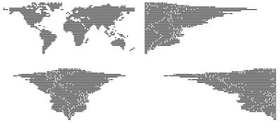
Angela Detanico et Rafael Lain sont des jeunes artistes brésiliens, qui travaillent dans leur pays d’origine et en France. Ils s’intéressent à la cartographie et à la façon dont celle ci se construit et s’organise. "Typography" réunit des cartes artistiques et celle ci s’intitule "The World, Justified"
Elle montre le monde "justifié" au sens bureautique du terme...Certains se trouvent à gauche, d’autres à droite mais tous sont alignés sur des marges allant de la droite vers la gauche.
On peut donc se questionner sur la possibilité que le monde dans lequel nous vivons n’est ni de gauche, ni de droite, ni de centre, mais tout simplement « justifié ».
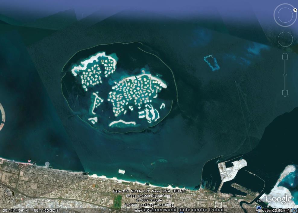
Cette photo-satellite issue de Google-earth représente "The World" qui est un archipel d’îles artificielles situé au large de l’Émirats-Arabes-Unis de Dubaï (golfe Persique). A termes, cet archipel représentera une planisphère où figureront tous les plus grands pays du monde.
Ce "très ambitieux projet architectural" rassemblera plus de 250 îles privées principalement allouées au tourisme. Les plus grandes fortunes du monde pourront s’offrir une île pour la modique somme de 10 millions de dollars pour les plus petites à 45 millions pour les mieux loties. Les travaux, toujours en cours, ont débuté en 2003 et devaient se stopper initialement en 2008. Il faut savoir que pour réaliser de tels édifices, une main d’œuvre, principalement d’origine étrangère travaille de manière continue, 24heure/24 et 7jours/7 dans une grande précarité.
Si vous voulez néanmoins acquérir une de ces îles, vous pouvez consulter ici le très noble site officiel.
unsiteblanc.com est la base de données du travail de l’Atelier de Géographie Parallèle (AGP) sur les zones blanches des cartes, travail développé à partir d’“Un livre blanc”, un récit de Philippe Vasset paru chez Fayard en septembre 2007. Philippe Vasset a co-fondé l’AGP avec les plasticiens, Xavier Courteix et Xavier Bismuth. Le groupe signe toute ses réalisations collectivement.
unsiteblanc.com agrège toutes les tentatives de représentations de ce qui apparaît sur les points aveugles de la carte 2314 OT de l’Institut Géographique National. Ces représentations peuvent prendre la forme de photographies, de récit, de vidéos ou bien d’esquisses réalisées en marchant sur une zone blanches avec un GPS puis en projetant la trace obtenue sur un support.
40 more maps that explain the world
Maps seemed to be everywhere in 2013, a trend I like to think we encouraged along with August’s 40 maps that explain the world. Maps can be a remarkably powerful tool for understanding the world and how it works, but they show only what you ask them to. You might consider this, then, a collection of maps meant to inspire your inner map nerd. I’ve searched far and wide for maps that can reveal and surprise and inform in ways that the daily headlines might not, with a careful eye for sourcing and detail. I’ve included a link for more information on just about every one. Enjoy.
http://www.washingtonpost.com/blogs/worldviews/wp/2014/01/13/40-more-maps-that-explain-the-world/

« 4816 is about finding the minute points on the GPS grid in the urban area of Vienna.
The point N 48° 11,000´ E 16° 19,000´ is an example of these 185 intersections
of latitudinal and longitudinal minutes within Vienna. The intercept points are about
1.9 km apart on the north-south axis and about 1.25 km apart on the east-west axis.
The goal with 4816 is to find those intercepts with the support of the GPS tool and
document them photographically. At each intercept point a photo is taken in each
compass direction.
By traversing the GPS intercept points you take a journey through Vienna. The goal is
known. But what will be the nature of its environment? Will it be approachable? What
will be the special thing about it? It will be a interesting process to observe how
long it will take untill all 4816-points are found. A significant number of points
will be in buildings. A few will be in the middle of the Danube. These are two of the
difficulties we have encountered. It remains to be seen which ones await us.»
A concept, a sign system and an order of knowledge established at the centres of power
«When I speak of geography I do not mean the materials we all studied at
school about land masses and cloud formations and climactic zones and
flora and fauna. Nor am I speaking about demographics and national
formations and geo-political resources. Instead I am contemplating the
possibility of rethinking the relations between subjects and places way
from the organising principles of the law; the law of the state that
controls privileged inclusions and desperate exclusions, or the cultural
law of naturalised and essentialised heritages that assume that a place
called France for example , is inhabited by French people who share a
language, a historical culture, a shared set of assumptions and attitudes.
What if a large part of the population is Francophone by coercion, if its
lives out its life in France, in French but also in resistance and in
resentment, if its complex allegiances are elsewhere and its presence in
France is a legacy of colonial histories and of contemporary economic
imperatives. - Could the map of that internally split entity still be
called by the overly simple term of ’France’, still be coloured a uniform
pink or yellow of whatever colour it is the atlas, a colour that would
over-ride all of the contradictory internal differences of which it is
made up?
To speak of Geography in relation to issues of cultural difference, is to
steer clear of identity politics, to navigate away from the internal
coherence of groups with an already established identity ’in common’. In
this form of politics known as identity politics the preoccupation is to
populate existing models of knowledge with a broader range of subjects. It
is to bring difference, whether sexual or cultural, into the existing
paradigms and expand their populations. For me, a far more important
project is to try and actually think difference; different modes of
knowing rather than different subjects within known modes. Geography thus
is a way of speaking cultural difference, a way of acknowledging that all
difference is always epistemologically embedded and subject to regimes
rather than simply subjugated to dominant powers.
It is made manifest in
the world through sign systems that include cartography, border marking,
landscape stereotypes, national cultures and many others. The
intersections between ’geographies’ as articulated through sign systems
and arts practices circulating as visual culture who might just have some
chance of rewriting these systems, is the heart of the subject I am trying
to produce here.
Geography is at one and the same time a concept, a sign system and an
order of knowledge established at the centres of power. By introducing
questions of critical epistemology, subjectivity and spectatorship into
the arena of geography we shift the interrogation from the centres of
power and knowledge and naming to the margins, to the site at which new
and multi dimensional knowledge and identities are constantly in the
process of being formed.»
Quote from Engendering Terror by Irit Rogoff.
A propos de cartographie subjective
Depuis quelques années, la cartographie s’est installée à Bruxelles comme un domaine particulier d’intérêts et d ’études pour certains collectifs et associations. A coté de la cartographie officielle, la cartographie dite subjective a ainsi été considérée comme un outil de prise de connaissance voire de résistance, de certains territoires.
L’expérience bruxelloise dans ce domaine a débuté en mars 2004 à l’occasion des ateliers MapRac organisés dans le grand restaurant de la cité Administrative. A travers un travail collectif sous forme d’ateliers, il s’agissait alors suivant les termes des organisateurs "d’aboutir à un document graphique permettant à la fois de synthétiser la situation de la cité Administrative actuellement et de proposer une série de pistes d’utilisation à courts et à longs termes".
A coté des dimensions spécifiquement spatiales, géographiques et urbanistiques, la cartographie subjective peut aussi revêtir une dimension fortement politique. C’est à celle-ci que nous convie l’écrivain Philippe Vasset dans son dernier livre " Un livre blanc-récit avec carte". Intrigué par la cinquantaine de zones blanches figurant sur la carte IGN qui couvre l’Ile de France, l’écrivain est parti tel un explorateur voir se qui se cachait derrière ces zones non-décrites par la cartographie officielle. Au-delà du décor post-industriel et des chemins cachés qui y mènent, le lecteur est amené à suivre le narrateur dans le côtoiement avec une réalité qui se cache ou qui volontairement est cachée. Derrière les barrières, l’auteur découvre une réalité en marge de la ville et par extension en marge de la société : bidonvilles, friches, terrains vagues accueillent des populations invisibles et nomades qui peuplent ces lieux improbables. Au fur et à mesure de ces explorations hebdomadaires, l’écrivain décrit des zones mouvantes qui sont provisoirement laissées à l’écart des projets officiels d’aménagement et sont appropriées par des populations reléguées par l’économie de la globalisation.
L’écriture du livre est dépouillée et épouse au plus près les environnements qui sont décrits. Le livre constitue ainsi une intéressante réflexion sur la question de la représentation ou plutôt sur l’impossibilité de représenter certaines réalités complexes du territoire. Il est également une réflexion critique sur la réalité de l’économie de la globalisation qui produit une géographie de territoires homogènes, proche et lointaine à la fois : " les mégalopoles s’indifférencient sur leurs marges, et leurs zones blanches sont les avant-postes de cette transformation, les points par où Paris, Lagos et Rio, communiquent comme les bassins d’une écluse. Un double mouvement rapproche les grands centres urbains, à l’internationale grossièrement mise en scène des sièges sociaux et des salons VIP répond celle des terrains vagues et des bidonvilles, zones poreuses reliées entre elles par un réseaux de correspondance fines comme des vaisseaux capillaires et qui peuvent permettre de voyager sans bouger".
Benoît Moritz
"Un livre Blanc", Philippe Vasset, Editions Fayard, 136 pages
Publié par "Bruxelles en Mouvements" numéro 205, 30 mai 2008

All streets: all of the streets in the lower 48 United States: an image of 26 million individual road segments. The last work of Ben Fry.
«The data in this piece comes from the U.S. Census Bureau’s TIGER/Line data files. The data is first parsed and filtered (to remove non-street features) using Perl. Next, using Processing, the latitude and longitude coordinates are transformed using an Albers equal-area conic projection (which gives it that curvy surface-of-the-Earth look that we’re used to), and then plotted to an enormous image that’s saved to the disk. »
Read more here for technical details and here to zoom in the project.

On theweblog of Yolande Harris, you will find the details of her project Satellite Sounders, which «maps» satellites positions into audio.
Here is a note she wrote to explain her ideas on mapping
by "mapping" i refer to decisions of how to transform data into soundthis is a relatively simple example:
GPS data is limited in its ranges and frequency of change
the sound is limited by the computing power of the small devicei need identify the prominent characteristics of movement and change in the data and map this to suitable changes in audio. but to do this I need to have an idea of the density of the soundfield I will make, how perceivable changes in data will be, how the characteristics of movement will be traceable in the final sound.
the data has specific numerical ranges and limits. the sound is only limited by human hearing range and distortion of the audio signal. so choices have to be made at the specific level of numerical transformations into audio processes and the final audible result will be particular to those choices.
the sonification of data implies an obligation to choose sounds, and engage in the sonic as composition and as a field of emotive potential to the listener, basically pure sound overlayed or underlayed with patterns of meaning that may or may not be apparent in the audible experience.
An-atlas of Radical Cartography
An Atlas of Radical Cartography pairs artists, architects, designers, and collectives with writers to explore the map’s role as political agent. These 10 mapping projects and critical essays take on social and political issues from globalization to garbage.
Art et GPS, pas incompatibles,...
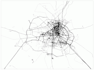
Daniel Belasco Rogers, Berlin drawing 2003 - 2007
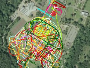
Jeremy Wood, ACS Cobham International School, 2008
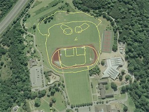
Jeremy Wood, ACS Cobham International School, 2008
Le GPS s’est installé dans notre quotidien comme outil technologique à part entière. L’Art s’est donc tout naturellement saisi de cette technique qui bouleverse notre conception du paysage, en voici la preuve.
D’autres points de vue sur l’Observatoire des nouveaux médias.
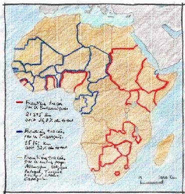
Philippe Rekacewicz, coordinateur de l’Atlas environnement du MONDE diplomatique nous présente son travail de cartographe-géographe. Il nous raconte comment il se retrouve au croisement de plusieurs disciplines. Et le rôle engagé du créateur de cartes géographiques.
Etyc : Bonjour Philippe Rekacewicz. Le cartographe est-il le dessinateur des réalités du monde ?
Philippe Rekacewicz : On considère à tord les cartographes comme de simples techniciens. Le statut de l’objet technique de la cartographie est ambigu. Dans le MONDE diplomatique de février 2006 je précisais cela. « La carte géographique n’est pas le territoire. Elle est tout au plus une représentation ou une ‘perception’. La carte n’offre aux yeux du public que ce que le cartographe (ou ses commanditaires) veut montrer. » Il n’existe pas de représentations officielles, admises par tous, du découpage politique du monde. La carte est toujours subjective. Et le tracé des frontières est la partie la plus délicate du métier. Doit-on mettre une frontière entre le Maroc et le Sahara occidental ? Les frontières africaines correspondent-elles à la réalité ?
Etyc : Le cartographe n’est donc pas un simple exécutant, c’est un individu engagé.
Philippe Rekacewicz : La cartographie au Monde diplomatique est différente d’avec la presse générale. Ici, nous avons voulu hisser la cartographie au rang éditorial. Elle joue un rôle d’information, avec les intentions politiques que cela peut comporter. Le cartographe contemporain utilise les bases de la cartographie et les mêle à un vrai travail de recherche, un fil directeur, pour exprimer des idées. Le public a un accès plus direct à la carte qu’au texte. Pour cela elle doit être brutale, expressive. Et refléter les intentions de son créateur.
Etyc : La cartographie est donc un art…
Philippe Rekacewicz : La carte vend du spectaculaire, du dramatique… Il y a une recherche de design graphique. Les couleurs, les mouvements des flèches, les formes font parler la carte. C’est le rouge pour les méchants, le bleu pour les gentils. La cartographie se trouve entre l’application et la recherche. On recherche de nouvelles formes de représentations visuelles en fonction de notre fil de pensée, des sentiments que l’on veut exprimer. Le cartographe doit être iconoclaste.
Etyc : Tout cette recherche explique les 13 mois de travail pour la réalisation de l’Atlas environnement. Mais ça reste court pour tout inventer. Quelles sources sont assez fiables finalement ?
Philippe Rekacewicz : « Chacun a sa vérité et ses arguments, mais il n’existe ni ‘règles’ ni ‘autorité’ délivrant des solutions faciles. » L’ONU « reste l’institution la plus légitime pour proposer des solutions équitables ».
Il y a deux types de données dans la cartographie : les données qualitatives et quantitatives.
On ne peut pas tout vérifier sur le terrain. Il faut donc sélectionner des sources de confiance.
Nous utilisons plusieurs types de sources :
* Les institutions internationales, nationales et ONG qui font des tableaux de données. Ce sont des informations de 1ère main ½. Eux sont sur le terrain.
* Les réseaux d’informateurs : chercheurs au CNRS, enseignants… qui nous donnent des données qualitatives.
* Nos propres informateurs sur le terrain qui nous proposent de l’inédit, résultat d’investigations.
Dans un atlas comme celui-ci il y a 50% d’utilisation du patrimoine, retravaillé. Il y a aussi 50% de création. Une création qui peut être parfois le résultat d’une réflexion sur du long terme. Il m’arrive de reprendre des séries d’esquisses inutilisées.
Le plus attrayant reste tout de même d’aller sur le terrain.
Propos recueillis par Jennifer Szwarc
* Pour en savoir plus : Lire l’article de Philippe Rekacewicz « La cartographie, entre science, art et manipulation », paru dans Le MONDE diplomatique de février 2006.
http://www.monde-diplomatique.fr/cartes/manipulation
Dans le cadre de IBAI#3 19/04/2007 par CONSTANT vzw : Un exercice d’exploitation des imperfections et des interstices qui se glissent dans les jointures, les angles morts et le gavage de données des logiciels de navigation, des plannificateurs d’itinéraires et de la cartographie par satellite. Peut-on disparaître derrière une présence excessive ? Devenir introuvable justement parce que nous sommes localisables ? Peut-on cartographier à raz de terre ?
Mots-clé :
Track, hotspots, surveillance, gps, camouflage, MIVB.be, Google Earth, Open Streetmap, …………
Tout est là :
sur le Wiki
et là : sur le blog de IBAI
2 interesting books about art/ cartography/ subjectivity
GNS - an exhibition in "Palais de Tokyo" site de création contemporaine /édition cercle d’art - september 2003
editorial managment : Nicolas Bourriaud and Vincent Honoré
artists : Franz ackermann - Bureau d’études - Nathan Carter - Wim delvoy - Dominique gonzalez-Foerster - Thomas Hirschhorn - Laura Horelli - Pierre Huyghe - Pierre Joseph - Jakob Kolding- Mathieu Laurette - Mark Lombardi - John Menick - Julie Meheretu - Aleksandra Mir - Ocean Earth - Henrik Olesen - Kristen Pieroth - Marjetica Potrc - Matthew Ritchie - Pia Rönicke - Sean Snyder - Stalker - Simon Starling
isbn : 2 70022 0699 9
Le dessus des cartes - art contemporain et cartographie - an exhibition in ISELP - juni 2004
artists : Gianni Caravaggio - Jocelyne Coster - Wim delvoye - Erick Derac - Roger Dewint - Peter Fend - Christophe Fink - Changha Hwang - Marie Christine Katz - William Kentridge - Moshekwa Langa - Capucine levie - Matéo maté - Michel Mineur - David Renaud - Françoise Schein - Panagiotis Siatidis - Therry Tillier - jessica Vaturi - Angel Vergera
isbn : 2-87373-0141-0
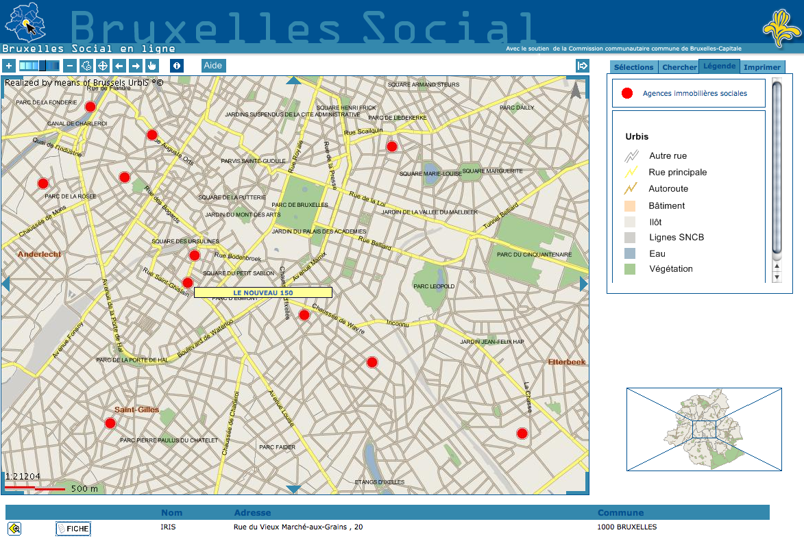
Le site Bruxelles Social offre la visualisation sur cartes de nombre d’acteurs sociaux à Bruxelles, avec une base de données très riche allant des structures d’hébergement jusqu’au agences de logements par exemple. Basé sur Urbis et développé par le CIRB, la navigation requiert -pour l’instant- l’utilisation de trois fenêtres : requête, carte et fiche détaillée.

Post boxes are a familiar repetitive phenomenon in the urban landscape. Even when postoffices become privatized and disappear, these boxes remain firmly planted in the urban soil. Busboîtescartesmaps invites us to validate these entities as more than just utilitarian tools. Drifting from one box to another, the walks propose to climb them, to explore their musical qualities, to listen to the stories that echo from their interiors. Among other things the walks contribute to a collective mapping in which the trace of one walk echoes the existence of other walks. You can participate in the walks starting from Recyclart, where also the communal map can be consulted, and also the Atlas of subjective and collaborative maps of Brussels.
Postbussen zijn een bekend wederkerig aspect van het urbane lanschap. Zelfs nu posterijen en agentschappen geprivatiseerd worden en langzamerhand steeds meer verdwijnen, blijven de bussen ferm gewordteld in de stadse aarde.
Busboîtescartesmaps nodigt ons uit om de bussen te herwaarderen als meer dan enkel nuttige gereedschappen. De wandelingen onderzoeken de bussen als potentiele muziekinstrumenten, als stadselementen die beklommen,kunnen worden en als dragers van verhalen en herinneringen. De wandelingen dragen bij aan een collectieve audio-mapping die de verschillende onderwerpen van de wanddelingen met elkaar verbindt. Je kunt meewandelen vanaf Recyclart, waar ook de gemeenschappelijke kaart kan worden bekeken / beluisterd, samen met de Atlas van subjectieve kaarten van Brussel.
Les boîtes postales implantées dans le paysage bruxellois sont des points de repère familiers. Si les bureaux de poste disparaissent graduellement avec la privatisation, les boîtes, elles, résistent et jalonnent le territoire. Busboîtescartesmaps est une invitation à prendre ces boîtes pour plus que de simples conteneurs utiles. En dérivant de l’une à l’autre, les différentes ballades proposées en feront des montagnes à escalader, des instruments sonores ou des antennes déclencheuses d’histoires et de narrations. Ces ballades feront en outre l’objet d’une mise en carte commune où chaque trajet pourra faire écho à un autre. On pourra participer à cette cartographie en partant de Recyclart, qui abritera aussi la carte commune ainsi qu’un espace de consultation dédié à un Atlas des cartes subjectives et collaboratives de Bruxelles.
Found on the TechOn website, Hitachi’s Sensor Depicts Human Relationships as Topographical Map, an article by Shinya Saeki, Nikkei Electronics.

A name-tag-shaped sensor network terminal measures the time used for face-to-face communication among the members of the organization and their activities. And it functions as an inflated radiation sensor, a triaxial acceleration sensor, a sound sensor and a radio communication device.The massive data collected by the sensor network terminal are signal-processed by the server and displayed as a "topographical map of the organization."

Which means:
Every employee of the company wears a badge with its name. The badge contains a chip that gives a handful of information about where s/he is and what s/he does. The software produces a set of statistics that give a precise picture of the employee’s moves, who s/he meets, how long, who s/he avoids, etc.
Therefore:
The system can be used to clarify the problems within an organization and, thus, reduce the risk in organizational operation, in addition to the improvement of productivity, by quantitatively showing the strength of the relationships among the members of the organization, according to the company.
By way of contrast to utopias, heterotopias
Some fragments, in French and English, of Foucault’s thoughts on Heterotopias.
« On ne vit pas dans un espace neutre, blanc. On ne vit pas, on ne meurt pas, on n’aime pas dans le rectangle d’une feuille de papier...
Il est bien probable que chaque groupe humain, quel qu’il soit, découpe dans l’espace qu’il occupe, où il vit réellement, où il travaille, des lieux utopiques. Il y a parmi tous ces lieux qui se distinguent les uns des autres, il y en a qui sont, en quelque sorte absolument différents. Des lieux qui s’opposent à tous les autres, qui sont destinés à les effacer, à les compenser, à les neutraliser ou à les purifier. Ce sont en quelque sorte des "contre - espaces". Ces "contre - espaces", ces utopies localisées, les enfants les connaissent bien. Bien sûr, c’est le fond du jardin, c’est le grenier, ou mieux encore : c’est la tente d’indien dressée au milieu du grenier...
La société adulte a organisé elle-même, et bien avant les enfants, ses propres "contre - espaces", ces utopies situées, ces lieux réels hors de tous les lieux. Par exemple : il y a les jardins, les cimetières, il y a les asiles, les maisons closes, les villages du Club Méditerranée et bien d’autres... En général, les hétérotopies ont pour règle de juxtaposer en un lieu réel plusieurs espaces (réels ou imaginaires) qui normalement seraient ou devraient être incompatibles... Les hétérotopies sont ces espaces différents, ces autres lieux, ces contestations mythiques et réelles de l’espace où nous vivons. »
« There are also, probably in every culture, in every civilization, real places - places that do exist and that are formed in the very founding of society - which are something like counter-sites, a kind of effectively enacted utopia in which the real sites, all the other real sites that can be found within the culture, are simultaneously represented, contested, and inverted. Places of this kind are outside of all places, even though it may be possible to indicate their location in reality. Because these places are absolutely different from all the sites that they reflect and speak about, I shall call them, by way of contrast to utopias, heterotopias. »
[...]
« The heterotopia is capable of juxtaposing in a single real place several spaces, several sites that are in themselves incompatible. Thus it is that the theater brings onto the rectangle of the stage, one after the other, a whole series of places that are foreign to one another ; thus it is that the cinema is a very odd rectangular room, at the end of which, on a two-dimensional screen, one sees the projection of a three-dimensional space, but perhaps the oldest example of these heterotopias that take the form of contradictory sites is the garden. We must not forget that in the Orient the garden, an astonishing creation that is now a thousand years old, had very deep and seemingly superimposed meanings. The traditional garden of the Persians was a sacred space that was supposed to bring together inside its rectangle four parts representing the four parts of the world, with a space still more sacred than the others that were like an umbilicus, the navel of the world at its center (the basin and water fountain were there) ; and all the vegetation of the garden was supposed to come together in this space, in this sort of microcosm. As for carpets, they were originally reproductions of gardens (the garden is a rug onto which the whole world comes to enact its symbolic perfection, and the rug is a sort of garden that can move across space). The garden is the smallest parcel of the world and then it is the totality of the world. The garden has been a sort of happy, universalizing heterotopia since the beginnings of antiquity (our modern zoological gardens spring from that source). »
From Michel Foucault Of Other Spaces (1967), Heterotopias.
Lire en français, Des espaces autres (1967)
Cabspotting traces San Francisco’s taxi cabs as they travel throughout the Bay Area. The patterns traced by each cab create a living and always-changing map of city life. This map hints at economic, social, and cultural trends that are otherwise invisible. The Exploratorium has invited artists and researchers to use this information to reveal these “Invisible Dynamics.”

The core of this project is the Cab Tracker. The Tracker averages the last four hours of cab routes into a ghostly image, and then draws the routes of ten in-progress cab rides over it.
The Time Lapse area of the project reveals time-varying patterns such as rush hour, traffic jams, holidays and unusual events. New projects are produced by the Exploratorium’s visiting artists and also created by the larger Cabspotting community.
Sources : cabspotting.org

Blast Theory est un collectif de chercheurs s’intéressant à l’art et aux frontières délicates existantes entre les réalités physiques et numériques.
"Can You See Me Know" fut lauréat en 2003 du Golden Nica au festival Ars Electronica, à Linz en Autriche, dans la catégorie “interactive art”. Depuis cette nouvelle façon de "jouer la ville" ne cesse de voyager à travers le monde : Sheffield (2001), Rotterdam (2003), Tokyo (2005), et plus récemment Amsterdam (septembre 2007).
Le jeu se déroule parallèlement en ligne et dans les rues d’une ville. Des joueurs disposant d’une connexion à Internet peuvent participer en ligne, où qu’ils se trouvent, et jouer contre des membres de Blast Theory. “Trackés” (poursuivis) par satellite, ces membres apparaissent en ligne sur une carte de la ville, dans laquelle figurent également les joueurs en ligne. S’en suit un jeu du chat et de la souris, du gendarme et du voleurs, du gentil et du méchant aux règles extrêmement simples qui a pu perdurer dans le temps de par son efficacité. (Pour plus de détail, voir le site)
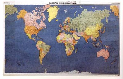
“Carte Du Monde Utopique“ Marcel Broodthaers (1968)
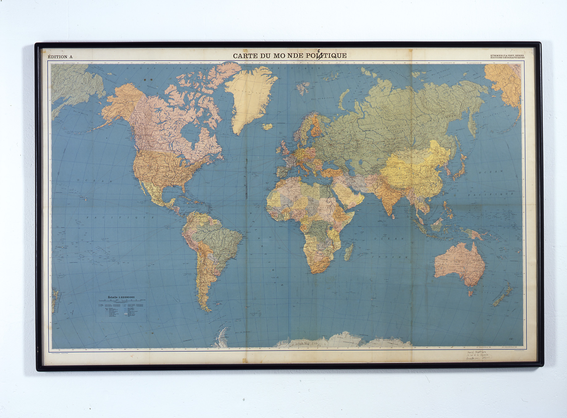
"Carte du monde poétique", Marcel Broodthaers (1968)
La cartographie est utilisée par de nombreux artistes pour créer des œuvres d’art : t : cartes Google Maps, cartes en 3D, cartes virtuelles ou cartes d’inspiration académique, tout est prétexte à les déstructurer, à les décomposer, à les broyer pour créer des collages, des objets, des images d’un univers à la fois raisonné et qui semble, de toute part, partir en déliquescence. D’une certaine manière, on avale des kilomètres et du bitume, on se fait des visites de pays entiers, on survole des continents et on revient toujours au même point de départ : moi, moi et encore moi.
http://googlexxl.blogspot.com/2007/10/art-et-cartographie.html
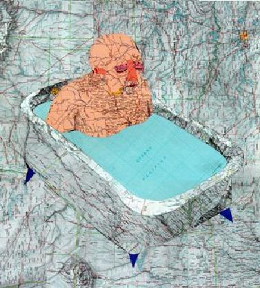
Carto.net, scalable vector graphics
Un pointeur vers un site de cartographes qui s’intéressent aux outils interactifs et particulièrement à l’implémentation du standard SVG (Scalable Vector Graphics). Ils et elles ne se contentent pas d’analyse mais mettent aussi la main à la pâte en réalisant des exemples.

Un extrait:
Un problème souvent évoqué est l’impossibilité de diffuser à l’utilisateur final des représentations graphiques 2D en mode vectoriel. Une telle technique permettrait de développer l’interactivité et des fonctions telles que le zoom et le pan (panoramique). La qualité de reproduction graphique augmenterait également de façon significative. La représentation du texte et de l’image raster est standardisée depuis longtemps. Or les cartographes ont besoin d’un certain nombre de fonctions complémentaires. Certaines ont pu être réalisées au moyen scripts complexes, soit côté serveur soit côté client, mais toujours en utilisant des images raster.
[...]
Le présent article traite d’abord du problème des standards d’Internet, en grande partie responsables du retard de l’application du graphisme vectoriel, suivi par une discussion sur les autres possibilités - dont quelques unes furent disponibles dès 1996 - permettant d’inclure du graphisme vectoriel dans un environnement web. Les exigences techniques requises par le graphisme vectoriel sont expliquées, ainsi les technologies complémentaires les plus importantes. Dans la partie principale, la nouvelle norme SVG est présentée, accompagnée d’une discussion détaillée sur les points concernant plus particulièrement la cartographie. Les exemples sont consultables sur des pages web spécialement réalisées pour les "Kartographischen Nachrichten", ainsi que les codes-source commentés.
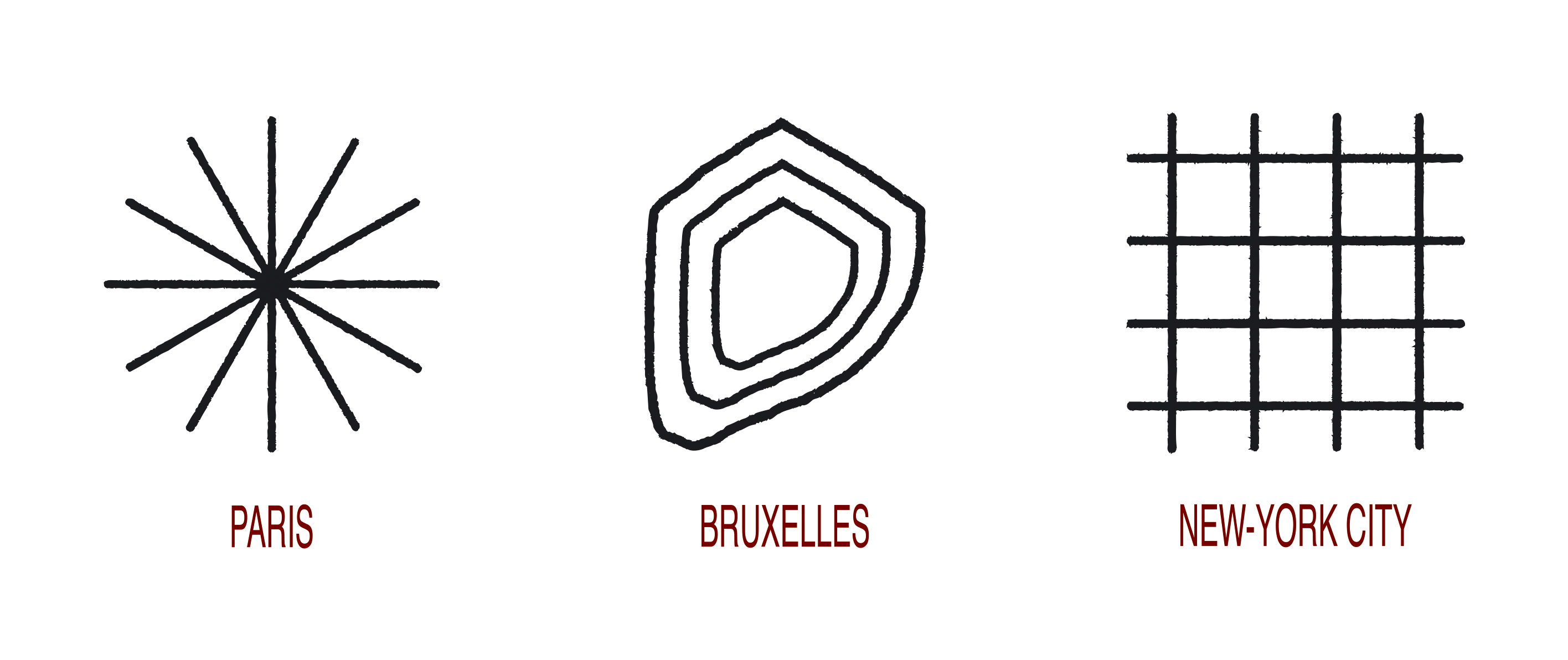
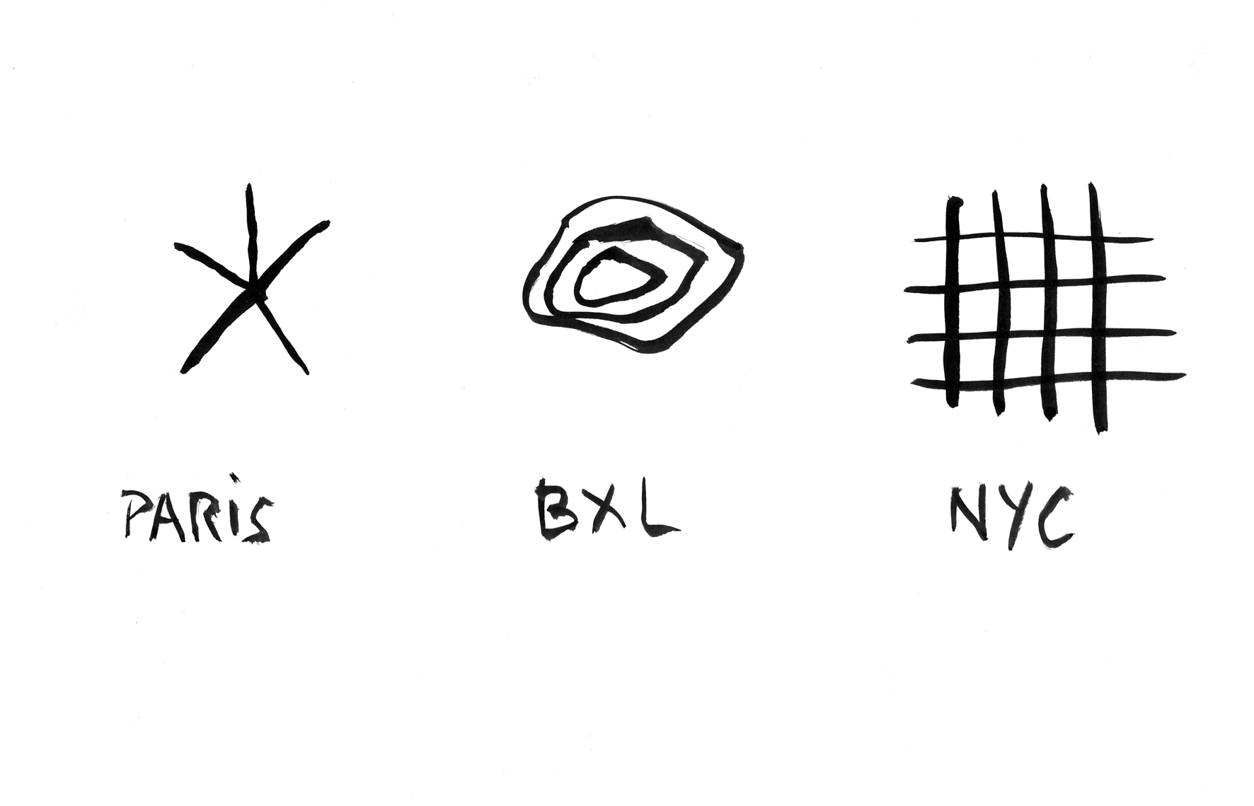
Paris, Bruxelles, New-York, Jérôme Giller, 2004-2005
Traduction graphique de la sensation de l’urbanisme des trois villes.
Cartographie collective et participative de l’Afrique
Cartographie collective et participative de l’Afrique... par des voyageurs... Données mise à disposition gratuitement de la communauté tracks4africa et vendues par ailleurs
Using GPS devices, the Tracks4Africa (T4A) community when touring Africa do meticulous record keeping of their travels. From this huge repository of high quality GPS data we have created a super accurate GPS map called the T4A Map. But the T4A Map is more than that, it is the collective navigational experience of the T4A community over the past 7 years. It shows Africa the way it is and how it is constantly changing. Click here for more informaton about Tracks4Africa’s maps.
Professed by the late Jan Joubert, we believe that conservation of environmental resources depends on access to INFORMATION and for the traveller to be INFORMED. This is the 4th dimension of eco-travel and it is the focus of Tracks4Africa.
We invite everyone with a GPS to join this pan African mapping initiative aimed at creating a popular African GIS culture where everyone can give a contribution towards the re-mapping of Africa ; to contribute by email your GPS track logs, waypoints, photos and INFORMATION which will ensure eco-tourism that is safe and environmentally correct.
Please note that this initiative is not aimed at mapping major urban centres (often for cities very good quality data already exists) but rather to focus on rural and remote Africa. Tracks4Africa also serves to impact positively on the small business initiatives (craft markets and community rest camps) of people in rural and remote parts of Africa.

Cartographie des 200 forums francophones les plus populaires
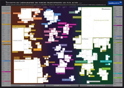
Quels sont les 200 forums les plus populaires sur le web francophone, en 2008 ? Après sa cartographie subjective de la blogosphère, Ouinon répond comme à son habitude par une superbe cartographie, qui figure des données collectées.
Pour constituer cette carte, des milliers de forums francophones visités sur une période de 7 mois et près de 2000 mesurés avec au minimum 7 relevés pour chacun.
Pour résumer, c’est avant tout le nombre de messages par jour qui est pris en compte pour construire cette carte (la taille des « territoires » leur est proportionnelle). Plusieurs chiffres ont ensuite été relevés et utilisés pour fiabiliser au maximum ces données (et les relever à nouveau si besoin), notamment le nombre de visiteurs en ligne à une tranche horaire précise, le nombre de membres, le record de visiteurs en ligne simultanément, la plateforme utilisée ou encore le pays d’origine. Les explications détaillées sur le pourquoi et le comment de cette carte sont disponibles ici : http://www.ouinon.net/documents/pourquoi-comment.pdf
Cartographie des résaux de métros Nord-Américain
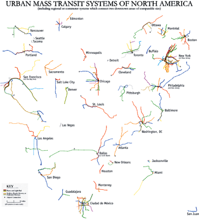
A première vue, ces réseaux de métro des grandes villes Nord-Américaines sont similaires. Mais les changements d’échelles appliqués à la taille des réseaux tronquent la réalité de leur étendues. Encore une fois, l’échelle est l’élément fondamentale de la justesse d’une carte. Ainsi, le système de Los Angeles est comparable à celui de Dallas et ceci par la volonté du cartographe qui décide des éléments qu’il souhaite présenter.
Source : Radical cartography
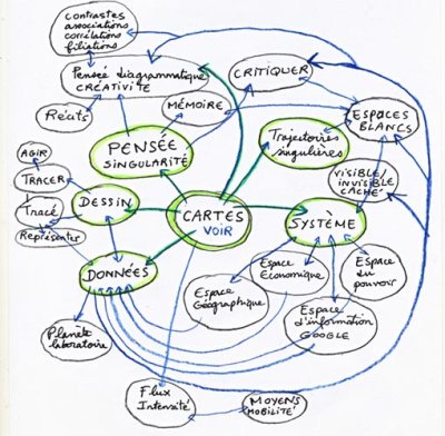
Cette carte réalisée par Dominique Peysson présente le pouvoir de la carte en matière de transmition de l’information. La carte peut apparaitre comme l’outil central capable de retranscrire physiquement une multitude de données diverses et variées (géographiques, économiques, psychologiques, sociologiques,...).
Voir ici les travaux s’intitulant "Battre les cartes, ou la mise en relation de deux territoires" pour de plus amples informations.
Cartographie subjective de Felix Gonzalez Torres
En expo sans doute quelque part à Berlin (merci Benoît)...

Cartography and the Technologies of Location
Suggested by Femke, a text by Graham Harwood that questions maps and software.

« Forgetting the invisible city is a normality for most of us : a common sense that can help amass someone an empire a small business or - as in Bristol - transport people half way around the world against their will. This forgetting offers us a temporary blindness that allows us to go about our daily business, walking past the sick, the homeless or the building built on glories that meant other peoples’ pain. In the same way that we forget the map and remember the journey, we also forget the software that wrote this text. »
(English version)
Mapping in urban design
Part 3/Paper 2
Published in:
Barbara Golicnik Marusic, et al. (edited by), *Human Cities, Celebrating
Public Space*, Brussels: Stichting Kunstboek, Urban Planning Institute of
the Republic of Slovenia and Promateria, 2010 (p. 47-51).
written by Rafaella Houlstan-Hasaerts (La Cambre), Nicolas Malevé (Constant vzw).
WHY?
Cartography and power are closely related: Who controls the map controls the territory, and this is true at several levels. The person who consults it, insofar as he knows how to interpret it, gains the ability to identify his position in space. The person who creates it – who is situated one step above – proposes (or imposes) his vision of the territory, as he perceives it or as he projects it. The person who possesses it, finally, decides how to distribute it and consequently decides to grant or deny others the power he has concerning the territory. In fact, a map is hardly a harmless tool: figurative as well as projective, simulation of space as much as a space for simulation – it is found at the very source of military strategies, mercantile capitalism, territorial divisions, and in the particular case of towns, by and large it has determined what is to be drawn and measured, and consequently, at the end of the day, what is to be built or at least planned. Cartography, formerly reserved strictly to a minority, is now opening up to a broad range of users. With our greater mobility, as neo-nomads in a global world, we use them and find them everywhere in public transport, tour guides, streets, shopping malls and, still more particularly, on our computer screens or our GPS. With Google Earth, Google Maps, Mappy and the other geoportals, the whole world is offered on our computer screens in just a few clicks, free from any constraints with regard to scale and paper.
Pleased as one must be with this “democratization” of access to cartography, there are still some weak points. The first concerns the codes that have been imposed over the centuries in mapmaking that offer a unilateral vision of space. Indeed, today’s complex and shifting territories seem to need representations that go far beyond a simple zenithal perception and conventions that tend to show space exclusively in terms of surface areas. Here is an example that is pertinent today: more than half the world’s population lives in towns and many studies predict that this trend will intensify in decades to come. Consequently, there are serious reasons to think that the 21st century will be more urban than any other. But a “traditional” map essentially emphasizes square metres, showing a majority of huge, relatively unpopulated areas on a worldwide scale (oceans, countryside), and therefore it totally misses the urban phenomenon whose importance is not directly proportional to its size. “Traditional” cartography can also be questioned when it comes to representing contemporary urban living: city limits have become hazy – there are no longer well-defined borders and cities are no longer understood in opposition to nature. They no longer seem to be closed, limited entities – they move, expand, change from day to day, mocking the immobility of a map. In addition, the preeminence of a visual, two-dimensional representation of the city tends to make us forget that it is first and foremost a ’lived-in’ space, and our preception goes beyond that which is visible – a city can also be traveled, heard, felt, imagined. Despites its formidable power of abstraction, the limits of a map as we know it lie in the fact that often it only takes account of geometric, material, incorporated, objectivated or abstract visions of the city, thus ignoring its cultural, sensitive and imaginative dimensions and clouding the scale of the places we live in, the way they interweave and overlap, denying or giving only a normative picture of social reality . Moreover, beyond this questionable hegemony, this characteristic of representation on maps becomes even more problematical when “the people who use them think they are true, although or because they are geometrical” . Indeed, the concept of urban living in general and public space in particular has been (and still is) determined for the most part by official maps, statistics and administrative limits, without taking into account other visions of the city, particularly those of everyone who lives there on a daily basis.
To help improve for this state of affairs, drafting and distributing maps should not be the privilege of some, but the right of everyone. However, tools that enable the community to create and distribute its own maps are still marginal. Of course, many cartographic services present on the Web go beyond simple consultation, and enable users to add to the content of maps and share them with other users. But this broader possibility is still only partial: most of these cartographic softwares are proprietary, their geospatial data are protected, and most of the resulting maps are subject to very strict conditions for use and distribution.
WHO AND WHAT FOR?
For more than three years, a group of people in Brussels has been working on the project Towards a Subjective Collective Cartography . This is an effort to see mapmaking – maps themselves, as well as the process for drafting them and the data associated with them – as a common good, in terms of access to them (universal, rather than restricted), regulation (permissive, rather than restrictive), and ownership (public rather than private). This desire to defend the right of the community to consult, create, publish and exchange maps, as well as to have access to cartographic data, is both poetic and political. Poetic because it responds to the inevitable share of subjectivity in an approach to the territory and considers that multiple cartographic visions are as many possible metaphors of the world we live in. Political because it gives users the power to think individually or collectively about the territory and perhaps to influence its future. In the past, urban action could take place without or even counter to many users of the city, or occasionally with them, in a sort of concession won over from the authorities or generously consented by them, but things should be very different today. In fact, the way people feel about and perceive a city– and a map can be used to represent this – should be the keystone of the democratic decision making process concerning the territory in general and public space in particular.
Given these observations and objectives, the Towards project focuses on creating two different tools that are nevertheless complementary: an Atlas of Brussels on one hand that includes the various maps of the city (imaginary, anecdotal, emotional, etc.) and, on the other, a cartographic software project – Tresor – that will make it possible to create maps, consult them, compare them, adjust the parameters that define them, complete them, publish them or use them as part of personal or collective projects. Over the last three years, various workshops have been organized in collaboration with artists, militants, urban planners, architects, graphic artists, computer programmers etc. to set up these tools.
HOW DOES IT WORK?
Today, this Atlas of Brussels includes some 50 maps made by artists, militants, people working in associative or academic circles, citizens, etc. These maps can be consulted on-line on the Website of the project. In the long run, the idea is to enable the user of the Tresor cartographic software project to go, not from one image to another, but from one dynamic vision to another, by circulating the metadata (descriptions, comments, and names) from one map to another. The outcome should be an atlas of the city of Brussels that is like a labyrinth full of secret passages, a group of maps based on principles stemming from both geometry and imagination.
And how does Tresor work? It doesn’t work, it puts to work. During the workshops, participants asked themselves what cartographic software might include. Is it an interface with buttons, that produces manipulation of symbols? Or is it something broader, encompassing a different way of going about things, negotiating with others, and another way of thinking about what using a computer could be? So when a group of people starts thinking, writing and talking about what this software might be, the software is already at work – the software puts the group to work. Of course, there is still a long way to go to reach something that can be used as a tool, but what is gained by using a readymade tool? Would that be user-friendly or rather… user-deadly? The options in prefab softwares reproduce separations that are meaningless for users, particularly for the users who took part in the cartographic workshops. For example, these tools separate artistic and technical functions, “real” geography and drawing. Cartographic software no doubt allows a change in colours and icons here and there, but the organizational graphic principle is always the same, and this is of little interest, for example, to people who want to represent their neighbourhood in the form of a galaxy with planets and their relations in the form of a trail in the Milky Way. If they want to represent this map in an imaginary form, they have to use graphic software, meaning that they lose any connection with geography. If, on the contrary, they use a GIS, they will have to give up their imagination. Tresor is the tool that refuses this segregation. There are no acceptable reasons for this division that springs from segmentation of the market and division of tasks in the economy – and there is nothing to prevent developing this kind of tool. Nothing? Of course there is. The fact that the people who are actually involved have interiorized this division themselves: I am an artist, so I draw; I am a map maker, so I measure things. The first effect of Tresor, before a single line of code was written, was to break down mental barriers that had been internalized by participants.
In the second stage, the participants wondered about the possibilities for developing a tool that corresponds to the concept of “common good” in terms of accessibility, regulation and ownership. These questions naturally led to the conclusion that the components of Tresor should be distributed in keeping with the principles governing free licences. In fact, in the case of a free licence, the authors of a software or a visual or literary work authorize anyone to use their creations, to modify and distribute them, but with the restriction that they cite their sources and the previous authors, and they redistribute their own derivative works using that same licence, under the same conditions. These free licences are more than just a simple, pragmatic solution used here and there. They are also rather like an internal constitution for joint projects that tries to ensure that public goods stays public. The use of this type of licence is important at two levels for Tresor. First, it simplifies exchanges between various users when producing maps: everyone has the right to re-use, modify, comment everyone else’s creations and to produce other versions of these maps. Secondly, all the people who feel an affinity to this tool can correct it, improve it, test it, document it, translate it, etc.
In the third stage, participants realized that there was already a whole series of isolated free software programs (for example softwares that can connect GIS databases, vector graphics software, etc.) that could offer many possibilities for mapmaking when put together in a network. The result is that Tresor is not a software program as such, but a whole series of paths between existing free software programs, and a link for programs that do not communicate with each other. By means of a series of scripts, user strategies, plug-ins and add-ons, these existing software programs are incorporated into Tresor as the need arises. Each mapmaking project corresponds to a documented experiment, a published code and tested tools that fill the toolbox little by little. In this project, the first lines of code that were written created a connection between Inkscape , an open source program for vector graphics and Mapserver , a web-based map server, or Spip , a software for publishing articles on the web to create a timeline. More ambitious projects followed, such as Genderartnet , a map of female artists who are working in Europe or using Europe as a subject, and Busboitescartesmap (BBCM), a sound map exploring the city of Brussels.
This last project gives an idea of the way the tool and the practices can be used together to explore and represent the territory in a different way. This project proceeds by means of sessions. A series of places are chosen for each session. These places correspond to mail boxes in the city centre. They offer a large diversity of environments: they are near schools, near major roads, in alleys, parks, etc. A group of participants goes to the city centre with a sound recorder and a GPS and visit the places that have been chosen. The clocks on the GPS and the recorder are synchronized. When the participants get back, a software program in the Tresor toolbox extracts the audio segments corresponding to the location of the mail boxes by comparing the time codes on the two appliances. These audio tracks are then plotted on an interactive map so that people can listen to the cacophony of all the sounds recorded or choose only the sounds recorded in a specific place, and listen to one sample after another, or to the overall atmosphere of a location at different times of day. As the participants are encouraged to vary the context of the place they record (they can drum on the mail boxes, or use them like an echo chamber; they can play with the sounds in the vicinity, or describe the environment or simply talk to each other), the sounds produced disclose new characteristics of urban space and invite everyone to continue his/her exploration of the town.
AND TOMORROW?
These first experiments using Tresor, done within Towards or in another context, show that this type of tools that adjusts to the users’ needs rather than formatting them, can be truly useful to produce new and multifaceted representations of the territory. The next step will be to distribute it to a broader audience so that, insofar as possible and necessary, it helps generate real transformation.
But this process will no doubt be complex because each step forward comes with its own obstacles and questions. One of the constraints that continues to weigh on the development of Tresor is of course economic. Because of its hybrid nature, this is a UFO for many sources of finance. In addition, the methodology for developing specifications does not correspond to the usual procedures for software development. By and large, a certain number of people define the specifications that are then frozen and can be implemented by experts. In the case of a project like Tresor, it is hard to imagine freezing specifications of a project whose purpose is to define a subjective approach to mapmaking. Consequently, the organizational development is decentralized and slow. Another problem is of a legal nature and it derives from the fact that the data that make up geographic maps (geolocation coordinates, points and shapes, etc.) are most of the time in Europe subject to the ownership of states or corporations. A way to circumvent this problem is to collect oneself the necessary data, with a GPS for instance. The project OpenStreetMap , that Tresor uses regularly as a source of data and to which it also contributes, offers an infrastructure to share the GPS traces collected. But even there, the legal question still causes problem. Indeed geographical data do not fall under the scope of free licences that protect “original” creations, like a literary work, but not collective “objective” information like coordinates. After a few years of existence, participants in OSM realized that the licence under which they distributed the data included in maps was not valid in court. During a several month process, the OSM foundation that facilitates the operations of the project organized a consultation with participants and voluntary legal specialists who promote the cause. The objective was to redefine a contractual logic to be sure that anyone can use the OSM data with no problem, but that he is also required to add any modifications he has made to the OSM database, if he has made corrections or additions. It was interesting to observe the way participants convinced each other, in on-line and off-line discussions, of the importance of protecting the open source, how they showed each other the importance of preventing distortion of their common effort, while remaining open, and how they accepted to contractualize their participation a bit more in order to safeguard the meaning of their participation. This type of discussion again shows that anything that is considered public is constantly undergoing re-negotiation.
A workshop organised in the framework of the PEPRAV network
Making maps... Quite a few of us are busy in a way or another with making maps. Be it to develop subjective visions of the city, to assert political positions or to archive projects. We thought it would be interesting to take some time to work together and see how we could exchange from our different perspectives with map making and map reading.

This worksession is a moment in time used to make the first practical steps to design the Tresor software, a tool for collective subjective cartography.
Un événement organisé dans le cadre du réseau PEPRAV
Faire des cartes... Nous sommes plus d’un/e à nous y intéresser. Que ce soit pour développer des visions subjectives de la ville, pour affirmer une position politique ou pour archiver des projets. Nous pensons qu’il serait bon de prendre un peu de temps pour travailler ensemble et de voir si on peut échanger des idées et des pratiques depuis nos différentes approches de la cartographie et de la lecture que nous faisons des cartes.
Cartography workshop #2 + EuroMaps
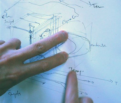
Together, Recyclart , Citymined , Constant organise a worksession in the
Culture 2000 framework of the PEPRAV network, with the collaboration of theK.V.S.. The participants are invited to collaborate on ongoing cartographies, to assist to small presentations and demos, to think about the language of visual interfaces for geographical representations or to help develop a software component that will bridge inkscape, the free vector drawing programme, to a spatial
database. Read more (en français , in het nederlands)
On Friday 06/07/07, Euromaps, an evening of lectures on Post/colonial
mappings curated by Jochen Becker. Read more (en français , in het nederlands)
Cherry Blossoms- When war comes home
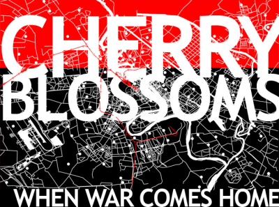
Le projet Cherry Blossoms (2007) d’Alyssa Wright témoigne, avec le projet « Dead in Irak » de Joseph Delappe, d’un certain activisme outre-atlantique consistant à déplacer le monde de la guerre là où on ne l’attend pas, en faisant entrer en collision le quotidien des civils irakien vivant à Bagdad avec l’univers du promeneur dans la ville de Boston, aux Etats-Unis, pour le premier, et avec l’univers des jeux vidéos pour le second.
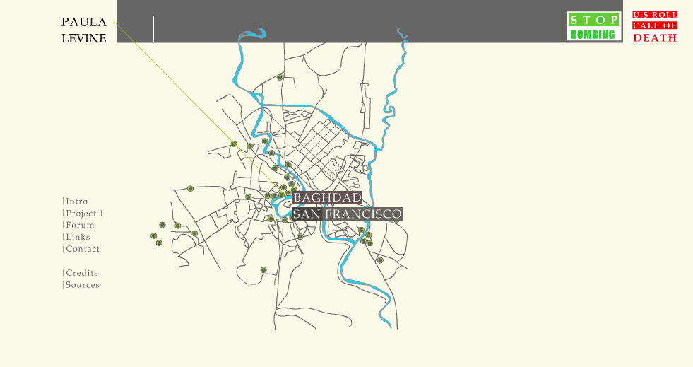
S’inspirant d’un mashup cartographique de l’artiste Paula Levine (Illustration 2) superposant la carte de Bagdad à celle de San Francisco - et qui n’est pas sans rappeler certaines expériences de dérives situationnistes - Alissa Wright amplifie l’impact du rapprochement des réalités irakiennes et américaines en inscrivant, à Boston, des événements - explosion d’un sac à dos rempli de confettis quand le marcheur rencontre dans son parcours la localisation relative d’un décès (par GPS) suite à un attentat recensé par les informations - dans la marche du visiteur, proposant ainsi une singulière expérience d’ubiquité et d’empathie. Elle espère par là même donner aux citoyens américains une idée plus juste d’une réalité qu’ils sous-estiment - en raison d’un certain contrôle médiatique - à savoir celle des victimes civiles de la seconde guerre du Golfe à Bagdad.
http://www.hyperurbain.org/
CityGML : An Open Standard for 3D City Models ?

Une série de villes, allemandes entre autres, développent des modèles 3D complets les représentant.
Excerpts :
"CityGML is a common information model for representing 3D urban objects. It defines classes and relations for the most relevant topographic objects in cities and regional models with respect to their geometric, topological, semantic and appearance properties.
(...)
Currently most virtual 3D city modeling efforts, like the Google tools, provide only graphic or geometric models, neglecting the semantic and topological aspects of the buildings and terrain being modeled. A common issue with these and other city 3D modeling efforts is lack of interoperability. Web-aligned open standard geometry models for computer graphics (e.g., X3D and geospatial technologies (Geography Markup Language 3 (GML3)) are available but still relatively new and not yet widely adopted. Though their common XML foundation provides the elements needed for convergence, this convergence has not been addressed - yet.
(...)
Visualization is just the tip of the iceberg. Indeed, some applications of great importance to society, such as disaster management, homeland security and advancement of sustainable energy facilities, would benefit immensely from being able to immediately integrate 3D city models developed for other purposes. This will only become possible through the development and widespread use of an open 3D city model standard that is harmonized with various other standards. CityGML is intended to enable and achieve all these goals."
The entire text + un communiqué de presse en français.
Cognitive and cartographic representations
A dense paper that tackles many important themes for a subjective collective cartography: data collection from subjective perception of space, the comparison of subjective datasets, how to map them, which protocols to use, etc.

"In order to clearly understand the cognitive representations of the urban space, this paper presents an approach in three steps : identification, which highlights the importance of a place ; its location more or less exact which indicates the level of the individuals’spatial knowledge, and the description which specifies the significant attributes of these places for the interviewed individuals. In order to obtain comparable maps, a precise protocol is proposed for each step."
Colette Cauvin, « Cognitive and cartographic representations : towards a comprehensive approach », Cybergeo, Cartographie, Imagerie, SIG, article 206, mis en ligne le 15 janvier 2002, modifié le 03 mai 2007. URL : http://www.cybergeo.eu/index194.html. Consulté le 04 septembre 2007.
Je suis plusieurs fois tombé récemment sur le terme cognitive mapping mis en circulation par le philosophe Frederic Jameson.
Un extrait de son texte Postmodernism, or, The Cultural Logic of Late Capitalism
We cannot, however, return to aesthetic practices elaborated on the basis of historical situations and dilemmas which are no longer ours. Meanwhile, the conception of space that has been developed here suggests that a model of political culture appropriate to our own situation will necessarily have to raise spatial issues as its fundamental organising concern. I will therefore provisionally define the aesthetic of this new (and hypothetical) cultural form as an aesthetic of cognitive mapping.
In a classic work, The Image of the City, Kevin Lynch taught us that the alienated city is above all a space in which people are unable to map (in their minds) either their own positions or the urban totality in which they find themselves: grids such as those of Jersey City, in which none of the traditional markers (monuments, nodes, natural boundaries, built perspectives) obtain, are the most obvious examples. Disalienation in the traditional city, then, involves the practical reconquest of a sense of place and the construction or reconstruction of an articulated ensemble which can be retained in memory and which the individual subject can map and remap along the moments of mobile, alternative trajectories. Lynch’s own work is limited by the deliberate restriction of his topic to the problems of city form as such; yet it becomes extraordinarily suggestive when projected outward onto some of the larger national and global spaces we have touched on here. Nor should it be too hastily assumed that his model — while it clearly raises very central issues of representation as such — is in any way easily vitiated by the conventional poststructural critiques of the “ideology of representation” or mimesis. The cognitive map is not exactly mimetic in that older sense; indeed, the theoretical issues it poses allow us to renew the analysis of representation on a higher and much more complex level.
Une quinzaine d’années plus tard, dans un texte de Brian Holmes, Imaginary Maps, Global Solidarities, le même concept est remis au travail dans le contexte de nouveaux moyens de communication
Where do maps meet the intricacies of minds, bodies, aspirations? The interaction between mental conceptions and graphic representations can be studied beneath the heading of "cognitive cartography." As Daniel Montello writes: "Map design can be thought of as mind design; the way a map is designed will influence the views of the world it stimulates or inhibits." (2) But cognitive cartography as he presents it is concerned with the psychological mechanisms of perception, what is called "psychophysics." The cartographer uses empirical observation and analysis to determine the most effective means for the representation of data — measuring the perceptibility of shades of color, dot size, line thickness, etc. These mundane questions of graphic design, which are directly faced by the practical map-maker, become immediately relevant when you want to "get somewhere" in the world, or to "get some information" from a map. With the advent of Geographic Information Systems, typically combining the resources of satellite imagery, geographically indexed databases, telematics and global positioning technology (GPS), the problem of cartographic information design is burgeoning into a major new industrial field, mobilizing thousands of digital artisans for the creation of products whose efficiency will be "tested by the market." But just what is the market testing for? If you reflect that the basic elements of Geographic Information Systems, and of GPS-based "locative media" in particular, were developed by the US military for the tracking of enemy movements and the targeting of missiles, and if you further reflect that the same systems are now being massively adapted by the private sector for the management of mobile workforces and the statistical targeting of consumers, a feeling of deep disorientation may arise, concerning "the efficiency of efficiency." What kind of world do contemporary maps represent? What is it good for? What is the use of "getting some information," if the results are commercial or military propaganda? Or of "getting somewhere," if the destination is worthless, even repulsive? What shall we make of the contemporary design of our own minds?The feeling of being irretrievably lost in the process of planetary integration — or "globalization" — is not new. Twenty years ago, the American Marxist Frederic Jameson wrote of the urgent need for "an aesthetics of cognitive mapping" to resolve "the incapacity of our minds, at least at present, to map the great global multinational and decentered communicational network in which we find ourselves caught as individual subjects." (3) That phrase, "an aesthetics of cognitive mapping," is at once immensely suggestive and at least partially misleading. It is suggestive, because the word aesthetics evokes an experiential and experimental domain, whose questions are both theoretical and sensual, fully embodied and self-reflexive. The notion of aesthetics points to all the formal, emotional, and associational dimensions that come into play when we ask ourselves questions about a particular artifact that we find in front of us: like a map. What is it? What isn’t it? Is it good? Why? What for? How does it relate to other, more familiar things? How can it be played with, reinterpreted, turned upside down? How can it be reworked, reframed, refolded — estranged and transformed for another use? Twenty years ago, Jameson pointed to the striking absence of aesthetic objects, and particularly maps, that could both mediate the debates over the globalization process and help the participants to internalize some of their results, so as to create intuitive, embodied representations of the contemporary world. Cognitive mapping in this sense is about orientation, about situating yourself, achieving a better fit between your body/mind and a mutating earth. In fact, the major intellectual project of the worldwide Left in the 1990s was to map out the political economy of neoliberal capitalism, which had literally produced a new geography. In that respect Jameson’s question was a decade ahead of its time. And yet his phrase was also misleading, because the word "cognitive" tends to reduce the interaction of mind and map to the level of individual contemplation, or even to psychophysics — as though it were a matter of a purely functional nervous system staring into its cartographic mirror. Whereas recent history, since the massification of access to the Internet, tends to show that the aesthetics of cognitive mapping only becomes effective, only opens up a public inquiry about the ways the globalization process can be conceived and embodied by its subjects, when it actually transits through the "great global multinational and decentered communicational network" in which we are individually and collectively caught — both as moving targets and as potential actors, that is, as political beings.
collecte - données de Sabine Rousseau - MRBC
en annexe, l’atlas des quartiers envoyé par Sabine Rousseau - Région Bruxelloise
comparaison des cartes en lignes - précision
Un joli post d’un cartographe canadien qui compare la précision des services carto offerts par google, yahoo, etc.
Vingt-cing ans avant le concours pétard mouillé du récent réaménagement des Halles à Paris, une affiche de Jean-Claude Castelli à propos de la consultation de 1980 sur le précédent aménagement.
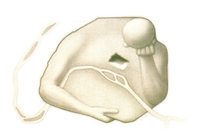
Une étude approfondie de Tatiana Debroux, publié sur le site de Brussels studies
Sur basede d’une cartographie diachronique détaillée, cet article analyse l’implantation résidentielle des
artistes plasticiens à Bruxelles de 1830 à aujourd’hui. Des logiques spatiales fortes se dessinent au fil du temps, marquant l’apparition, le déclin ou la permanence des pôles de concentration d’artistes, qui doivent être resituées dans le contexte des dynamiques urbaines ayant modelé le tissu urbain. Trois périodes se dégagent, correspondant au développement (ou redéveloppement) d’espaces spécifiques de la ville : la deuxième moitié du 19e siècle, associée à l’urbanisation des faubourgs d’artistes du nord-est ; l’entre-deux-guerres, se distinguant par des concentrations plus périphériques ; la fin du 20e siècle, enfin, durant laquelle se redéploie l’ancien pôle sud-est, en même temps qu’apparaissent de nouvelles concentrations liées aux phénomènes de rénovation des espaces centraux. Le travail cartographique entrepris et les résultats obtenus apportent un regard original sur la structuration du monde artistique bruxellois, tout en révélant l’importance de la profondeur historique pour l’analyse des dynamiques urbaines contemporaines mettant en scène les artistes.
Dans les plis de la carte : Élie et Élisée reclus à Bruxelles
Les visites guidées de mai de Quartiers Latins :
Dans les plis de la carte :
Élie et Élisée reclus à Bruxelles
Samedi 25 mai à 14h
Par Frédérique Bianchi
Après des études de lettres, a réalisé une
recherche sur l’animalité dans l’oeuvre de Colette, ainsi qu’une analyse
sur la réception des contes.
La promenade Élie (1827-1904) et Élisée (1830-1905) Reclus à Bruxelles propose une lecture de textes variés et un parcours dans la ville, du centre vers Ixelles. Les rues traversées et les lieux choisis seront l’occasion d’entendre comment l’ethnographe et le géographe nous invitent à nous ouvrir au monde, les pieds sur terre.
photo de Frédérique Bianchi
Rendez-vous à la librairie.
P.A.F. : 10 €.
Sur réservation au 02 227 34 00.
Durée de la visite : environ 2h
DebianGis is about improving [WWW] Debian to make it the best distribution for Geographical Information Systems applications and users. A good deal of GIS related softwares and libraries (e.g. GRASS, see [WWW] http://grass.itc.it) are already present in Debian. Thanks to efforts of the DebianGis team, we have currently an up-to-date GRASS package in main and many other packages. Other programs are along their way to be included in the archive.
Denis Wood on maps, neighborhoods and pumpkins
From the archive of This American Life’s radio, a wonderful broadcast described as:
Five ways of mapping the world. One story about people who make maps the traditional way—by drawing things we can see. And other stories about people who map the world using smell, sound, touch, and taste. The world redrawn by the five senses.
Especially moving is the interview of Denis Wood who creates maps of Boylan Heights, Raleigh, North Carolina, his neighborhood: a traditional street locator map; a map of all the sewer and power lines under the earth’s surface; a map of how light falls on the ground through the leaves of trees; a map of where all the Halloween pumpkins are each year; and a map of all the graffiti in the neighborhood
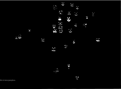
I couldn’t resist to make a partial transcript of the interview. Here it goes:
Denis Wood: I have a map of the pumpkins that were on the porches at Halloween.
Ira Glass: What does it tell you?
DW: That’s actually a very interesting map. I like to relate it to the map that shows the number of times each residence was mentioned in the Boyler Heights newsletter in the past 25 years
IG: You made a map of that?
DW: Yes, you take all the newsletters and you just note every address that appears in it.
Wether it appears as the name of a specific individual in the neighborhood or as address and you just do frequenties attached to each one of the residences. And the thing that strucked me about that map when I first did it was that some locations, some dwellings ... are frequently mentioned no matter whoever lives in them and I imagined that who were going to be movers and shakers in the neighborhood pick homes that are in important locations in the neighborhood are architecturally significant or historically significant
IG: They have just got more money
DW: Believe me, money is what’s behind both the pumpkin map and that map.
IG: As you told me this, I was thinking where are the pumpkins? Where is the greatest proliferation of orange pumpkins.
DW: Oh that’s not what the map was. I photographed the pumpkins face and then I printed them black on black so you see the eyes and the mouths of the pumpkins on the black background
IG: So the map of the pumpkins is a map where there are just little eyes and pumpkins mouths floating by the houses which have them
DW: They are just floating on the black background just like the traffic lights were floating...And the map of the traffic signs is just traffic signs, there are no streets or anything. On the map of the streets there are just streets, on the map of the trees there are just trees. And what you do when you go through these maps is you begin to build up even though it is never said a kind of structural knowledge that you take away as a kind of resonance of that neighborhood. You know the idea that we have to have the pumpkins drawn against the streets only makes sense when you don’t have any other images. As soon as you have other images, you say oh my... look look look where these pumpkins are, they are just exactly where, and I here answer your question, exactly where people are mentioned all the time in the newsletter And if you go away to the edges of the neighborhood where people aren’t mentioned in the newsletter My good they don’t have pumpkins on their porches
IG: So the people mentioned in the newsletter they tend to be people in the bigger homes
DW: Yes, they do.
...
DW: [I made maps of] patterns of leaf light in the neighborhood light coming through the leaves of the trees in summer time
IG: What does that tell you?
DW: They are what it is to live in the neighborhood. the neighborhood is experienced as a clutch of patterns of light and sound and smell and tastes and communication with others
...
DW: But I guess, what I am pushing for here is selecting subject for cartographic display that are other than these that are typical
IG: it almost sounds like you are trying to create a ... novel
DW: I am
IG: but with pure symbols of map
DW: yeah. why not?
note: I found the link to the broadcast on the excellent Perrygeo weblog
Des logiciels libres aux données libres
Un article fort complet d’ Yves Jacolin sur les logiciels et données libres pour la géomatique. On y apprend entre autres qu’ Openstreetmap adopterait une nouvelle licence (en remplacement de la licence Creative Commons actuelle) pour préciser davantage ce que signifie la réutilisation de données et les travaux dérivés.
(Merci P !)
Desktop GIS for Linux, a series
The Linux Journal is publishing the first issue of a series about Linux and GIS desktop publishing.
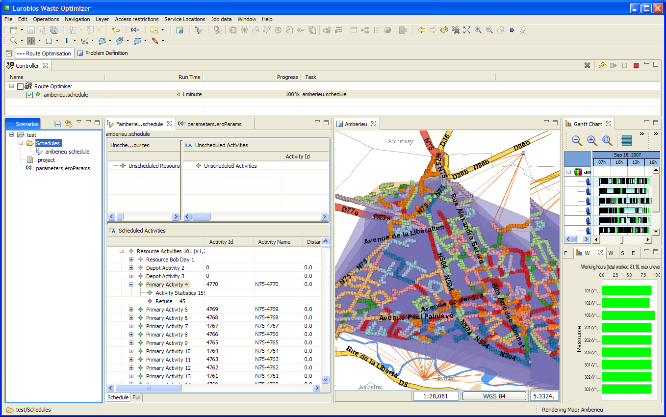
Thanks, Eric!
Dispatches From the Hyperlocal Future
A small novel by Bruce Sterling published in Wired, July 2007. The main character, a famous geo blogger embodies the "hyperlocal" utopia.
So what am I doing here in DC? I just finished testifying before Congress about the fast-gathering passport brouhaha. I even rented a suit for the occasion. (And get this: To return it, all I have to do is drop it off at a dry cleaner — transmitters sewn into the hems will tell FedEx where to send it and how to bill me.) I gently opined to the glum congressional committee that sealing borders in a world of location-aware technology is a futile effort doomed to an ignominious defeat. Yes sir, just like digital rights management!Too bad none of the assembled officials could remember digital rights management. But that makes sense. Another 10 years and nobody will remember passports, either. I leaned into the microphone to deliver the money line. "Hyperlocality is transforming our lives at every scale: bodyware, roomware, streetware, cityware, nationware, and global ware. From nano to astro!"
Reading this gives a strange feeling in our Belgian context where the Mercators of Val Duchesse are fighting over the inner borders of a micro-nation.
Hello,
Voici mes réflexions - à chaud- après avoir fait l’exercice d’introduire les données de Nathalie via la grille préfigurées.
– je n’ai introduit que les données de la carte 1 " collecte des interventions artistiques à Bxl". Les deux autres cartes "valeur immatérielle de Bxl" et " projet utopique de Bruxelles" sont en général pas localisables et donc localisées et pas reliée à une période - encore moins à une assoc.
– j’ai introduit les données telles qu’on me les a données, donc telles qu’elles ont été récoltées , même si j’en connaissais plus sur l’intervention.
– j’ai gardé les doublons
– le nom de l’artiste est chaque fois renseigné dans "initié par ", mais peut-être faut-il créer une colone spécifique ?
En annexe, le tableau
Laurence
Downtown Los Angeles Homeless Map

The Los Angeles Homeless Map, by the people of Cartifact.
“The purpose of the downtown Los Angeles Homeless Map is to visually tell the story of downtown’s homeless population. Before a problem can be solved it must be understood. These maps exist to convey the situation on the streets to City leaders, the Police Department and all those who are concerned with homelessness in our city.”
Visually efficient and the map-making process is documented here.
En effet... Il me semble, on pourrait concevoir les gens comme des mains.
... le problème d’une analyse, c’est peut-être pas du tout de faire une "psychanalyse", mais de faire par exemple, on peut concevoir autre chose, une "géo-analyse".
– Et une géo-analyse c’est précisément, ça part d’une idée suivante : c’est que les gens, que ce soient les individus ou les groupes, ils sont composés de lignes. C’est une analyse de linéaments, tracer les lignes de quelqu’un, à la lettre, faire la carte de quelqu’un. Alors là, la question même : est-ce que ça veut dire quelque chose ou pas ? Évidemment elle perd tout sens. Une ligne, ça veut rien dire. Simplement faire la carte avec "les espèces de lignes de quelqu’un" ou d’un groupe, d’un individu, à savoir qu’est-ce que c’est que toutes ces lignes qui se mélangent. En effet... Il me semble, on pourrait concevoir les gens comme des "mains". Chacun de nous c’est comme une main ou plusieurs mains. On a des lignes, alors ces lignes ne disent pas l’avenir parce qu’elles préexistent pas, mais il y a des lignes, bon, de toutes sortes de natures, et entre autres il y a des lignes qu’on peut appeler de bordures, de pentes ou de fuites.
– Et d’une certaine manière vivre, c’est vivre sur - en tout cas aussi - c’est vivre sur ces lignes de fuite. Alors c’est ça que j’ai essayé d’expliquer, mais chaque type de lignes a ses dangers. C’est pour ça que, c’est pour ça que c’est bien, c’est pour ça que c’est très bien, on peut jamais dire - c’est là que je me sauverai - le salut ou le désespoir, vient toujours d’une autre ligne que celle qu’on attendait. On est toujours pris par surprise. ...
Extrait des cours de Gilles Deleuze donnés à l’Université de Paris 8. A lire et écouter ici.
This well-known border curiosity can be observed in Baarle Nassau, the Belgium-Dutch village that managed to make an unresolved border conflict into a tourist attraction.
"In 1995 a remeasurement of all the borders of enclaves according to modern exact standards was completed. This gave rise to some problems of this kind. In at least one case a house would have had to move from Belgium to the Netherlands. The inhabitants did not want that to happen, but the solution was simple: they moved the front door of their house."
http://ontology.buffalo.edu/smith/baarle.htm
(thanks Nik Gaffney for reminding us)

Un projet de cartographie subjective et collective de la ville de Medellin.
http://www.encuentros-cartograficos.net/logbook/
El proyecto "Encuentros cartográficos" es parte del Encuentro Internacional de Medellín (MDE11), liderado y realizado por el Museo de Antioquia.
Exhibition Mapping the City - 16.02.07 - 20.05.07 (to late !) - Stedelijk Museum (Amsterdam)
This group exhibition focuses on the relationship between artists and the city from around 1960 to the present day. The show revolves around the way in which artists perceive urban space. The emphasis is on the city as social community, on behaviour, poses, and urban rituals.
hello,
le Stedelijk museum de Aalst (Oude vismarkt, 13) organise une expo - Art contemporain et cartographie jusqu’au 15 octobre...
leur propos semble plus esthétique, mais peut-être intéressant à voir
ouvert ma-ve : 10-12 et 13-17h et we 14-18h

Exxon secrets is a project by Greenpeace that documents Exxon-Mobil’s funding of climate change skeptics. It displays a network graph connecting the different organizations that receive funding from Exxon-Mobil and their spokespeople.
For an art against the cartography of everyday life
A beautiful synthesis of the questions surrounding the emergence a few years ago of Locative Media. By Rian Griffis.
«The title of this essay is a remix of the title of an essay by artist Martha Rosler originally published in 1979, “For an Art Against the Mythology of Everyday Life”. Rosler’s text is an engagement with what was then the emerging context now often referred to as “post-industrial globalization.” More specifically, it is an engagement from the perspective of someone attempting to make things – art works – that can “address these banally profound issues of everyday life, thereby revealing the public and political in the personal”. She was particularly interested in both the oppressive and potentially liberating aspects of “mass media.” Here, I want to take up where Rosler left off, discussing the potential of art, and technology, to “step toward reasonably and humanely changing the world” using the example of what is commonly referred to as “locative media.”»
Rian Griffis references a few interesting resources, among others a polemic started from Questioning the Frame a text by Coco Fusco. A good part of the responses are compiled here.
Of interest too is Drew Hemment’s The Locative Dystopia.
FOSS4G2006 - Free And Open Source Software for Geoinformatics
A tip from Jo Walsh...
"The conference focuses on an array of open source technologies and presents how they are being used around the world. Seminars and workshops will share the theme of advancing open source GIS technology, by covering management and technical aspects as well as the latest trends."(Lauzanne, Switzerland).
Une connaissance de Jo, Andrew Turner, y fera une intervention intitulée Enabling Users to Produce personalized Geodata. Rien que ça. Ce monsieur sera avec Jo à Bruxelles du 16 au 21 septembre...
From the text Future Map, by Brian Holmes
"The trading function are overlaid on a map of the Middle East, like windows of geopolitical opportunity. This interface, and the lure of profit it offered, would be the electrodes attached to the precognitive lobes of the investors. If they produced striking images, then preemptive policies would follow."
"The PAM trading interface is literally a “future map.” It is also a perfect example of what Foucault calls a “security device,” and it offers precise insight into the dynamics of surveillance under cybernetic capitalism. It is not a police program, but a market instituted in such a way as to precisely condition the free behavior of its participants. It produces information, while turning human actors into functional relays, or indeed, into servomechanisms; and it “consumes freedom” for a purpose. Like all security devices, it serves two functions. One is to optimize economic development: in this case, the development of financial speculation. But the other function is to produce information that will help to eliminate deviant behavior, of the kind that can’t be brought into line with any “normal” curve. This is the double teleology of closed-loop information systems in cybercapitalism. The map of the future is always a promised land to come. But there are always a few enemy targets on the way to get there. The question is, do you hold the gun? Do you just watch as the others take aim? Or do you try to dodge the magic bullet?"
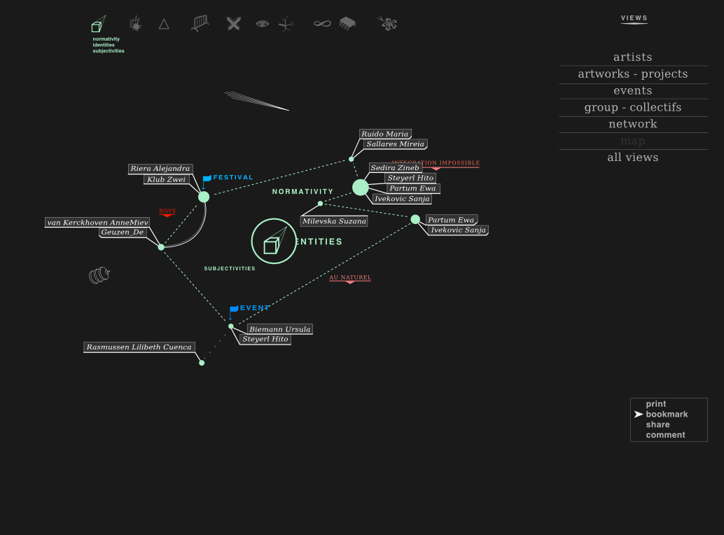
OSP participe actuellement au développement du projet Gender Art Net.
Gender Art Net propose de créer un atlas interactif donnant accès à différentes vues et lectures d’un ensemble de positions artistiques feministes dans l’Europe contemporaine.
Soutenu par l’European Cultural Foundation le projet est conçu par la productrice et commissaire Bettina Knaup, en collaboration avec Constant vzw. L’équipe du projet se compose de curatrices, artistes, statisticienne, développeurs, de Berlin, Barcelone, Amsterdam (Dunja Kukovec, Laurence Rassel, Diana McCarty, Maria Perez, Katalin Timar, Urska Merc) et d’étudiants le la section European Media Studies de l’Université de Postdam (Lenore Hipper, Inés Matres, Sebastian Moering, Laura-Helen Rüge)
Le projet explore les relations entre genres, territoires, artistes, œuvres, groupes, réseaux et événements à travers différentes thématiques / fils de discussions.
La base de données du projet se nourrit d’informations encodées par l’équipe éditoriale et d’informations extraites dynamiquement sur les sites web représentatifs des artistes.
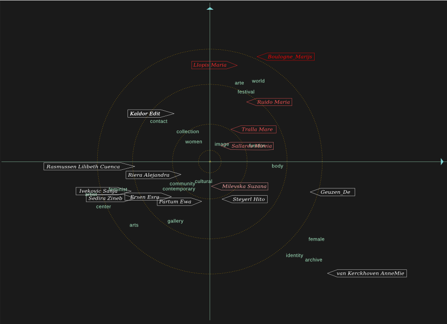
OSP travaille à rendre visibles, dynamiques et interactifs ces différents niveaux d’informations.
En collaborations avec Anne-Laure Buisson (statistician, feminist activist, Brussels), nous cherchons à distribuer/spacialiser un ensemble de mots clés significatifs en relation avec les artistes.
Les mots extraits des sites sont filtrés via des techniques de statistiques multi-variées pour générer des représentation en deux dimension reprenant les mots et les artistes, indiquant les relations entre eux et les particularités du lexique et des centres d’intérêts des artistes. Une série de graphiques, agissants comme des clichés ou petites cartes thématiques de l’atlas sont ainsi obtenus.
Plus d’informations Ici
Les informations encodées par l’équipe éditoriale localisent les lieux d’origine et de travail des artistes, associent les artistes à des fils de discussion et réseaux, et relient des œuvres/projets à des lieux.
OSP développe une interface qui permettra de parcourir en ligne cette carte feministe du ciel artistique européen.
"The GeoNames geographical database is available for download free of charge under a creative commons attribution license. It contains over eight million geographical names and consists of 6.5 million unique features whereof 2.2 million populated places and 1.8 million alternate names. All features are categorized into one out of nine feature classes and further subcategorized into one out of 645 feature codes. (more statistics ...).
The data is accessible free of charge through a number of webservices and a daily database export. GeoNames is already serving up to over 11 million web service requests per day."

An example of this data being used: Walter Rafelsberger has worked on a vizualisation of the worlds cities with a population of more than 1000, [...]. Cities with more than 5 million inhabitants are labeled.
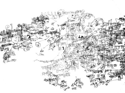
Géraldine Chevenier est une artiste franco-belge installé à Bruxelles :« Dans les transports, devant la télévision, les images bougent et changent sans cesse. Cette série de dessins : « Vitesse » se construit au fil des images qui défilent sous mes yeux. Depuis 3 ans, j’enregistre à ma façon les mouvements, les mots, les attitudes et les détails qui surgissent des images qui envahissent mon regard. A l’aide de feutres, de collages, de fragments de texte et de touches de couleurs, les dessins se construisent et prennent forme. Parfois chaotiques, les compositions peuvent être chargées ou dépouillées selon le contexte et les images observées. Les images de magazines, les tickets de tram, de magasins ne sont pas là par hasard, ils nous remettent en contact direct avec la société de consommation qui nous entoure et nous envahit peu à peu. »Plus d’informations sur son site personnel ici
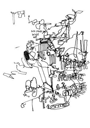
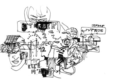
gipfel - and you know what you see

from the gipfel’s website:
gipfel helps to find the names of mountains or points of interest on a picture. It uses a database containing names and GPS data. With the given viewpoint (the point from which the picture was taken) and two known mountains on the picture, gipfel can compute all parameters needed to compute the positions of other mountains on the picture. [...] You can think of gipfel as a georeferencing software for arbitrary images (not only satelite images or maps). gipfel also has an image stitching mode, which allows to generate panorama images from multiple images that have been referenced with gipfel .
To get the idea, firefox or konqueror users can point their browsers here. The hotspots on the image appears when you move the mouse over it. Please scroll to the right-hand part of the image as all the linked elements are concentrated in this area.

«Decisions are normally taken from the high, by a minority of players, leaving out those more related to the territory.
How we can get them in?
Through four steps: awakening, aggregating, activating, complaining»
Gli exclusi is a map/diagram created by density design to illustrate a scenario to organise citizens response to the Italian National Action Plan.
Read more about this map (and many more )on the density design’s website.
Google Maps, Reloaded : Animated Mozillas and Gnus attack Redmond
** Google Map hack "Star Wars Imperial ATAT attack on Palo Alto".
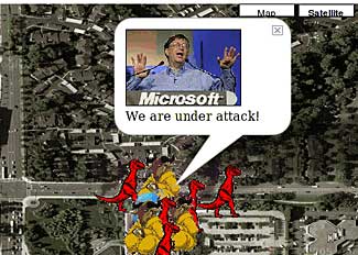
** and *animated* hack : invaders move around the map ! And this time invaders are mozillas and gnus converging towards Microsoft Offices in Redmond ! ;-) Here is the animated map : Link. Be sure to check the HTML code (with the Javascript code that moves invaders around). In the blog post I also ponder that "It should be very easy to create real playable games on Google Maps.
Here are some ideas : - playing Risk on the real world map (with the ability to zoom in/out to combat at different scales). Extend Jrisk or JavaRisk (code available on SourceForge). - playing FreeCiv on real world maps. Modify FreeCiv source code. - driving a car race on streets of the real world. - much more I guess.
Haïti and the importance of open maps.
A bit after the fact, but still very interesting information. How Openstreetmap has been used to help NGO’s work in Haiti after the earthquake. A specific webpage has been set up for the occasion: http://www.openstreetmap.org.ph/
A thorough article by Camille Gévaudan, in ecrans.fr (in French).
Other informations in opensource.com
Quick selection of images:
– Map showing the depth of flooding, using OSM road data.

– Port au Prince before and After
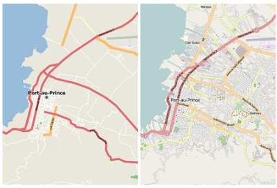
High-Yield Detonation Effects Simulator
In the category ’curiosities’, this unusual use of Google Maps by Eric CSS Meyer:
"The High-Yield Detonation Effects Simulator, an experiment in AJAX and Google Maps programming based on public data and showing the destructive zones of large explosions".
In short, it visualises the effect of a bomb exploding in New York, Washington and a few other American cities.
Legend to the map (Overpressure Key):
- 15 psi Complete destruction of reinforced concrete structures, such as skyscrapers, will occur within this ring.
- Between 7 psi and 15 psi, there will be severe to total damage to these types of structures.
- 5 psi Complete destruction of ordinary houses, and moderate to severe damage to reinforced concrete structures, will occur within this ring.
- 2 psi Severe damage to ordinary houses, and light to moderate damage to reinforced concrete structures, will occur within this ring.
- 1 psi Light damage to all structures, and light to moderate damage to ordinary houses, will occur within this ring.
- 0.25 psi Most glass surfaces, such as windows, will shatter within this ring, some with enough force to cause injury.
From The David Rumsey collection website

“ The David Rumsey Collection was started nearly 20 years ago, and focuses primarily on cartography of the Americas from the 18th and 19th centuries, but also has maps of the World, Asia, Africa, Europe, and Oceania. The collection includes atlases, globes, school geographies, books, maritime charts, and a variety of separate maps, including pocket, wall, children’s and manuscript.”
Notice that the maps of this website are released under a Creative Commons license.
“ Images copyright © 2000 by Cartography Associates. Images may be reproduced or transmitted, but not for commercial use. For commercial use or commercial republication, contact carto@luna-img.com. This work is licensed under a Creative Commons License. By downloading any images from this site, you agree to the terms of that license.”
History is not given. It has to be constructed
Just out: Mind the map, a publication documenting and discussing 5 years of collaborative mapping through the eastartmap.org * project.

Slowenian art collective IRWIN started the project in 2001, because they felt that the art history of the East was too important to leave to (Western?) art-historians.
We are planning to transform the legends and stories of the underground into a legal art history. [...] History is not given. It has to be constructed.
* Flash-based project; some mysterious setting results in white-on-white text when you browse the project with Mozilla plug in for Linux...

I-See is a web-based application charting the locations of closed-circuit television (CCTV) surveillance cameras in urban environments. With iSee, users can find routes that avoid these cameras ("paths of least surveillance") allowing them to walk around their cities without fear of being "caught on tape" by unregulated security monitors.
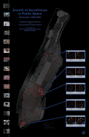
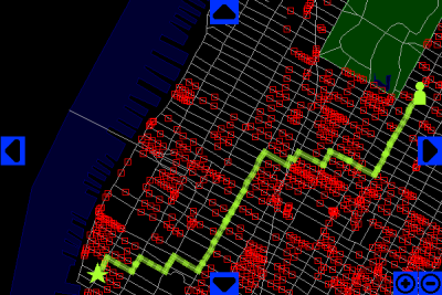
More informations :I-See
Just cannot resist to post these two recent images of cartographic and notational practices in the collective Constant and friends associations.
The two first are documents taken during the Speed Cartography event.
«When the arts labs (kunstenwerkplaatsen), Zennestraat 17 Rue de la Senne and BRXLBRAVO started cooperating on the Artslab² project, the multitude of artists in Brussels became a pivotal point, as well as the complexity of network(s), its multilingual and geographically dispersed landscape and numerous cooperations.
With this map we want to show a fragment of this complexity in a playful way, therefore we organize two public mapping performances with paint, on the floor, in the entrance of Zennestraat 17 Rue de la Senne»
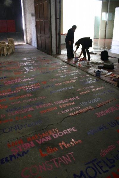
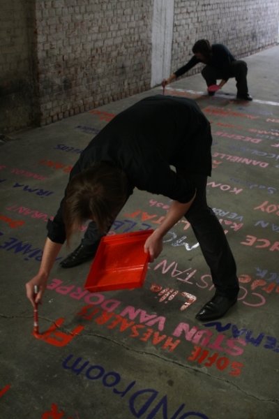
These other two are notations made during the rehearsals of the Kaleidoscope project, «an installation-performance initiated by Constant and Mangrove Tentactile. Kaleidoscope will be showed during Verbindingen/Jonctions12 at La Bellone, 25, 27 & 28th November 2009.»
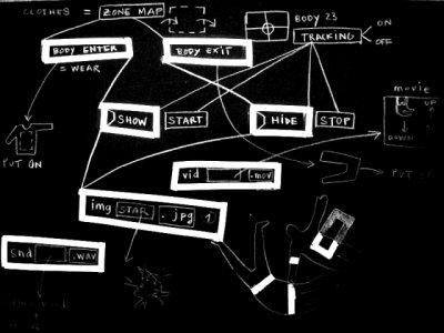
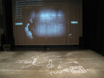
With admiration.

A website that parallels a thesis titled The Form of Facts and Figures from Christian Behrer at the University of Postdam. It contains "a collection of 55 design patterns that describe the functional aspect of graphic components for the display , behaviour and user interaction of complex infographics ".
For each of these patterns, there is a description, a layout example and a real world example.
It is a bit unfortunate that this interesting and carefully designed information is embedded in a flash application, but reading from the homepage of the website, this will maybe change in a near future.
Interstices Urbains Temporaires
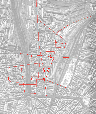
Cette carte présente une tentative de représentations des interstices existant dans le quartier de La Chapelle situé dans le 18ème arrondissement parisien. Ce projet s’intéresse aux expérimentations architecturales et artistiques menées autours des interstices urbains.
Il faut entendre par "interstices", les zones territoriales résistant encore aux politiques foncières de l’aménagement urbain. La ville, dans son ensemble, dispose de quantités d’espaces vierges d’activités : on parle de terrains vagues, de friches, d’indéterminations spatiales,...Leur fonctionnements diffèrent des espaces classiques de la ville, et "l’auto-gestion" prend ici une ampleur significative.
Les objectifs de cette recherche-action sont d’explorer une série de situations urbaines interstitielles (spatiales, temporelles, institutionnelles, interculturelles…) et d’expérimenter des micro-dispositifs participatifs d’intervention artistique et architecturale à différentes échelles (quartier, ville). Pour plus d’informations, visitez le site des Interstices Urbains Temporaires
Juste quelques punaises sur une carte ?
ou quelques considérations critiques sur la cartographie criminelle.
Un article de Benoit Dupont, Lecturer in Policing Studies Charles Sturt University, qui détaille les difficultés pour les services de police de faire usage des technologies géolocatives. Les points relevés par ce chercheur en 2000 s’avèrent toujours d’actualité comme nous le rappelle ce papier de Libération ou ce post précédent.
On ne resiste pas au plaisir d’extraire cette anecdote :
« Lors d’une tentative de cartographie de la criminalité et de localisation des incidents en milieu rural, des policiers australiens furent équipés de systèmes GPS portatifs. L’intention était d’utiliser ces derniers pour relever la longitude et la latitude de l’incident ayant requis la présence de la police. Les policiers envoyés sur le lieu d’un accident de la route ou d’un crime allumaient dûment le récepteur GPS et retournaient ensuite au commissariat se trouvant à plusieurs kilomètres afin d’y rédiger leur rapport, recopiant les données lisibles sur l’écran de l’appareil. Bien sûr, la machine prenait en compte le trajet de retour vers le commissariat, et affichait maintenant les coordonnées de celui-ci ! Cette pratique perdura jusqu’à ce que l’on se rende compte du nombre anormalement élevé de crimes et de carambolages ayant pour cadre les locaux du commissariat. »
Justin Benett - soundcartography ?
Selection :
– Europa : map european borders with sound
– City’s Anatomy (without sound)
More on Justin Benett Website
Kies een kaart - Choisis une carte
At the occasion of the its 175th anniversary, the Belgian National Institute of Geography organised an exhibition to show the evolution of the national landscape through three centuries of cartography.

Their website hosts a wonderful virtual visit that lets you navigate through different maps and compare them. Maps from different centuries are simply different layers that you can move on top of each other.
L’incroyable téléphérique du parc de Forest
Augustus 31 at 7pm, 2 boarding stations open the doors of Park Forest. Invent a journey and become the guide of the most incredible walk (15’-30’) of all the time ! Post your suggestions in our box ( inthe sandpit in the park) or via teleferiek@gmail.com
La cartographie comme bien commun
Mapping in urban design
Part 3/Paper 2
Publié dans :
Barbara Golicnik Marusic, et al. (edited by), *Human Cities, Celebrating
Public Space*, Brussels : Stichting Kunstboek, Urban Planning Institute of
the Republic of Slovenia and Promateria, 2010 (p. 47-51).
écrit par Rafaella Houlstan-Hasaerts (La Cambre), Nicolas Malevé (Constant vzw).
WHY ?
Cartographie et pouvoir sont intimement liés. C’est une évidence : celui qui contrôle la carte contrôle le territoire, et ce à plusieurs niveaux. Celui qui la consulte, pour autant qu’il sache la décoder, devient à même de s’orienter dans l’espace. Celui qui la crée, situé un cran au-dessus, propose (ou impose) sa vision du territoire, tel qu’il le perçoit ou tel qu’il le projette. Celui qui la possède, enfin, décide de sa diffusion et donc du pouvoir qu’il accorde ou dénie aux autres concernant le territoire. En effet, la carte est loin d’être un outil anodin : figurative autant que projective, simulation de l’espace autant qu’espace de simulation, elle se situe aux sources mêmes des stratégies militaires, du capitalisme marchand, des découpages territoriaux et, dans le cas particulier des villes, elle a la plupart du temps déterminé ce qui allait être dessiné, mesuré et donc en fin de compte bâti ou du moins planifié. Jadis strictement réservée à une minorité, la cartographie s’ouvre aujourd’hui à une plus vaste gamme d’utilisateurs. Personnes à mobilité accrue, néo-nomades dans un monde globalisé, nous les utilisons et les trouvons partout : dans les transports en commun, les guides touristiques, les rues, les centres commerciaux et, plus particulièrement encore, sur les écrans de nos ordinateurs ou de nos GPS. Avec Google Earth, Google Maps, Mappy et autres géoportails, c’est la terre entière qui s’offre à nous en quelques clics, affranchie des contraintes de l’échelle et de la feuille de papier.
Mais si l’on peut se réjouir de cette « démocratisation » de l’accès à la cartographie, des bémols subsistent. Le premier concerne les codes qui se sont imposés à travers les siècles dans l’élaboration des cartes, qui offrent une vision unilatérale de ce qu’est l’espace. En effet, les territoires actuels, complexes et mouvants, semblent demander des représentations qui dépassent largement leur simple perception zénithale ainsi que les conventions qui tendent à figurer l’espace uniquement selon ses unités de surface. Un exemple : de nos jours, plus de la moitié de la population mondiale vit en ville et de nombreuses études prédisent une accentuation de cet état de fait au cours des prochaines décennies. Il existe donc de sérieuses raisons de penser que le XXIème siècle sera, plus que tout autre, placé sous le signe de l’urbain. Or, la carte « classique », qui valorise essentiellement les mètres carrés, montre au niveau mondial une majorité d’espaces étendus mais peu peuplés (océans, campagnes), et passe de ce fait totalement à côté du fait urbain, dont l’importance n’est pas directement proportionnelle à son étendue. La cartographie « classique » peut d’ailleurs également être remise en cause lorsqu’il s’agit de représenter l’urbanité contemporaine : la ville est devenue diffuse, elle ne possède plus de contours définis et ne s’appréhende plus dans son opposition avec la nature. Elle n’apparaît plus comme un organisme cerné et limité, elle bouge, grandit, mute au jour le jour, snobant la fixité de la carte. De plus, la prééminence du visuel et de la bidimensionnalité dans les représentations de la ville tend à nous faire oublier que celle-ci est avant tout un espace vécu, c’est-à-dire qu’au delà du visible, elle est également parcourue, entendue, ressentie, imaginée. Malgré son formidable pouvoir d’abstraction, la limite de la carte telle que nous la connaissons se situe dans le fait qu’elle ne rend compte bien souvent que de visions géométriques, matérielles, agrégées, objectivées, ou abstraites de la ville, niant ses dimensions culturelles, sensibles, imaginaires, occultant les échelles des espaces vécus, leur imbrication, leur superposition, démentant toute réalité sociale ou la restituant de manière normative . Or, au-delà de sa contestable hégémonie, cette caractéristique des représentations cartographiques devient encore plus problématique lorsque « ceux qui s’en servent les pensent vraies, bien que ou parce que géométriques » . En effet, la conception de l’urbanité en général et de l’espace public en particulier a été (et reste) majoritairement déterminée par les cartes officielles, les statistiques et les limites administratives, sans que soient prises en compte d’autres visions de la ville, notamment celles de tous ceux qui la vivent au quotidien.
Pour pallier à cet état de fait, l’élaboration et la diffusion de cartes ne devrait pas être le privilège de certains mais le droit de tous. Cependant, les outils qui permettraient à la collectivité de créer et de diffuser leurs propres cartes restent marginaux. Bien sur, de nombreux services cartographiques présents sur le Net vont au-delà de la simple consultation et permettent aux utilisateurs d’alimenter le contenu des cartes et de les partager avec d’autres utilisateurs. Mais cette ouverture demeure partielle : la plupart des logiciels cartographiques sont propriétaires, leurs données géospatiales sont protégées et la majorité des cartes qui en résultent sont soumises à des conditions très strictes d’utilisation et de diffusion.
WHO AND WHAT FOR ?
Depuis plus de trois ans, un groupe de bruxellois porte le projet Towards a subjective collective cartography et tente de penser la cartographie - les cartes mais aussi leur processus de conception et les données qui y sont associées - comme relevant du « bien commun », tant dans ses dimensions d’accès (universel, plutôt que restreint), de régulation (permissive, plutôt que contraignante), que de propriété (publique plutôt que privée). Cette volonté de défendre le droit de la collectivité de consulter, créer, éditer et échanger des cartes mais aussi d’accéder aux données cartographiques est poétique autant que politique. Poétique parce qu’elle assume l’inévitable part de subjectivité dans l’approche du territoire et considère la pluralité des visions cartographiques comme autant de métaphores possibles du monde dans lequel nous vivons. Politique parce qu’elle entend donner le pouvoir aux utilisateurs de penser individuellement ou collectivement le territoire, et, peut-être, d’influencer son devenir. Si hier l’action urbaine pouvait se faire sans ou même contre ces nombreux utilisateurs, ou à la rigueur avec eux, dans une sorte de concession arrachée au pouvoir ou généreusement consentie par celui-ci, il devrait en aller tout autrement aujourd’hui. En effet, la manière dont les gens ressentent et perçoivent la ville, et dont la carte peut constituer une médiation, devrait être la pierre d’achoppement dans toute prise de décision démocratique concernant le territoire en général et l’espace public en particulier.
Tenant compte de ces constats et de ces volontés, le projet Towards s’est focalisé sur la création de deux outils différents mais néanmoins complémentaires : d’une part un Atlas de Bruxelles qui reprend diverses cartes de la ville (imaginaires, anecdotiques, émotionnelles, etc) et, d’autre part, un projet informatique de cartographie – Tresor -, permettant de créer des cartes, de les consulter, de les mettre en parallèle, de jouer avec les paramètres qui les définissent, de les compléter, de les éditer, ou de les utiliser dans le cadre de projets personnels ou collectifs. Durant ces trois dernières années, différentes sessions de travail ont donc été organisées en collaboration avec des artistes, activistes, urbanistes, architectes, graphistes, programmateurs, etc pour mettre en place ces outils.
HOW DOES IT WORK ?
A ce jour, l’Atlas de Bruxelles comprend une cinquantaine de cartes réalisées par des artistes, des activistes, des personnes issues de milieux associatifs ou académiques, des citoyens, etc. Ces cartes sont consultables en ligne sur le site du projet. A terme, l’idée serait d’arriver, via le projet informatique de cartographie Tresor, à faire passer l’utilisateur non pas d’une image à une autre, mais d’une vision dynamique à une autre en faisant circuler les métadonnées (descriptions, commentaires, noms) entre les différentes cartes. En résulterait un atlas de la ville de Bruxelles qui serait un labyrinthe plein de passages secrets, un ensemble de cartes articulées sur des principes tant géométriques qu’imaginaires.
Et justement, comment fonctionne Tresor ? Tresor doesn’t work, it puts to work. Lors des sessions de travail, les participants se sont tout d’abord interrogés sur ce que pouvait être un logiciel de cartographie. Est-ce une interface avec des boutons, qui produit des manipulations de symboles ? Ou bien est-ce quelque chose de plus large, comme ré-imaginer une pratique, la négocier avec d’autres, mais aussi ré-envisager ce que peut être la pratique de l’informatique. Ainsi quand un groupe de personnes se met à réfléchir, écrire et parler sur ce que serait ce logiciel, le logiciel fonctionne déjà, le logiciel met déjà le groupe au travail. Bien entendu, le chemin est long pour aboutir à quelque chose qui fonctionne comme un outil, mais qu’y a t’il à gagner en utilisant un outil tout fait ? User-friendly is user-deadly. Les logiciels préfabriqués reproduisent dans leurs options des séparations qui n’ont pas de sens pour les utilisateurs, notamment pour ceux qui ont participé aux sessions de travail cartographique. Ces outils divisent par exemple les usages artistiques et techniques, la « vraie » géographie et le dessin. Certes, dans un logiciel de cartographie, on peut changer ci et là des couleurs et des icones, mais le principe graphique organisationnel est toujours le même. Ce qui a par exemple peu d’intérêt pour des personnes voulant représenter leurs quartiers sous la forme d’une galaxie, de planètes et leurs relations sous forme de sillons dans la voie lactée. Si ils veulent représenter cette carte sous une forme imaginaire, ils doivent utiliser un logiciel de dessin et perdre toute connexion à la géographie. Si au contraire, ils utilisent un GIS, ils sont sommés d’abandonner l’imaginaire. Tresor, c’est l’outil qui refuse cette ségrégation. Il n’y a aucune raison acceptable pour cette division. Elle vient de la segmentation du marché, de la division des tâches dans l’économie, mais rien n’empêche d’imaginer un tel outil. Rien ? Si bien sûr. Le fait que les acteurs eux-mêmes ont intériorisé cette division. Je suis artiste et je dessine. Je suis cartographe et je mesure. Le premier effet de Tresor, avant la première ligne de code, a été de faire sauter les barrières mentales qui étaient internalisées par les participants.
Dans un deuxième temps, les participants se sont interrogés sur les possibilités d’élaborer un outil qui soit en accord avec la notion de « bien commun », en termes d’accessibilité, de régulation et de propriété. Ces questions les ont naturellement menés à la conclusion que les composantes de Tresor devaient être distribuées selon les principes qui régissent les licences libres. En effet, dans le cas d’une licence libre, les auteurs d’une œuvre logicielle, visuelle ou littéraire autorisent toute personne à s’approprier leurs créations, à les modifier et les distribuer, mais avec la contrainte de toujours citer ses sources ainsi que les auteurs précédents et de redistribuer ses propres œuvres dérivées sous la même licence, aux mêmes conditions. Ces licences libres sont ainsi plus qu’une simple solution pragmatique utilisée ça et là, elles sont aussi une sorte de constitution interne de projets collaboratifs qui visent à faire en sorte que ce qui est commun le reste. L’utilisation de ce type de licences est importante à deux niveaux pour Tresor. D’une part, elle simplifie les échanges des différents utilisateurs dans la production des cartes : tout le monde a le droit de réutiliser, modifier commenter les créations de chacun/e et de produire d’autres versions de ces cartes. D’autre part, toutes les personnes qui se sentent une affinité avec l’outil peuvent le corriger, l’améliorer, le tester, le documenter, le traduire, etc.
Dans un troisième temps, les participants se sont rendus compte qu’il existait déjà toute une série de logiciels libres isolés (par exemple des logiciels capables de se connecter à des bases de données GIS, des logiciels de dessin vectoriel, etc) qui, mis en réseau, pourraient offrir de multiples possibilités en matière de cartographie. Il en résulte donc que Tresor n’est pas un logiciel à proprement parler mais un ensemble de routes entre des logiciels libres existants, c’est une brèche dans des logiciels qui ne communiquent pas entre eux. Via une série de scripts, de stratégies d’utilisateurs, de plugins, d’add-ons, ces logiciels existants sont « trésorisés » selon les nécessités. A chaque projet de carte réalisé correspond une expérience documentée et du code publié, des outils testés qui petit à petit remplissent la boite à outils. Les premières lignes de code du projet ont eu pour objet de créer une connexion entre le logiciel libre de dessin vectoriel Inkscape et Mapserver, un serveur de cartes via le web, ou avec Spip un logiciel de publication d’articles sur le Web pour réaliser une ligne du temps. Ont suivi des projets de plus grande ambition comme genderartnet, une carte des artistes féministes qui travaillent en, ou à propos de l’’Europe et Busboitescartesmap (BBCM), une carte sonore d’explorations de la ville de Bruxelles. Ce dernier projet peut donner une idée de la manière dont un outil et des pratiques peuvent se conjuguer pour explorer et représenter différemment le territoire.
Ce projet procède par sessions. Pour chacune, une série de lieux sont choisis. Ces lieux correspondent aux boîtes postales du centre ville. Elles offrent une grande diversité d’environnements : on en trouve près d’écoles, dans des artères principales, dans des impasses, des parcs, etc. Un groupe de participants se rendent en ville avec un enregistreur audio et un GPS allumé et visitent les lieux sélectionnés. Les horloges du GPS et de l’enregistreur sont synchronisés. Au retour des participants, un logiciel de la boîte à outils Tresor extrait les segments audio qui correspondent aux emplacements des boîtes aux lettres en comparant les time code des deux appareils. Ces pistes audio sont alors placées sur une carte interactive grâce à laquelle on peut écouter le brouhaha de tous les sons enregistrés ou sélectionner seulement les sons enregistrés en un lieu précis, écouter échantillon par échantillon ou l’atmosphère globale d’un emplacement à divers moments de la journée. Comme les participants sont invités à jouer avec le contexte dans lequel ils sont placés (utiliser la boîte postale comme une sorte de tam-tam, ou jouer avec sa chambre d’écho, ou les bruits environnants, ou eux-mêmes décrire les alentours ou parler), les sons produits permettent de découvrir de nouvelles qualités de l’espace urbain et invitent chacun et chacune à poursuivre sa propre découverte de la ville.
AND TOMORROW ?
Ces premières expériences réalisées au sein de Towards ou ailleurs grâce à Tresor montrent que ce type d’outils qui s’adapte aux besoins des utilisateurs plutôt que des les formater peut être d’une réelle utilité dans la production de représentations inédites et plurielles du territoire. Une prochaine étape serait donc d’arriver à le diffuser auprès d’un plus large public, pour que, dans la mesure des possibilités et des nécessités, il contribue à générer de véritables transformations... Mais ce processus sera sûrement complexe car chaque avancée apporte son nouveau lot d’entraves et de questionnements. Une des contraintes qui continue à alourdir le développement de Tresor est bien sur d’ordre économique. Du fait de sa nature hybride, c’est un OVNI pour de nombreuses sources de financement. De plus, la méthodologie de l’élaboration de ses spécifications ne rencontre pas les procédures habituelles en matière de développement de logiciels. En général, un certain nombre de personnes définissent ces spécifications qui sont ensuite gelées et puis implémentées par des experts. Dans le cas d’un projet comme Tresor on imagine mal comment geler des spécifications qui auraient pour but de définir l’approche subjective de la cartographie. D’où un développement organique, décentralisé et lent. Une autre difficulté est d’ordre juridique et vient du fait que les données qui composent les cartes géographiques (coordonnées geolocatives, points et formes, etc) ne tombent pas dans le champ d’application des licences libres, qui protègent les créations « originales » comme des œuvres littéraires mais pas la collecte d’informations « objectives » comme des coordonnées. Cette difficulté a été soulevée notamment par OpenStreetMap, dont Tresor utilise les sources de données régulièrement et auquel il contribue aussi. Après quelques années d’existence, les participants d’OSM se sont rendus compte que la licence avec laquelle ils distribuaient les données qui composent leurs cartes n’était pas valide devant un tribunal. Pendant un processus de plusieurs mois, la fondation OSM qui facilite les opérations du projet a organisé une consultation avec les participants et des juristes bénévoles liés à sa cause. L’objectif était de redéfinir une logique contractuelle pour être sur que toute personne puisse utiliser les données d’OSM sans problème, mais soit aussi contrainte de reverser ses modifications dans la base de données d’OSM si elle y apporte des correctifs, ou des ajouts. Ce qui est intéressant à observer dans les débats en ligne et hors ligne est la manière dont les participants se convainquent de l’importance de protéger leur ouverture, comment ils se montrent les uns aux autres l’importance d’éviter une récupération de leur effort commun sans se refermer et comment pour ce faire ils acceptent de contractualiser leur participation un peu plus pour préserver le sens de leur participation. Ce type de débats montre encore une fois que ce qui se veut commun se négocie perpétuellement.

Lorsqu’un consensus apparaît dans l’opinion publique, il est bien rare de ne pas trouver un régiment de businessmen pour s’en emparer et surfer sur cette tendance lucrative.
Dans un premier temps, ce vent d’approbation globale permet de lever des fonds, et ensuite, bien sûr, de vendre un produit beaucoup plus facilement en bénéficiant d’une image éthique et responsable, ce qui n’est pas donné à toutes les entreprises.
Il y a 10 ans donc, alors que les chiffres d’analyse prospective étaient les mêmes qu’aujourd’hui, c’est à dire qu’ils prévoyaient la fin du règne du pétrole pour les années 2050, une société avait pourtant bien du mal à trouver de l’argent pour financer une activité de recherche en carburant de substitution. Les Etats-Unis se foutaient ouvertement de Kyoto, les grands groupes pétroliers refusaient d’accepter cette réalité mathématique, les fabriquants de voitures continuaient de traiter la crise environnementale à coup de pots catalytiques et le consommateur se sentait super-responsable quand il achetait du déodorant Narta avec le petit logo "préserve la couche d’ozone".
Mais aujourd’hui, tout à changé.
En France, il y a Nicolas Hulot et son pacte, aux Etats-Unis, Scwharzenegger et son hydrogène, et tout le monde s’accorde à dire qu’il faut sauver la planète, tout en s’assurant si possible de pouvoir continuer à aller chercher le pain en bagnole.
En économie, c’est ce qu’on appelle un "secteur porteur", et si vous avez besoin de millions, c’est vers lui qu’il faut impérativement se tourner (comme ce fut le cas d’internet il y a 10 ans).
Afin de mettre en évidence cette réalité, le site Earth2Tech a donc décidé de répertorier les 101 start-up majeures créées dans ce très éthique domaine des "énergies propres", et de les représenter sur une carte. En cliquant sur les petits logos, on peut ainsi découvrir combien de millions la société est parvenue à lever, ainsi que les dernières infos relatives au secteur.
D’apparence très encourageante pour les générations à venir, cette carte a pourtant la terrible qualité de nous mettre face aux mécanismes capitalistes, eux-mêmes dénués de toute éthique, mais dont la capacité d’analyse prospectiviste permet de se glisser dans des niches financières spécifiques tout en profitant du "capital-éthique" qu’elles contiennent.
Espérons que cette carte sera actualisée dans les années à venir, afin de saisir pleinement une autre grande capacité du capitalisme mondialisé : celle de transformer une multitude d’initiatives, opportunistes ou citoyennes, en conglomérats financiers détenus par les trois ou quatre multinationales. Aucune raison, en effet, pour que les énergies dites "propres" ne subissent pas à leur tour cet enviable sort.
Et quand on sait que jusqu’à présent, les grands groupes pétroliers étaient particulièrement bien placés pour financer l’essentiel des campagnes électorales des partis politiques occidentaux, cette carte pourrait bien, à terme, devenir la représentation (géo-)graphique des nouveaux méta-décideurs du 21e siècle.
source :www.fluctuat.net
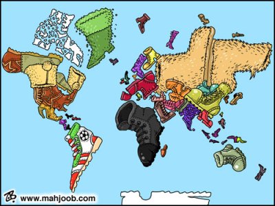
Cette carte a été réalisé par Emad Hajjaj, dessinateur pour le journal jordanien "Al-Ghad". Ici, chaque pays, chaque continent, est représenté par une chaussure, le limitant ainsi à un aspect communément admis. L’Amérique du Sud devient alors une chaussure de foot et les États-Unis ,une botte de cow-boy.
Source : Strange maps
Vu sur le Net les 9 yeux de google
Jon Rafman, artiste flâneur de google street view expose à NYC.
Plus proche de nous -son site internet : http://9-eyes.com
Le mode "street view" de Google Maps , est composé d’instantanés saisis par Google. Les captures trouvées par l’artiste canadien Jon Rafman, après des longues heures de flâneries sur le site, ont fait le tour du web.
Les sujets photographiés le sont toujours à leur insu, forcement insolite, parfois tragique... Ces clichés sont en ligne sur son site , Nine Eyes, du nom de la camera à neufs objectifs utilisée par le géant californien pour ses prises de vue à 360 degrés...
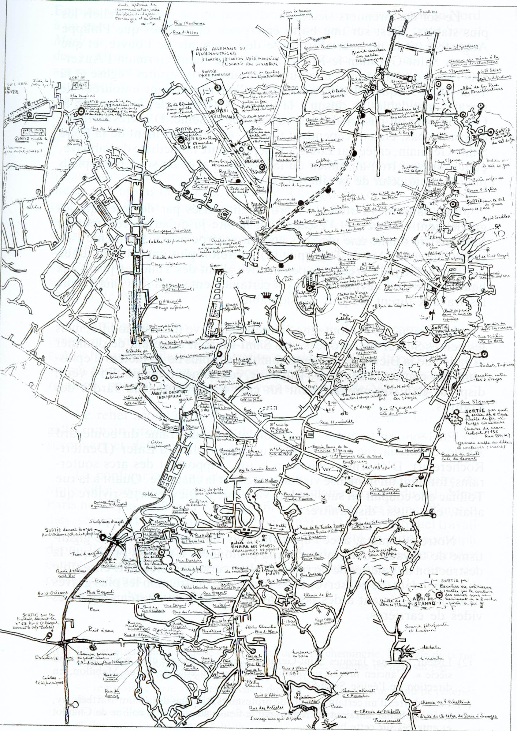
Voici un plan des légendaires catacombes parisiennes...En réalité, le terme "catacombes" est un abus de langage. Ce vaste réseau souterrain (quasiment 300 km de galeries sous la capitale française) correspond aux anciennes carrières de gypse et de calcaire extrait pour la construction de Paris. Cette exploitation minéralogique commença dés le 12ème siècle pour se terminer au début du 20ème. Les ossuaires municipaux ne représentent que 1,7 km et sont visitables via le musée "catacombes de Paris".
Aujourd’hui, une multitude d’amateurs de sensations fortes arpentes ces sous sols à la recherche d’anecdotes historiques gravées dans la roche. On y retrouve des salles, statues, sculptures, messages en tout genre, fresques, graffs et tags...
Mais attention, ces explorations urbaines pittoresques sont strictement interdites et une contravention spéciale existe dans le droit français à l’encontre de ces "Indiana Jones" des temps modernes. Le nombre d’entrées est limitée et elles se situent souvent sous des plaques à même la rue.
Ce réseau apparait comme un véritable labyrinthe et il est donc indispensable de descendre muni d’un plan ou d’une carte détaillée comprenant les carrefours, renfoncements, entrées, sorties, etc, ainsi que d’un guide expérimenté. Les galeries les plus profondes peuvent aller jusqu’à 40m sous terre. Bref, claustrophobe s’abstenir !!!
Pour plus d’informations, et une visite en images, vous pouvez consulter le site fcosinus.com
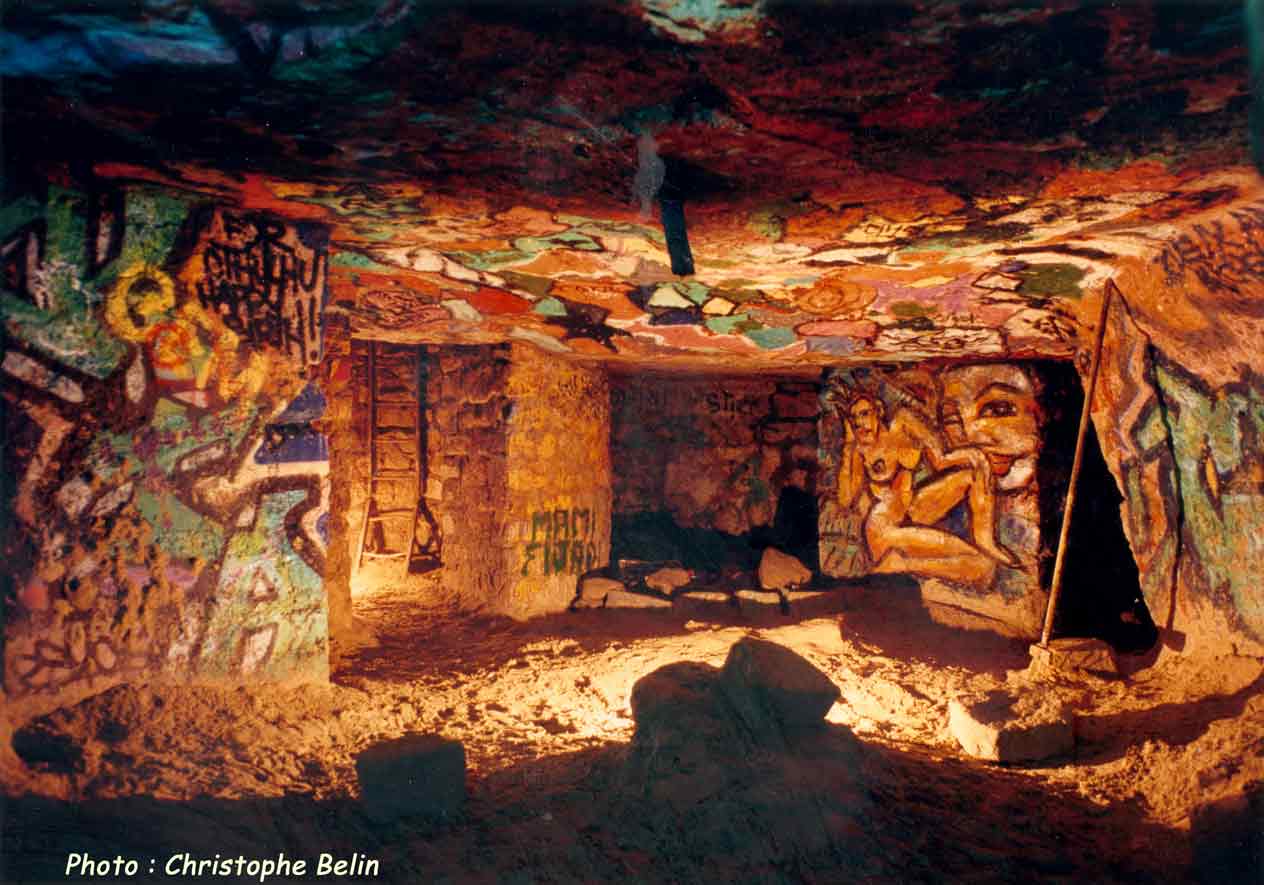
Voici la salle de "La Plage" située dans le 14ème arrondissement
les fleuves bougent et les militaires aboient!
from Harrisson
Interstices et propagande dans la cartographie, les fleuves bougent et
les militaires aboient!
Exemple de site utilisant des carto’s:
Christian Nold et Bio mapping
http://www.softhook.com/
http://www.biomapping.net/
http://www.emotionmap.net/
Même système d’utilisation de google earth pour localiser des assoc/...
http://nodel.org/seednodes.php?map=1 :
Plusieurs cartes de strasbourg (graff’ et caméras de surveillance) mais pas top niveau visuel
http://www.strasbourgcurieux.com/:
Université tangeante: (total autre genre)
http://ut.yt.t0.or.at/site/index.html
They rule (possibilité de réaliser ses propres diagrammes)
http://www.theyrule.net/2004/tr2.php
Du coup :
www.l-atlas.net
Portail cartographie de Wallonie
http://cartographie.wallonie.be/NewPortailCarto/index.jsp?page=GenInformationsGeo&node=11
Logiciel de "cartographie":
http://www.maptools.org/ reprends des outils open sources
http://www.apo33.org/bookmarks/wakka.php?wiki=CartographieLibre: idem + des exemples
http://mapomatix.sourceforge.net/: présentation de mapomatix
http://gollumlab.dyndns.org/mapomatix/cgi-bin/mapframe.pl?name=sf-Memory: ex de cartes réalisée
avec mapomatix
http://www.openstreetmap.org/ : logiciel libre de carto (non exploré)
http://www.cartographie.org/: officiel
http://c.asselin.free.fr/french/carto.htm: Sélection de moteurs et logiciels permettant de cartographier les résultats d’une requête (non exploré)
http://grass.itc.it/community/index.php : démonstration
une approche de la technologie SVG (utilisée par mapomatix) faite par
des cartographes:
http://www.carto.net/
voir la page d'exemples:
http://www.carto.net/papers/svg/samples/
Living archive: présentation des 3 workshops et comptes rendus
A project by Liz Kueneke that took place in Conflux, the annual New York festival for contemporary psychogeography.
“Manhattan’s Urban Fabric” is a public intervention which intends to show just a glimmer of this richness, and to make visible what normally remains invisible about a place: our opinions, impressions, and feelings about it. Participants answer various questions by sewing simple symbols into the map, and they are also welcome to embroider freely along the edges of the cloth. Through this work I want to offer a participatory experience to the people (and visitors) of Manhattan, which permits them to reflect upon their own use of the urban space. The project has two main goals. First, the communication between participants about personal memories and community issues is facilitated by the intimate act of “sharing a table” and commenting together about their shared city. Furthermore, the act of embroidering, which for some is a hobby, and for others a new experience, enhances the conversation. Second, the results obtained can be an important source of material for urban planning, or at the very least, as a jumping-off point to discussion. The patterns and nodes of responses created, can contribute to a wider understanding of the complexity of uses of the city.
See some documents of other works by Liz Kueneke at the Hangar’s website.
MAP-it is a hands-on tool used to plan, analyse and reconstruct past and future projects and spaces. It is a method to visualise a process in space and time, in a low-tech, open and flexible manner. It can be used in various situations, such as brainstormings, debriefings, interviews...
Mapping architectural controversies
Mapping Architectural Controversies (MAC) is an interactive website dedicated to students and researchers working on controversies surrounding design projects, buildings, master plans, and urban and development issues. Documenting and visualising recent controversies in architecture, it also aims to address a broader audience interested in the design of cities, spatial networks and built environments as well as planners, representatives of city government, NGOs and citizens. As it is a part of the EU-funded project MACOSPOL, Mapping Architectural Controversies draws on a variety of documental sources and visual methods to explore the multifarious connections of architecture and society.
Niger : it’s dunes, its rivers, its vast territory. its cultural diversity. its traditions. its abundant youth. its immense heat and its vast rains. Its problems with water (too much or not enough), poverty and corruption. sanitation and hygiene, as well as with its infrastructure.
‘Mapping for Niger’ is a collaborative mapping and social media project of young geographers of the Abdou Moumouni University of Niamey. We aim to share and discuss the realities of our country and to help you discover it as well. But as geographers we also have another goal : to put Niger on the map, literally and figuratively. To help you see not only its dunes and rivers but also the structure of its roads and education and health systems as an example.
http://mappingforniger.wordpress.com/2013/09/12/mappingforniger/
Book:
Mapping Hacks: Tips & Tools for Electronic Cartography (Hacks) [ILLUSTRATED] (Paperback) by Schuyler Erle (Author), Rich Gibson (Author), Jo Walsh (Author)
Description by the editor:
"Mapping Hacks is a collection of one hundred simple techniques available to developers and power users who want to draw digital maps. You’ll learn where to find the best sources of geographic data and then how to integrate that data into your own creations. With so many industrial-strength tips and tools, Mapping Hacks effectively takes the sting out of digital mapmaking.
Since the dawn of creation, man has designed maps to help identify the space that we occupy. From Lewis and Clark’s pencil-sketched maps of mountain trails to Jacques Cousteau’s sophisticated charts of the ocean floor, creating maps of the utmost precision has been a constant pursuit. So why should things change now? Well, they shouldn’t. The reality is that map creation, or "cartography," has only improved in its ease-of-use over time. In fact, with the recent explosion of inexpensive computing and the growing availability of public mapping data, mapmaking today extends all the way to the ordinary PC user. Mapping Hacks, the latest page-turner from O’Reilly Press, tackles this notion head on. It’s a collection of one hundred simple—and mostly free—techniques available to developers and power users who want draw digital maps or otherwise visualize geographic data. Authors Schuyler Erle, Rich Gibson, and Jo Walsh do more than just illuminate the basic concepts of location and cartography, they walk you through the process one step at a time. Mapping Hacks shows you where to find the best sources of geographic data, and then how to integrate that data into your own map. But that’s just an appetizer. This comprehensive resource also shows you how to interpret and manipulate unwieldy cartography data, as well as how to incorporate personal photo galleries into your maps. It even provides practical uses for GPS (Global Positioning System) devices—those touch-of-a-button street maps integrated into cars and mobile phones. Just imagine: If Captain Kidd had this technology, we’d all know where to find his buried treasure! With all of these industrial-strength tips and tools, Mapping Hacks effectively takes the sting out of the digital mapmaking and navigational process. Now you can create your own maps for business, pleasure, or entertainment—without ever having to sharpen a single pencil."
April 25, 18:00 - 20:00, in Recyclart
A roundtable meeting about cartography between An Mertens (and other members of
Saturdays, Woman and Free Software)
, Liesbeth Huybrechts (Cultural studies PHD KuLeuven, researcher, curator),
Nicolas Malevé (Tresor software, Towards.be) and
Peter Westenberg (Routes + Routines) investigating GEO data control, different layers
and perspectives on the art of mapping, subjective cartographic perception and /Home as private territory.
- w h e n : April 25, 18:00 - 20:00
- l o c a t i o n : Recyclart, GARE BRUXELLES-CHAPELLE, Rue des Ursulines 25, Brussels
The company Vision 20/20 that sells services like Track your Teen, Monitor your Child and Trace your Pet has now released a free service to track sex offenders in your area. Free because ’We want you safe’.
There are 650,000 registered sex offenders in America – and that number grows by about 25,000 every year. Wouldn’t you like to know if any of them are living in your neighborhood?Now you can!
In PerryGeo , Matt Perry has written an interesting article that questions the basis upon which such a service relies: mainly, its sources and the fear as a selling argument . And as he is a GIS person, he also shows the lack of precision of the maps produced and its consequences.

An article by Richard Stiennon that use diagrams (do we consider this as maps?) to demonstrate the differences between system calls in a Linux machine running the webserver Apache and a Windows machine running the IIS webserver. As he says, A picture is worth millions of words. Map based evidence?
Thanks Wendy for the tip.
Mapping the privatization of war
Un point de départ assez riche pour une série d’exemples de Cognitive Mapping, engagés dans la dénonciation de la politique américaine au Moyen Orient: Subtopia, a field guide to military urbanism


Entre autres, Mapping the “War on Terror” :
The map was assembled by the “mutual support network” and rushed to press just before the invasion of Iraq in March 2003. The map has a low-tech, DIY aesthetic, designed to be reproduced by photocopy on the front and back of a standard sheet paper. The icons are composed of cut paper, arranged on a found map. The map was available at progressive bookstores around town, and was distributed at organizing meetings for various protest events. The list of weapons makers, media companies, and military recruiters helped locate the discussion around the March 27, 2003 direct action. Rockefeller Center ultimately was chosen for its proximity to several points on the map.
et ...
“The Privatization of War: Colombia as Laboratory and Iraq as Large-Scale Application”.
Commissioned for the Gwangju Biennial, this collaboration between artist Lize Mogel and writer Dario Azzellini diagrams the relationships between the United States and private military contractors (PMCs); and their activities in Columbia and Iraq. These nations are two key sites that exemplify PMC operation in the new world order.The privatization of military services is a worldwide business worth $200 billion a year. PMCs are an enormous part of this economy, offering "products" from logistics (such as building and managing military camps and prisons) to strategic support (radar and surveillance) to open combat and special sabotage missions. PMC corporations are based globally, and recruit heavily in the global south.
(plus d’infos à ce sujet, sur Critical Spatial Practice)
Intérêt tout azimuth pour la cartographie collective. On commence déjà à avoir des difficultés à suivre!
Entre autres dans le dernier numéro de la revue autrichienne d’art contemporain Springerin : Maps for the People : Contemporary Web projects on issues of cartography and territorial representation par Alessandro Ludovico
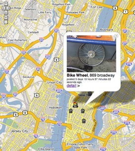 Le chapeau : "The representation of territories plays a historical role in the privileges of power. The ownership of the geographical data has always been in the hands of those in power. These days, however, the reappropriation of territorial representation described and shared in the form of a personal perspective is imminent, owing to new collaborative tools and the resulting mutation in the map’s value. It will never again be granted by power structures, but built by individuals.
This also has to do with the strength of global trade and the power to construct, with huge amount of money, a business and aesthetic model that is popular in most countries. These models have to be quickly and highly profitable and »funny« at the same time. But these development models are not only dubious but also culturally dangerous, because they compete side by side with the local economic and social culture."
Suit la description de quatre projets :
http://www.delocator.net/
http://www.where-next.com/
http://mapomatix.sourceforge.net/
et http://www.garbagescout.com/ qui propose de cartographier les trésors déposés sur la voie publique en attendant leur enlÚvement...
Maps of Babel - A very interesting contribution of Giorgia Lupi, Salvatore Iaconesi, Luca Simeone and Paolo Patelli at the Human Cities symposium, held in Brussels the 15th and 16th March 2012.

Frida V. is a rugged and comfortable bicycle equipped for efficient exploration and mapping of public urban spaces. It carries a small computer, GPS positioning device, 802.11 wireless network transciever and a basic audiovisual recording unit. The consolidated software and hardware assembly enables automated mapping of stumbled wireless networks, easy creation of location-tagged media and opportunistic synchronization with a server resource on the internet. In other words, let the warriding and rideblogging begin!
Read more orwatch the video (you will need thevlc player)
Thanks Wendy!
Meipi est une plateforme collaborative qui permet aux utilisateurs de publier des informations et des contenus sur un plan de ville. Les meipis choisis se réfère à un contexte spécifique. Celui-ci peut être local s’il représente une entrée sur un lieu donné ( un meipi de Grenoble par exemple) ou thématique s’il correspond à des sujets précis ( un meipi des villes belges).
Un meipi permet donc à une communauté d’utilisateurs de rassembler l’information concernant un endroit, une thématique et ainsi constituer une base de données collaborative.
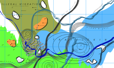
MigMap conveys a picture of how and where the production of knowledge is currently taking place in the area of migration – and of who is participating in and has access to it. MigMap investigates precisely how the new forms of supranational governance that can be observed in the European migration regime function. It looks, for example, at how European standards in politics and civil society are implemented, and at the authorities, persons and institutions taking part in this process. It examines how the various key players in the public and private spheres are interrelated and funded, as well as at the ways in which these spheres overlap or differ in terms of focus, location or personnel. Finally, it analyses how responsibilities are allocated and legitimised – and explores the theories, data and discourses upon which current paradigms in migration are based.
The four maps “Key Players”, “Discourses”, “Europeanisation” and “Places + Practices” are online here
More than the sum of the parts

In his PhD’s dissertation, Ben Shaw discusses «how shared representations enhance design collaboration. I draw on examples from my field study at NASA’s Jet Propulsion Laboratory, where real-time teams have radically accelerated the design of next generation exploratory spacecraft and science missions to Mars. My results highlight the roles representations play in generating possibilities, synthesizing perspectives and consolidating commitment to action, thereby helping collaborative groups bring about preferred futures.»
For his dissertation he created a few network animations of the Nasa designers team meetings.
«The behavior of these networks reflects important aspects of the interaction taking place in a design meeting at any given time, including the level of support and commitment expressed for different proposals, the extent to which participants engage one another’s points of view, and the degree of integration of shared representations in conversation. This behavior can be visualized using animated layout diagrams such as those below (produced with a program called SoNIA and viewed in Quicktime movies). The qualitative information conveyed by these diagrams can be complemented by applying numerical metrics to the network structures, as described in the dissertation.»
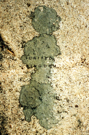
There is a type of lichen which is very common in the Finnish archipelago and my family’s summer house sits on a large granite hill covered with it. I have always seen certain shapes as islands or continents, and decided to affix rub-on letters directly to the lichens to identify them as the places I recognized. When I had finished, the whole hill had become a kind of scrambled atlas.
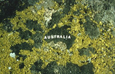
Number two is out ! Nummer twee is uit ! Le numéro deux est sorti !

[ EN ]
The new towards publication is out.
It contains :
– a history of the project including the numerous workshops and talks that happened the last two years.
– the schemes, ideas and plans for Tresor, a route accross free softwares for a subjective and collective cartography
– an overview of the maps collected in the framework of our nascent atlas of the subjective maps of Brussels
Using the tools and ideas explained in the Tresor section of the publication, we produced the cover. The code we have written at this occasion as well as an explanation of the process is available here.
Special thanks to the PEPRAV network for making this second publication possible and to Rafaella for her wonderful redactional work, insights and energy.
This publication is released under the terms of the Free Art License and you can download it here (45 Mb).
[ NL ]
Sinds enkele dagen is de tweede editie van onze tweede krant verschenen in een oplage van 3000 exemplaren. 8 goed gevulde pagina’s zijn het resultaat van meer dan 9 maanden voorbereiding. De grotendeels engelse inhoud bestaat onder andere uit :
– hoogtepunten van twee jaar activiteiten
– een selectie uit onze atlas
– een verklarend schema van het Tresor software-platform
– alle posts die op dit blog gepubliceerd zijn verwerkt in een cover-beeld
Gepubliceerd onder de Free-Arts licentie
Je kunt de krant ook downloaden (45 mb)
[ FR ]
Notre deuxième journal est sorti à 3000 exemplaires de chez nos fidèles imprimeurs depuis quelques jours. Plus de neuf mois de préparation pour un huit pages bien tassé.
Au sommaire, principalement en anglais :
– Le point sur plus de deux ans d’activités
– Une sélection parmi notre atlas
– Un schéma explicatif complet de la plateforme logicielle Trésor
– Et une couverture qui reprend tous les post publiés sur ce blog depuis le début !
Publié sous licence art libre il est aussi disponible au téléchargement (45 Mb).
Pour répondre à une question récente (« Où se passera la semaine de workshop Busboitescartesmaps ? À Recyclart. ») d’une manière plus cartographique, utilisons Openstreemap dont la qualité ne cesse de progresser !
En utilisant le rendu Mapnik (proposé par défaut) :
En utilisant le rendu OSmarender (proposé en alternative) :
Et pour pousser plus loin la découverte de la modification de rendu à partir d’une base de donnée GIS : http://tile.openstreetmap.nl/ panman/styledit/
Invitation Observatoire des déambulations
Du 27 fevrier au 2 mars
et
du 14/03 au 16/03
Dans la caravane, nous vous invitons à nous raconter votre quartier. Autour d’une tasse de café//thé//soupe. Dans le but de réaliser ensemble une carte insolite et poétique
02/488.662.745
plantation@atelierspopulaires.be
http://im-plantation.blogstop.com
On Psycho/Subjective Geographic Systems
PGS versus GPS : On Psycho/Subjective Geographic Systems
by elpueblodechina dialoguing with yves degoyon ( MapOMatix )

A subjective positioning system would be developed after working on questions such as what is the meaning of location when the activities that are mapped are constituted by human practices? Some inmaterial entities are missing in the mapping of human activities, for example, how can you trace the influence of a writer in a network of conversations? When trying to give location to the inmaterial, ephemeral, distributed and non objective nature of for instance, human labor, human play and civil participation, it seems that all monitoring - based systems will fail in locating the subjective nature of flows of human activity and the processes involved.
[...]
The use of Global Positioning System becomes powerful for independent media practitioners when it can survey the activity of police or other control forces. In this sense, it can be seen as useful when it counterbalances the forces of world government (*) but, even in this case, it reveals itself as insufficient since a place as a set of geographical coordinates does not contain the experience of the place. Furthermore, it fails when it’s used in in dependen t practices if we consider that it makes a lot of sense in terms of
market logic.
[...]
Spotting geographical locations, targeting and navigating are some narratives attached to GPS that are not so far from militar logistics or other kinds of methods based on stratification, verticality, identification, separation and distinction. We can relate to experience in different ways not all based on stratifying processes. A far more interesting ground of experimentation comes for instance from projects working on ways of materializing openness and the gift.
A geo-wiki as mapOmatix points towards a reinvention of locality, not as a source of time stamped information but as a ground for narration. These practices bring to the global space of the internet a structural shift in the modes of relation to experience. As narratives composed by open nodes that enlight a distributed conversation, different dialogues are being assembled as units of the multitude (monades (**) ). These horizontal networks contain a space to participate and experiment developing models different from those of consumption.
* Nightmarruecos map made by indymedia estrecho
** Monads in the sense of myriads of infinitesimal changes :Gabriel Tarde (1893) Monadologie et sociologie.
Read more online
Jeudi soir. On se prépare à une nuit blanche pour terminer la publication (de moins en moins catalogue) de 16 pages qui fait le point sur l’expo Cartografie et les quelques développements en cours. Livraison à l’imprimeur Delferrière vendredi matin, 8h. Et là, on vient d’apprendre qu’on a jusque mardi matin, les traductions en anglais pour la couverture à encarter dans Janus n’étant pas arrivées... Coupette!

Online surveillance map Zurich
«The organising committee of the Big Brother Awards Switzerland has published a map of more than 70 video surveillance cameras in a city district of Zurich (Switzerland). The map was presented on the occasion of a public camera-spotting walk on 10 April 2004, that was organised as part of the annual ’Spring surveillance’ events.
Most of the cameras are installed by private entities, some of them are dummies. The cameras are categorised by a special typology.»

Interesting maps half-way between architect plans and electric circuitry. Available for download with instructions on how to fold and print. Also notice the effort made for the icons in the legend.

And also other links to surveillance cameras websites.

[EN]
On sunday the 16th of September Constant organises an Open Street Map
event in Brussels. We will collect GPS tracks in the center of Brussels
and upload them to the database of Openstreetmap.org. A warm welcome to
everyone who wants to help walk, cycle and help us upload and anotate the
traces. We aim to tackle the whole pentagon of Brussels, if we don’t make
it in one day, we’ll continue some other day. We will provide coffee, tea
and a warm hangout.
Meetingpoint:
-------------------
Sunday 16 september, 11:00
RECYCLART,
Station Bruxelles-Chapelle,
Rue des Ursulines 25
1000 Brussels
If you have a bike? Please bring it along!
Do you have a GPS device? Take it with you!
You don’t own a bicycle or GPS but you would like to use one?
please let us know:
Constant has 6 GPS devices to be used, and bikes we can rent easily.
[FR]
Ce dimanche 16 septembre nous organisons une Open Streetmap party. Nous allons collecter des traces GPS de Bruxelles et les ajouterons à la base de données d’Openstreetmap.org. Tout le monde est le bienvenu pour parcourir la ville à bicyclette et récolter des traces ou pour aider à les uploader et les annoter. Le but de cette journée est de quadriller et tracer les rues du pentagone de Bruxelles. Nous fournirons du café, du thé et un espace de travail.
Poin de rencontre:
-------------------
Dimanche 16 septembre, 11:00
RECYCLART
Gare Bruxelles-Chapelle
Rue des Ursulines 25
Bruxelles 1000
Vous avez un vélo? amenez-le!
Vous avez un GPS, amenez-le!
Si vous n’avez pas de GPS (ou de vélo), mais vous voudriez en utiliser
un, faites-nous signe: Constant a six GPS à prêter et des vélos peuvent être facilement loués.
[NL]
Op zondag 16 september organiseert Constant een Open Streetmap evenement.
We verzamelen GPS tracks in Brussel en voegen die toe aan de database van
Openstreetmap.org. Iedereen is van harte welkom om mee te fietsen en mee
te helpen de tracks te uploaden en annoteren. Het doel is om de gehele
vijfhoek van Brussel te traceren en in kaart te brengen. We zorgen voor
koffie, thee en een warme uitvalsbasis.
Heb je een fiets? neem hem mee !
Heb je een GPS? neem hem mee !
Als je geen fiets of GPS hebt, maar je zou er graag een willen gebruiken,
geef ons dan een seintje:
Constant heeft 6 GPS apparaten te leen en fietsen kunnen we regelen.
Onmoetingspunt:
-------------------
Zondag 16 september, 11:00
RECYCLART
Station Brussel-Kapellekerk
Ursulinestraat 25
1000 Brussel
Open StreetMap, Brussels, at Actic 06-01-08
A quick dump of links collected for the Openstreetmap meeting at Actic this Sunday.


openstreetmap:
http://www.openstreetmap.org/
opengeodata:
http://www.opengeodata.org/
AND gives data to Open StreetMap:
http://www.opengeodata.org/?p=223
Potential_Datasources:
http://wiki.openstreetmap.org/index.php/Potential_Datasources
Example of recycling openstreetmap data:
http://www.camcycle.org.uk/resources/citycentre/
Tools:
http://blog.johnmckerrell.com/2007/12/...
Belgium:
http://wiki.openstreetmap.org/index.php/Belgium
osmarender:
http://wiki.openstreetmap.org/index.php/Osmarender
http://wiki.openstreetmap.org/index.php/Osmarender/Howto
josm:
http://www.towards.be/wiki/doku.php
outputs:
http://wiki.openstreetmap.org/index.php/Category:Outputs
source:
software:
http://svn.openstreetmap.org/
data:
http://wiki.openstreetmap.org/index.php/Planet.osm
using:
http://wiki.openstreetmap.org/index.php/Using_OpenStreetMap
OPENSTREETMAP in Brussels this Sunday
Benjamin Henrion who joined the July cartography workshop talked about the openstreetmap project(1). This Sunday, he will organise a first test of open cartography of the center of Brussels.
How do we do?
Meeting Point at 10 AM Brussels Grand Place with your bike and a GPS. We will wander through the streets of the city center.
Meeting Point at 1PM at Constant’s office 5 rue du Fort, 1060 Brussels to process the data acquired in the morning and upload them on the openstreeetmap’s website. http://www.openstreetmap.org/
Please add yourself on the participants list here.
(1) about openstreetmap:
OpenStreetMap is a project aimed squarely at creating and providing free geographic data such as street maps to anyone who wants them. The project was started because most maps you think of as free actually have legal or technical restrictions on their use, holding back people from using them in creative, productive or unexpected ways.
And:

Spanish OSMers got permission to import goverment data into OSM. The first task has been importing the "ROI" geodesy network; supposedly this is the first time that data from a National Mapping Agency is imported directly into OSM. "ROI" stands for "Red de Orden Inferior", or "Lesser Order Network".
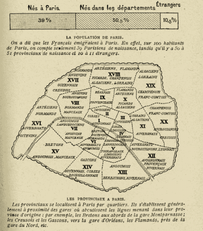
Cette carte issue du blog "Strange maps" révèle que de nombreux parisiens ne sont en réalité que des migrants issus des différentes provinces française. Bien que réalisée en 1920, cette carte porte en elle un clivage Paris/Province aujourd’hui toujours présent qui reste très marqué dans l’imaginaire collectif. A Paris, lorsque l’on désigne une Région française, on parle de Province (ainsi un habitant de la ville de Marseille devient un provinciale au même titre qu’un habitant de Nantes). En opposition, "le Provinciale", parlera de "Parigot" pour désigner un habitant d’Ile de France. Dans les deux cas, ces termes ont une connotation péjorative et ils renvoient souvent à l’opposition existante entre la ville et la campagne. La Fontaine l’avait déjà souligné au 17ème siècle avec sa fable "Rats des villes, rats des champs".
Un autre élément compris dans la légende semble également intéressant à souligner : les provinciaux arrivant à Paris ont tendance à s’installer aux alentours des gares qui desservent leurs Régions d’origines. Ainsi le 12ème arrondissement contient principalement des Avignonnais, des Provençaux et des Lyonnais alors que le 19ème accueille des Alsaciens, des Lorrains et des Franc-comtois.
The first volume of the osgeo (Open Source Geospatial Foundation) journal is out.
The OSGeo Journal is a digital publication containing case studies, news, tutorials, project updates and more. With a general aim at promoting, highlighting and educating readers about open source geospatial applications in general, but also provides updates on OSGeo projects.
Link to the complete issue in pdf
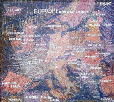
In the early 1990s, renowned graphic designer Paula Scher began painting small, opinionated maps—colorful depictions of continents and regions, covered from top to bottom by a scrawl of words. Within a few years, the maps grew larger and more elaborate. “I began painting these things sort of in a silly way,” Scher, a partner at the Pentagram design firm, said in a recent conversation. “And I think at one point I realized they would be amazing big. And I wondered if I could even do it. If I could actually paint these things on such a grand scale, what would happen ?”
“Paula Scher : The Maps”—on view at New York’s Maya Stendhal Gallery until December 17—is the answer to that question. The exhibition presents twelve painstakingly detailed map paintings—of the United States, South America, Africa, Japan, and the world—spanning five to twelve feet in width and teeming with the neatly lettered names of countries, cities, and landmarks. The results are remarkable. http://www.metropolismag.com/story/20051110/paula-schers-atlas-of-the-world
À partir de Libé Labo, un peu off-topic ?
"Subprimes : une tragédie américaine
A Cleveland, dans l’Ohio, la crise du crédit immobilier a laminé la ville. Notre correspondant aux Etats-Unis Philippe Grangereau a suivi deux couples en passe d’être expulsés de chez eux car ils ne pouvaient rembourser leur prêt dit « à surprime ». Chaque jour, la police effectue onze expulsions. Chaque lundi, des centaines de maisons sont mises aux enchères par le Shériff, mais personne ne les achète. Des quartiers entiers ont été pratiquement vidés de leur population. Des dizaines de milliers de logements sont laissées aux « looters » (pillards) qui arrachent la plomberie en cuivre, les portes, les fenêtres, les parements en aluminium, pour les revendre au prix de la ferraille."
12 minutes.
I just wanted to suggest a few tools for mapping photos of Brussels.
For example here is a links for the Panoramio tool that shows some of the current images http://tinyurl.com/2mclon
Most of these images are touristy views of buildings and landmarks but it could be used to show mores intersting things. In paticular this might be useful for documeting urban actions happening all over the city.
2 tools for embedding geo tags for Flickr:
http://www.flickrmap.com/tutorials/google_earth.php
http://webdev.yuan.cc/gmif/
Make maps for tags from Flickr:
http://flyr.whatfettle.com/
Some general links:
http://www.ogleearth.com/links.html
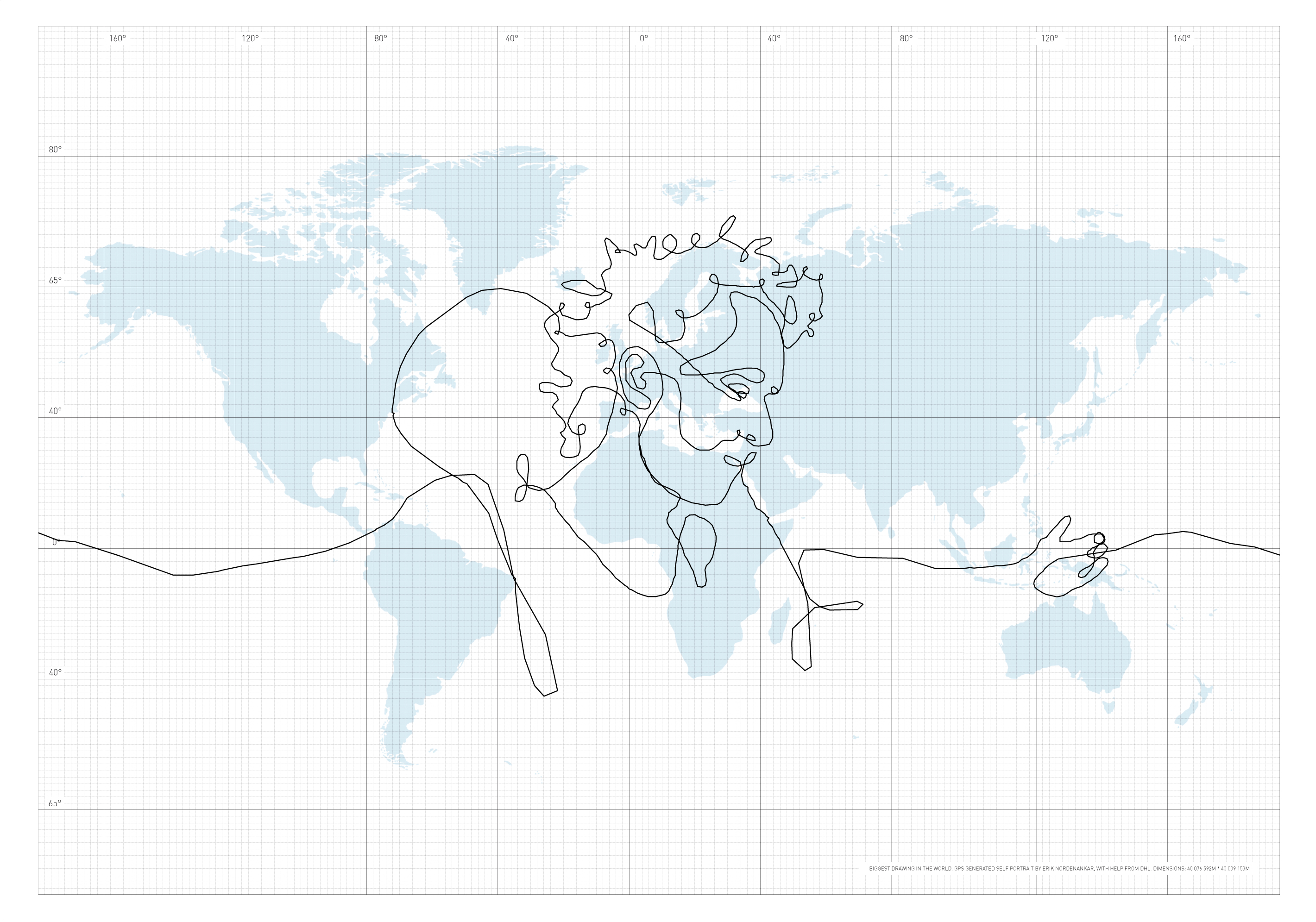
"The briefcase became my pen, the world my paper". Cette auto-portrait d’Erik Nordenankar a été réalisé grâce à une valise GPS qu’il a fait voyager aux quatre coins du monde via DHL. Le tracé virtuel s’étend sur 110 066 kilomètres : il peut donc prétendre à obtenir le titre "du plus grand dessin du monde". Retrouvez le tracé exacte ici
source : cartographie

Découvrez le travail de Proboscis sur le Net et notamment leur projet URBAN TAPESTRIES...
Proboscis part du principe selon lequel beaucoup de gens aimeraient laisser leur marque dans la ville si on leur en donnait l’occasion. Fort de cette intuition, le groupe s’est attelé à la conception d’outils d’annotation de la ville qui intègrent notamment un prototype de logiciel fonctionnant sur un téléphone portable connecté à un réseau GPS. Un groupe de participants a été convié à essayer ce prototype afin d’annoter un territoire donné sous forme de texte, de son ou de photographie (ou les trois à la fois) que l’on peut rattacher à une adresse spécifique. Les annotations ont ensuite été réunies en « chaînes » afin de constituer des circuits architecturaux, des feuilletons, des poèmes spatialisés ou encore des histoires de famille, visitables depuis Internet. Pour Proboscis, ce territoire annoté est bien plus qu’une simple représentation cartographique de l’espace social, imaginaire et anecdotique : quoi qu’immatériel, il s’agit bel et bien d’une construction, d’une chambre à nuages qui induit une spatialisation de l’espace social. A la manière des villes construites, qui superposent à travers le temps des espaces matériels, les Tapisseries Urbaines pourraient donc devenir des palimpsestes virtuels d’annotations qui se juxtaposeraient à travers le temps, visitables par nos successeurs dans quelques générations. Parallèlement à cette spatialisation virtuelle du social, chaque personne qui « annoterait » le territoire deviendrait donc architecte de son propre parcours, induisant une démocratisation ou plutôt une socialisation du spatial.
Project report "Busboîtescartesmaps"
More than time for a project report on Busboîtescartesmaps project that took place last November.
The project proposed to the participants to drift within Brussels using the post boxes as elements to create their itinerary. The walks were conducted by several guides (Peter Westenberg, Christina Clar and Natasha Roublov, Lottie Child) who imagined different experiments to understand space and urbanism differently.


This project was the occasion to make a first software prototype, using the Tresor’s toolbox, to record the meanderings of people in the city.
Here follows a series of notes explaining the first steps of the project.
The scenario goes like this. We select a series of spots in Brussels. These spots correspond to the postboxes spread in the center of the city. Their locations cover a wide range of places and environments, you can find them near schools, streets with heavy traffic, dead end streets, parks, etc.

A group of people go in the city with an audio recorder and a GPS and visit the spots. The clocks of the GPS and the recorders are synchronised. The GPS records all the time the tracklogs of the people and the audio device capture the sound for the whole duration of the walk. When they come back after the walk, the GPS data and the audio data are copied on a computer. By comparing the time code of the GPS track and the start time of the audio track, we can extract audio segments based on location. we can extract the audio recorded by the walkers when they were nearby the spots.
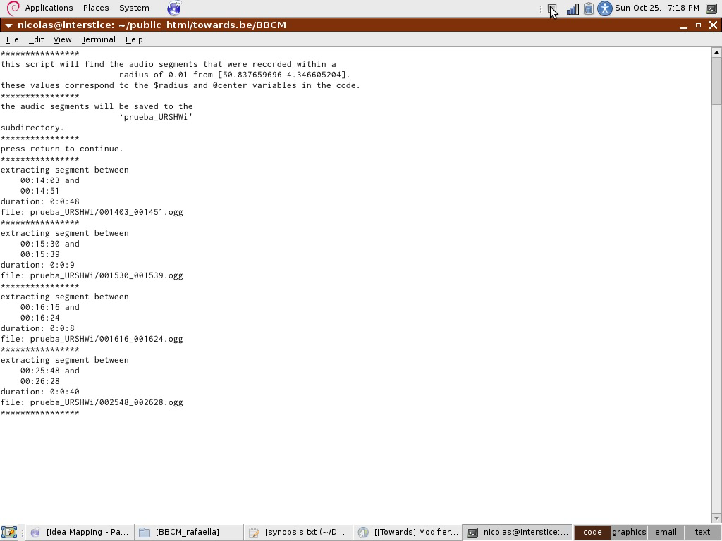
These audio segments can then be placed on a digital map where the visitors can listen to them. The interface allow them listen to the chaos of all the sounds they have recorded near the spots or to select the sounds one by one, turn them on and off.
Samples:
Some walks have concentrated on the atmospheric sound, recording the ambient atmosphere( ie. pool_atmosphere_long.ogg), or interacting with it (scratching the surface with shoes ie. scratching_the_ground.ogg).
Other guides gave instructions like describing aloud what one was seeing (STE-003-workingcopy_00m_43s_40h__01m_25s_90h.mp3, STE-003-workingcopy_35m_43s__38m_59s_40h.mp3, STE-003-workingcopy_09m_01s_80h__10m_37s_60h.mp3, STE-003-workingcopy_51m_30s__55m_28s_60h.mp3,STE-003-workingcopy_15m_55s_50h__19m_37s.mp3,STE-003-workingcopy_23m_17s_40h__27m_52s_90h.mp3)
Etc etc.
Interface:
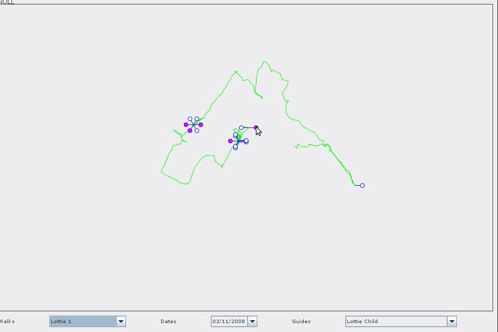
By default, the software lets you listen to the ’mumbling’(all_walk-5.ogg,all_walk-0.ogg) of the whole last walk, or to select individual takes within this.
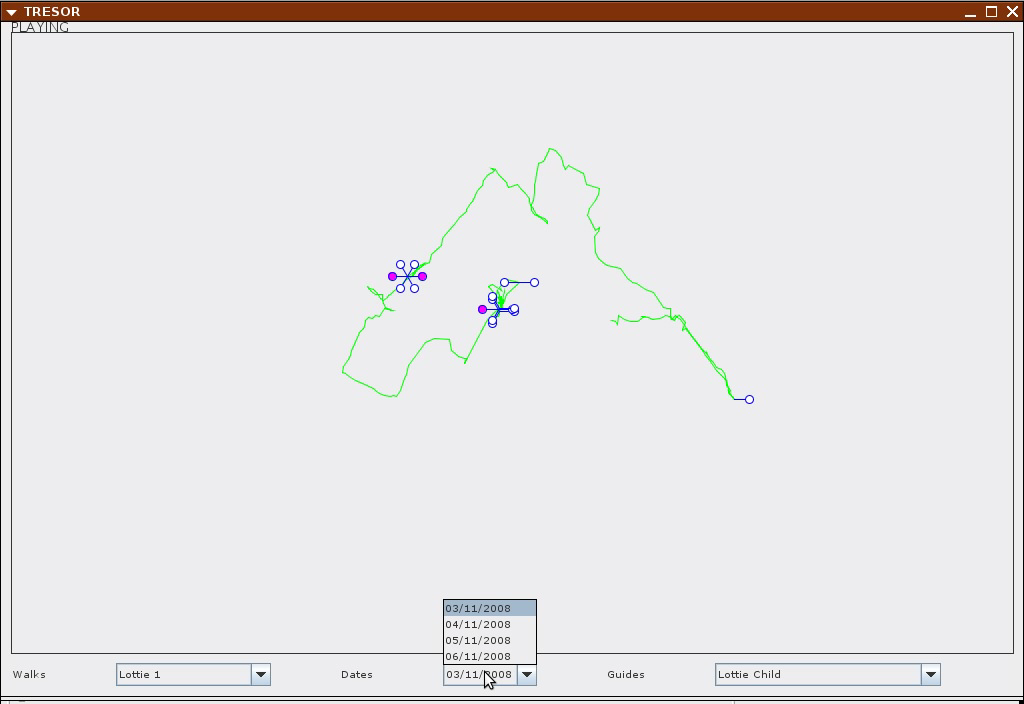
Using the menu, you can chose a walk or chose a date or a guide.
Software in use:
openstreetmap, setting the coordinates
gpsbabel, can extract data from a gps unit. can also select data by region and time
sox, given a start time, it can cut audio fragments for a certain duration
mp3splt, cuts an mp3 file in segments
gstreamer allows for playing audio files concurrently
perl, php and java to glue the elements.
The software prototype has been developed by Ivan Monroy Lopez and Nicolas Maleve. The pre-alpha soon available for download.
Public hearing on the World Bank

TheWorld Bank Campaign Europe is organizing a Peoples Tribunal in The Hague, Netherlands, on 15 October 2007. In this framework, they are looking for artists to produce a map based on the different testimonies (see highlighted paragraph below). Interested? Reply to this message and leave your coordinates or drop a mail to nicolas AT constantvzw.com
EventThe World Bank Campaign Europe is preparing a Public Hearing in cooperation with the Permanent Peoples’ against the World Bank, to be held in The Hague, Netherlands, on 15 October 2007 - a week before the annual meetings of the World Bank.
Witnesses from all Southern continents will give testimony of the impacts of World Bank policies and practices, especially in the areas of conditionalities and/or extractive industries. Well-known and respected experts will listen to testimonies from all parts of the world about the impact of World Bank financing. The witnesses will answer questions from the experts as well as the audience. In the evening, the expert panel would convene to draft a declaration to be presented the next morning in a press conference. There will be a live video streamlining for the entire event.
People for the expert panel will be Maartje van Putten(currently AfDB inspection panel member, Netherlands), Emil Salim (EIR Eminent Person, Indonesia), Elmar Altvater (economist, Germany), Francesco Martone (Senator, Italy). We are also inviting Susan George and Medha Patkar.
As witnesses we invited Gustavo Salgado(President of Nicaraguan National Consumer’s Network) on electricity privatisation (tbc), Miguel Palacin (President of Peru’s Mine Affected Communities and CONAI Indigenous Network) on policy conditions related to mining, a speaker from Ghana or Mali on the impact of water/cotton sector liberalisation (tbc), Michael Karipko (campaign officer of Environmental Rights Action, Nigeria) on West African Gas Pipeline, a speaker from Kazachstan on Kashagan Pipeline (tbc).
The hearing will focus on the impact of the economic conditionalities and fossil fuel project financing. The expert panel will listen to testimonies from all parts of the world about the impact of World Bank financing. The witnesses will answer questions from the experts as well as the audience and present accompanying images. The expert panel will convene at the end of the day to draft a declaration on the basis of what they heard. The declaration will be presented with specific demands to the World Bank and European governments at a press conference the following morning Oct 16.
We would like to involve mapping artists who would get information about the different testimonies beforehand and would develop maps reflecting the content. This could be presented between the testimonies. It could also be interesting to have an extra space for a map that could be created by the artists and the audience together - if possible. That were the ideas that came up in our meetings and I would be very happy to exchange about these and other ideas.
Redes digitales y espacio físico
Medialab Prado organises a «production workshop, talks and seminars around geospacial web and geosemantic web, web 2.0, place blogging, urban markup, open source mapping tools, locative art and locative gaming.»

Their list of selected projects looks impressive.
Earlier workshops include Visualisar and its Advanced Project Production Workshop Showcase.
Remapping the world : International conference of critical geography
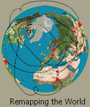
Imperialism and Resultant Disorder : Imperatives for Social Justice - 3-7 December 2007 - Mumbai, India
Between 1997 and 2005, four Critical Geography conferences have accomplished much toward elaborating and refining critical geographies by stimulating constructive debates, collaborative projects, and building connections among critical geographers and other scholars and activists worldwide (see the International Critical Geography Group web site, http://econgeog.misc.hit-u.ac.jp/icgg/). Following these highly successful events, we invite you to join us, the International Critical Geography Group, for the Fifth International Conference of Critical Geography in Mumbai, India, 3-7 December 2007, at the Tata Institute of Social Sciences(TISS).

Conformal Eisenlohr BL1sph(8/8)7_98

ApianusII BL3cyl7_98
A series of works by the artists Lilla LoCurto/Bill Outcault
After seeing Buckminster Fuller’s Dymaxion World Map, a projection of the earth on a flattened icosahedron, we began working on the idea of using computer technology to transfer the details of our physical bodies onto two-dimensional surfaces. Representing three-dimensional objects on two-dimension surfaces has been a concern for artists through the centuries and the concept of simultaneity, where all views of an object are experienced at once was a major theme of the Cubists and Futurists. We conceived selfportrait.map to explore this in a contemporary way using new digital imaging tools.The earliest map projections were produced by first visually and later mathematically projecting three-dimensional details onto two-dimensional surfaces and with the advent of computers ever more complex objects could be electronically recorded and transformed. As artists accustomed to working with physical materials like clay, stone or steel we considered the manipulation of three-dimensional forms in virtual space, like map projections, as a non-traditional extension of the sculptural process.
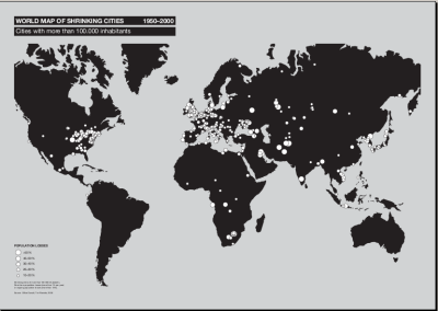
Title: "World Map of Shrinking Cities 1950 - 2000"
Graphics, 2006
(c) Project Office Philipp Oswalt
Whether in the USA, Britain, or Belgium, Finland, Italy, Russia, Kazakhstan, or China: everywhere, cities are shrinking. The dramatic development in eastern Germany since 1989, which has led to more than a million empty apartments and to the abandoning of countless industrial parks and social and cultural facilities, has proven to be no exception, but a general pattern of our civilization. Shrunken cities contradict the image, familiar since the Industrial Revolution, of the "boomtown", a big city characterized by constant economic and demographic growth. Shrunken cities spur a reconsideration not only of traditional ideas of the European city, but also of the future development of urban worlds. The drastic changes in cities caused by shrinking thus present not only an economic and social, but also a cultural challenge. Urban shrinking can hardly be affected by city planning, and it brings numerous problems. New types of cities arise; we do not yet have ways of thinking or of using their specific character.
A project initiated by Federal Cultural Foundation
software commit visualisations

Codeswarm by Michael Ogawa.
«This visualization, called code_swarm, shows the history of commits in a software project. A commit happens when a developer makes changes to the code or documents and transfers them into the central project repository. Both developers and files are represented as moving elements. When a developer commits a file, it lights up and flies towards that developer. Files are colored according to their purpose, such as whether they are source code or a document. If files or developers have not been active for a while, they will fade away. A histogram at the bottom keeps a reminder of what has come before.»
http://vis.cs.ucdavis.edu/ ogawa/codeswarm/
The code:
http://code.google.com/p/codeswarm/
http://code.google.com/p/codeswarm/wiki/GeneratingAVideo
It is worth looking also to the VIDI group of which Ogawa is a member.
http://vidi.cs.ucdavis.edu/publications
http://vis.cs.ucdavis.edu/...treemaplayout-final.pdf
Thanks Wendy for the info.
Statistiques qui poussent depuis les profondeurs enfuies des bases de données souterraines
Hans Rosling, expert suédois en statistique et médecine, est le promoteur très efficace de Gapminder, une intéressante interface de production de statistiques animées, récement rachetée par Google... Son graphisme assez rudimentaire rends peu justice à la finesse de ses critères et à la justesse de ses choix, mais c’est accessoire. Après avoir essayé le système, il faut voir Monsieur Rosling commenter live avec exhaltation les chiffres évoluants simultanément année par année aux très branchées conférences Ted de Monterey (BMW-powered). Et voir comment en 2006 puis en 2007 il insiste avec une vigueur communicative et visuelle sur les articulations sensibles des données qu’il manipule est plutôt ravigorant ! Irrésistible et bien sur culte.
"Nocturne, of Chopin, so beautiful music. But few people will appreciate the music if I just show them the notes. Most of us need to listen to the music to understand how beautiful it is. But often that’s how we present statistics ; we just show the notes we don’t play the music."
2006 :
2007 :
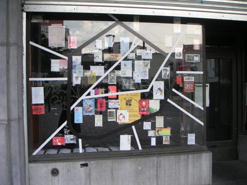
The brains of London cab drivers

«In a study that generated considerable media interest (and won her an Ig Nobel Prize), in 2000 Dr Eleanor Maguire scanned the brains of 16 London black-cab drivers, who had spent an average of two years learning ’the Knowledge’ – street names and routes in London. The taxi drivers had a larger right hippocampus than control subjects, and the longer they had been on the job, the larger their hippocampus was. These findings seem to indicate that the right hippocampus plays an important role in storing spatial memories.
[...]
"When we travel down a route we are familiar with, we often can’t see our destination. Instead, we have an image of it in our mind, and a mental map of how to get there. But this mental map is very different from a street map. I’m trying to understand how we create internal three-dimensional representation of space and our position within it."
She is also interested in another form of memory, linked to spatial memory, which appears to be mediated by the left, rather than the right hippocampus. "Having created an internal representation of large-scale space, how do we structure episodic memories – particular events and personal experiences that occurred at a specific time and place – within that environment?" »
Read more or watch the video on the National Geographic website
The Map Is not the Territory ?!
Wednesday, April 16th | 19:30-22:00hrs_Piet Zwart Institute | Mauritsstraat 36 | 3012 GC Rotterdam (The Netherlands).
Public event : "The Map Is not the Territory ?! - Mapping as critical investigation".
With : Bureau d’Etudes (FR), Theo Deutinger (AU/NL), Christoph Wachter and Mathias Jud (CH), Michael Murtaugh and PZI Media Design M.A. students ; introduction by Florian Cramer.
A Global Sense of Place – by Doreen Massey
From Space, Place and Gender. Minneapolis : University of Minnesota Press, 1994.
Imagine for a moment that you are on a satellite, further out and beyond all actual
satellites; you can see ’planet earth’ from a distance and, unusually for someone with
only peaceful intentions, you are equipped with the kind of technology which allows
you to see the colours of people’s eyes and the numbers on their number plates. You
can see all the movement and turn in to all the communication that is going on.
Furthest out are the satellites, then aeroplanes, the long haul between London and
Tokyo and the hop from San Salvador to Guatemala City. Some of this is people
moving, some of it is physical trade, some is media broadcasting. There are faxes, e-
mail, film-distribution networks, financial flows and transactions. Look in closer and
there are ships and trains, steam trains slogging laboriously up hills somewhere in
Asia. Look in closer still and there are lorries and cars and buses, and on down further,
somewhere in sub-Saharan Africa, there’s a woman - amongst many women - on foot,
who still spends hours a day collecting water.
Now I want to make one simple point here, and that is about what one might call the
power geometry of it all; the power geometry of time-space compression. For
different social groups, and different individuals, are placed in very distinct ways in
relation to these flows and interconnections. This point concerns not merely the issue
of who moves and who doesn’t, although that is an important element of it; it is also
about power in relation to the flows and the movement. Different social groups have
distinct relationships to this anyway differentiated mobility: some people are more in
charge of it than others; some initiate flows and movement, others don’t; some are
more on the receiving-end of it than others; some are effectively imprisoned by it.
In a sense at the end of all the spectra are those who are both doing the moving and
the communicating and who are in some way in a position of control in relation to it -
the jet-setters, the ones sending and receiving the faces and the e-mail, holding the
international conference calls, the ones distributing films, controlling the news,
organizing the investments and the international currency transactions. These are the
groups who are really in a sense in charge of time-space compression, who care really
use it and turn it to advantage, whose power and influence it very definitely increases.
On its more prosaic fringes this group probably includes a fair number of western
academics and journalists - those, in other words, who write most about it.
But there are also groups who are also doing a lot of physical moving, but who are not
’in charge’ of the process in the same way at all. The refugees from El Salvador or
Guatemala and the undocumented migrant workers from Michoacan in Mexico,
crowding into Tijuana to make a perhaps fatal dash for it across the border into the US
to grab a chance of a new life. Here he experience of movement, and indeed of a
confusing plurality of cultures, is very different. And there are those from India,
Pakistan, Bangladesh, the Caribbean, who come half way round the world only to get
held up in an interrogation room at Heathrow.
Or - a different case again- there are those who are simply on the receiving end of
time-space compression. The pensioner in a bed-sit in any inner city in this country,
eating British working-class-style fish and chips from a Chinese take-away, watching
a US film on a Japanese television; and not daring to go out after dark. And anyway
the public transport’s been cut.
Or - one final example to illustrate a different kind of complexity - there are the
people who live in the favelas of Rio, who know global football like the back of their
hand, and have produced some of its players; who have contributed massively to
global music, who gave up the samba and produced the lambada that everyone was
dancing to last year in the clubs of Paris and London; and who have never, or hardly
ever, been to downtown Rio. At one level they have been tremendous contributors to
what we call time-space compression; and at another level they are imprisoned in it.
The product space and the wealth of nations
The Product Space Conditions the Development of Nations, a paper by
C. A. Hidalgo. R. B. Klinger, A.-L. Barabasi, R. Hausmann is reviewed by Tim Harford from the Slate Magazine.
In his review, the journalist writes:
There are many explanations [ why poor countries are poor], but some are easier to test than others. One very plausible account of why at least some poor countries are poor is that there is no smooth progression from where they are to where they would be when rich. For instance, to move from drilling oil to making silicon chips might require simultaneous investments in education, transport infrastructure, electricity, and many other things. The gap may be too far for private enterprise to bridge without some sort of coordinating effort from government—a "big push."

The scientists are willing to test out this hypothesis and therefore have to measure what they call the proximity between two products.
The concept of proximity formalizes the intuitive idea that the ability of a country to produce a product depends on its ability to produce other ones. For example, a country with the ability to export apples will probably have most of the conditions suitable to export pears. They would certainly have the soil and the climate, together with the appropriate packing technologies, frigorific trucks and containers. They would also have the human capital, particularly the agronomists that could easily learn the pear business. However, when we consider a different business such as mining, textiles or appliance manufacture, all or most of the capabilities developed for the apple business render useless. Unfortunately this intuitive definition of proximity is, very cumbersome to measure. It requires quantifying the overlap between the set of markets related to each product. Thus, we measure proximity by using an outcome based method founded on the assumption that similar products are more likely to be exported in tandem.
The result of their analysis take the form of a map that gives a synthetic overview of their research. More interesting than the end result itself, is the documented process of creating this image on a website that complements the paper.
For a discussion about the content of the analysis itself, refer to the forum of the French translation of the article on the website Rue89
Thanks Didier!
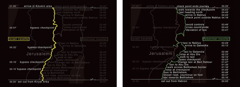
The territories of Israel and Palestine are, in these days, a laboratory of the world. This is a region where, in few acres, an incredible variety of borders, enclosures, fences, chek points, and controlled corridors are concentrated. On january 13th and 14th 2003, we tried to measure with our EU passport, the density of border devices in the surronding area of Jerusalem. On january 13th we travelled on the highway 60, along with a person with an Israeli passport from the colony of Kiriat Arba to the colony of Kudmin. The following day, we travelled allong with a person with a Palestinian passport from the city of Hebron to the city of Nablus. The two routes both start and end in the same latitude ; at some points they overlap. Their travelling times are profoundly different...
See more here
Lust (a design bureau based in The Hague) launched world/spectrum/archive today — a project which looks at RSS news feeds and than maps where on earth the news is ’good’ or ’bad’:
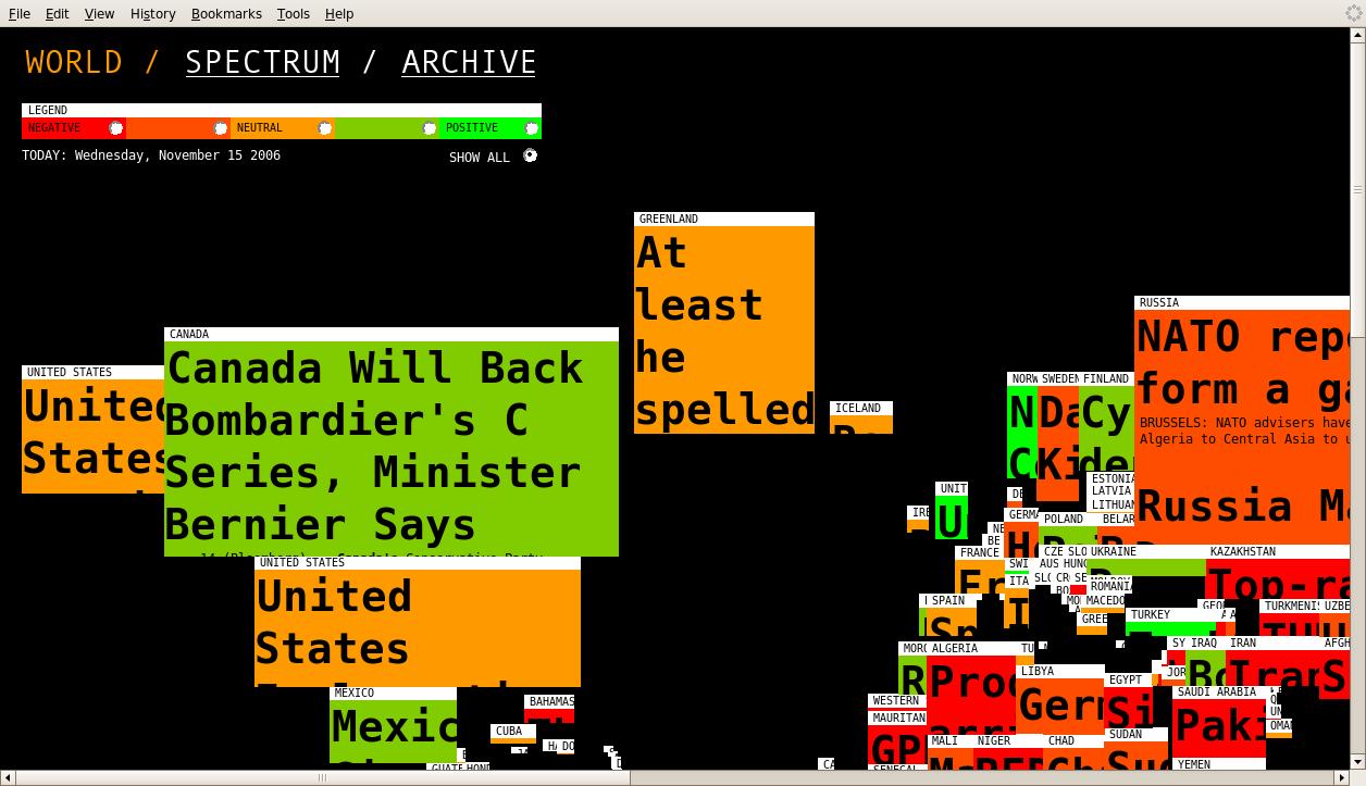
This is how Lust describes their project:
"The ’mood’ of a country can be partially read from the news in that particular country. (...) Using Google News RSS-feeds, words appearing in those articles are judged by an algorithm on whether they are positive or negative. It is interesting to see by the way, how according to Google, the western world is usually coloured more positive."
Would be interesting to see those algorithms ;-)
The topography of a football match
This weekend, in an article of De Morgen newspaper, Een club die niet rijk is, moet slim zijn, Hans Vandeweghe analysed the reasons why the clubs are adopting scouting softwares to make the most of their players. To find new talents, one needs a certain flair. But to monitor the performances of the players once they have been selected, the cold eye of digital technology seems more adapted: did they follow the tactical instructions, did they run fast enough, did they cover enough terrain, did they win duels during a match? A software called Prozone is made to answer these questions.
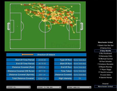
Prozone analyses the images recorded by ten cameras installed in a stadium and produces statistics about individual players performances, etc.
As marketing says:
PZ3 is a comprehensive reproduction of a live game. The data generated from this powerful software provides a high-quality assembly of physical, tactical and statistical information presented in multiple formats.The result is a phenomenal interactive coaching and analysis tool that allows you to view every movement, interaction and the total contribution of both your team’s players as well as those of the opposition – a truly invaluable asset in the world of modern football.
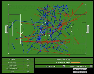
Topography+Statistics=Return on Investment?
Theinfo.org is «a site for large data sets and the people who love them: the scrapers and crawlers who collect them, the academics and geeks who process them, the designers and artists who visualize them. It’s a place where they can exchange tips and tricks, develop and share tools together, and begin to integrate their particular projects.»
They maintain, among others, a section about Vizualisations. Worth visiting.
Ton Bruxelles, il est comment ?
Une exposition collective issue d’ateliers d’écriture et d’arts plastiques animés à La Chom’hier, Bruxelles Laïque, Lire et Ecrire Bruxelles Nord-est, Lire et Ecrire Bruxelles Nord-Ouest, Lire et Ecrire Bruxelles Ouest et aux Ateliers de la Banane.
Textes, dessins, photographies, structures en trois dimensions réalisés par des personnes adultes en formation d’alphabétisation, toutes habitantes de Bruxelles.
Ces travaux sont une réflexion sur la ville et plus précisément sur la perception et la représentation que l’on a d’un territoire commun. Durant les ateliers, les personnes ont exploré la ville, seules et ensemble. Elles se sont perdues et retrouvées à maintes reprises en « arpentant les cartes », en confrontant leurs points de vue et en racontant leurs expériences.
Durant l’exposition, vous découvrirez une multitude de territoires qui se mêlent, se superposent, cohabitent et fabriquent ce que nous appelons « Bruxelles ».
Atelier co-animé par Karyne Wattiaux (Lire et Ecrire Bruxelles) et Mariska Forrest (Ateliers de la Banane), avec l’aimable participation d’Elise Wynen (Maison de la Famille) et de Marc Detiffe (photographe).
http://www.lejacquesfranck.be/agenda_detail.php?id_agenda=594
On Jill Britton’s website, a wonderful introduction to topology.

«A simple trick illustrates topology: taking off a vest without taking off a coat, since (topological) the vest is outside the coat — in the sense that a paper lying on the bottom of a wastebasket is really outside the basket, not in it, since being in would require removal of a boundary. One puts an arm through one vesthole; pulls the coat through this vesthole until it is hanging on the other arm; then pulls the through that other vesthole, where it is obviously "outside".»
Un café pour une carte de Bruxelles !
Amenez nous une carte qui raconte Bruxelles différemment pour compléter notre atlas bruxellois, venez participer à la réalisation d’une carte des réseaux de débrouille et d’entraides du quartier Liedts (Schaerbeek) ou participez à une carte émotionnelle du quartier en vous promenant avec une machine enregistrant vos variations émotionnelles.... En échange d’un thé ou d’un café...
Breng ons een kaart die Brussel op een andere manier belicht om onze atlas te vervolledigeen, werk mee aan de realisatie van een kaart van de wijk die uw geliefkoosde plekjes toont (vertel ons over de plaatsen waar u gedachten uitwisselt of anderen te hulp schiet) of help mee bij het maken van een emotionele wijkkaart door met een machientje rond te wandelen die uw emotionele veranderingen registreert.
En dat in ruil voor een koffie of een thee...
Ca se passera normalement:
sa. -za. / di.-zo. 3 - 4 mars-maart - 14.00 - 18.00
Place Liedtsplein (1030 Schaerbeek).
dans et in Guagua (rose flash caravan)
Info’s : City Mine(d) — 02 / 779 59 00 — veronique(at)citymined(point)org
Un projet de / een project van www.citymined.org / www.recyclart.be // en collaboration avec / in samenwerking met www.constantvzw.com / www.speculoos.com / http://www.biomapping.net /
Pour tous les détails du projet TOWARDS cliquez ici
Nous nous installons place Liedts avec notre Guagua Rose flash devenu pour l’occasion bureau de collecte de cartes: réelle, imaginaire, subjective (surtout!), artistique, géographique, urbanistique, amateur, professionnelle, régionale, de quartier, virtuelle, de papier, tous thÚmes et particuliÚrement ceux qui nous font découvrir un autre Bruxelles. Le tout formera un atlas disponible à terme sur le net... et plus si affinités.
Si vous voulez nous envoyer ça dÚs maintenant, allez-y gaiement: veronique(at)citymined(point)org / laurence (at)recyclart(point)be
Vous pourrez aussi participer à la création de deux nouvelles cartes du quartier autour de la Place Liedts:
une carte du quartier reprenant vos lieux préférés « d’échanges »: parlez-nous de ces endroits où vous échangez des services ou des produits sans échange monétaire. Un premier pas pour la réalisation d’un livre de recettes de bonnes pratiques micro-économiques dans le quartier Nord. Plus d’infos à propos du projet micronomics ici
Et puis une carte du quartier reprenant vos coups de coeur, de stress et vos indifférences... littéralement. Vous vous baladez dans le quartier avec un systÚme enregistrant votre état émotionnel en fonction du lieu où vous vous trouvez, grâce à l’ingéniosité de Christian Nold, artiste londonien et à la combinaison d’une sorte de détecteur de mensonge et d’un gps. Le tout donne une carte sensible du quartier. http://www.biomapping.net/ (à confirmer). Inscriptions: veronique@citymined.org et sur place.
Ce sera aussi l’occasion de découvrir le contexte de tout ça, le projet de cartographie: TOWARDS - Vers une cartographie subjective collective: une tentative de représentation subjective du territoire de Bruxelles couplé à la création d’un outil collaboratif de cartographie.
Plusieurs artistes ont participé au projet en cartographiant à leur façon les interventions urbaines ayant marqué leur souvenir et Bruxelles. Un site internet et une publication témoigne de cette premiÚre étape et seront consultables sur place, ainsi que notre premiÚre collection de cartes.
Traces du workshop : les sols de Bruxelles
La video de Tom Vigar
On my daily browse through blogs, I found this computer science professor Susan Rodger who maps out her mathematical experiments with baked goods.

On this occasion she made edible Turing machines, one batch on March the 23rd 2004, the other batch on March the 27th, 2004.

Susan Rodger has other delightful mathematical baking experiments online.
I do wonder what happens with the Turing muffins, afterwards...
Thanks Xeni Jardin!

Un très beau rayon art et cartographie
Un très beau rayon rayon "art et cartographie" à découvrir à la Librairie des Galeries ( 2, galerie Saint Hubert - 1000 Bruxelles)
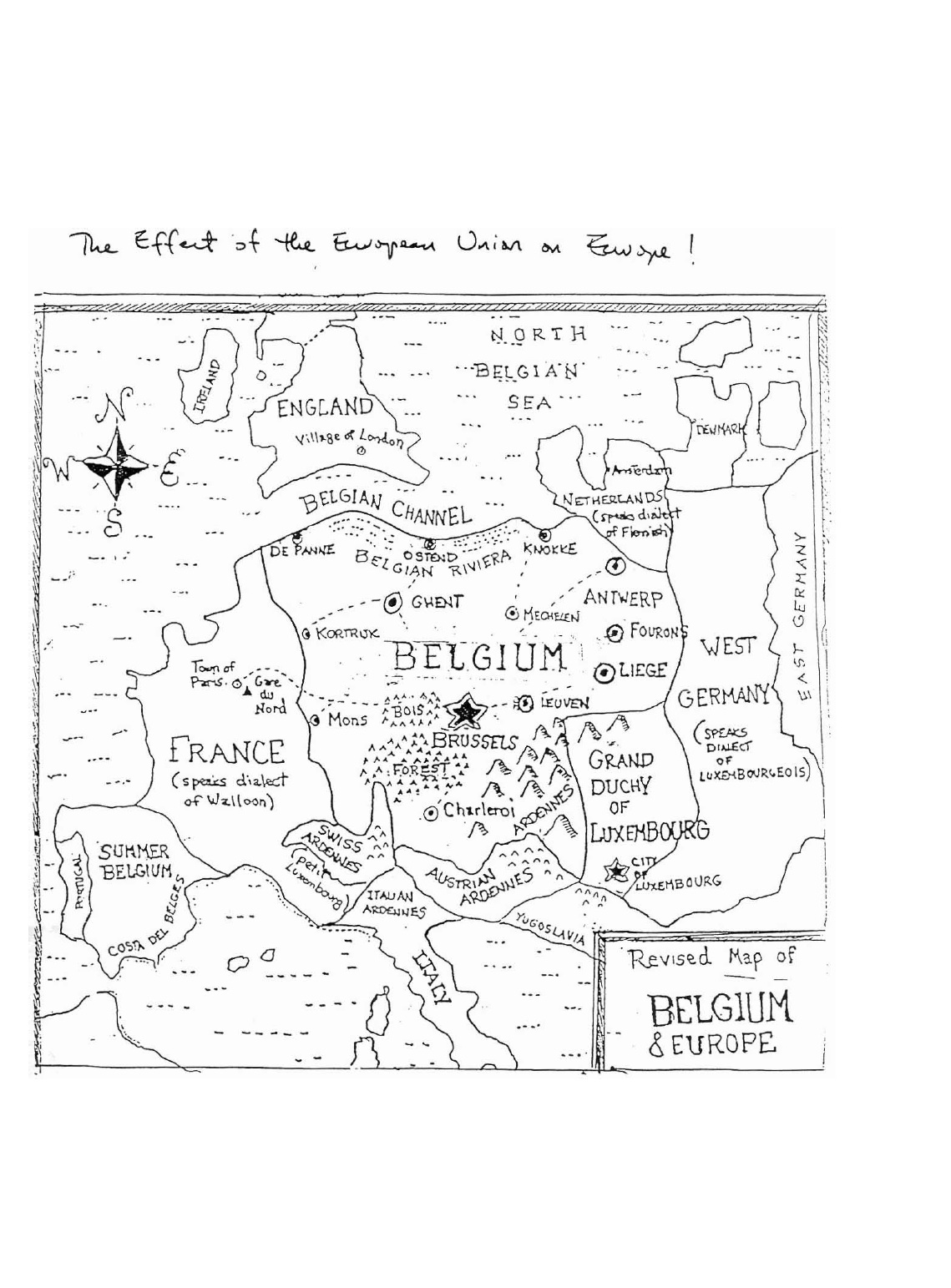
Cette carte revisite la géographie en centrant de manière surréaliste la Belgique au cœur de l’Europe occidentale.
Ici, la Belgique occupe la majeure partie du continent européen. Les moyennes villes belges telles que Gand, Louvain, Charleroi et Anvers sont présentées comme des mégalopoles à l’échelle du continent et des autres capitales (Londres apparait comme un simple village)..
Les Ardennes, en pleines expansions, dépassent les limites administratives classiques. Ainsi, la Suisse contient sa "Swiss Ardennes", le nord de l’Italie "l’italian Ardennes" et il existe bien sur aussi les « austrian Ardennes ».
La répartition des langues est elle aussi revisitée, de façon à ce que la France "parle un dialecte de Wallonie", l’Allemagne de l’ouest un "dialecte Luxembourgeois"et les Pays-Bas, un "dialecte Flamand".
Beaucoup d’autres éléments ont ainsi été repensé, on peut trouver la "Costa del Belges", la "Summer Belgique", etc...
Bien que surdimensionnée, cette carte présente une Belgique au cœur de l’Europe, ce qui peut se justifier au regard du rayonnement institutionnel européen que porte la Belgique en elle.
Vous pouvez visionner la carte ici

A quasi-license by Matthew Fuller and Usman Haque.
PreambleTake the separate domains of Free Software licenses and of spatial construction. Consider each of them as a series of types of entity, composition and relations. What series might be invented to run across the two of them? This document is a quasi-license. If its constraints are followed in the production of spatial structures, whether buildings or more fleeting constructions, you, and others, will be able to make something new, or reversion something already there and you will be able to express clearly how others can participate or make use of the work you are creating.
The production of structures to articulate, produce and protect space, often coded under the disciplinary term ‘architecture’ is arguably one of humanity’s oldest activities. Countless technologies and legal frameworks have grown along with this process. Formerly one of the most collaborative endeavours, architecture now often functions in opposition to such collaboration. On the one hand it reinforces, and is reinforced by, whatever accretes as the currently dominant political system and some contend that this relationship makes it ineligible as a means for authentically confronting structures of power.i On the other, making buildings is a substantially collaborative effort, always involving teams and multiple kinds of expertise and decision making. All that may be required to free up construction is to render its repertoire of collaboration more expansive. Recent social, cultural and technological developments, particularly in the fields of software and electronics, suggest strategies for productive mechanisms that exist substantially within a given political frameworkyet still are able to provide clear indication of political alternatives. These alternatives in software, Free, Libre and Open Source Software (FLOSS) are highly pragmatic, do the work required of them but also reinvent forms of production in a way that set up real possibilities for freedom.
Why is this relevant to the making of urban spaces? For the first time in the history of humanity more of us live within cities than outside them.ii It is vital to begin to think through how we can become more consciously involved in their design, production and inhabitation. While there is a concern about how much individuals can, with good purpose, affect their environment it is clear that we are all, collectively, and in ways strongly shaped by the kinds of collectives we form, having some sort of ecological impact. Therefore ways of organising frameworks, in formal or less formal ways, for collectively productive activities are becoming increasingly important to attend to. A discussion of the processes through which humans construct cities could appear to support the argument that there is a distinction between “artificial” and “natural”. In fact it demonstrates the opposite: just as with any non-human entity we collectively construct our ecological and architectural frameworks and these frameworks tend to overlap with those of others. These overlaos have consequences. The difference is (or should be) that we consciously recognise our interdependence and thus must consciously act upon it.
Architecture, which exists at the very moment when space is defined, constructed and experienced through activity, is perhaps the most common shared enterprise of them all. A city is a city if it is lived-in: otherwise it is merely a pile of bricks, cables and concrete. Our interdependence however does not mean that anyone is ‘naturally’ dependent on the current state of cities or societies. The proportion of the earth’s inhabitants ‘depending’ on systems of neo-liberalism or oligarchy, for instance, are rather pitiful compared to the amount of natural and human resources they require to maintain their unabashedly vampiric positions. Such a situation deserves some regeneration.
In order to develop thinking about such interdependence and collaboration we might as well start from where it is blocked. The architectural profession remains relatively steadfast in a distinction that divides designers from users, even though technology increasingly provides grounds for diminishing that distinction, either through networks (electronic, social, geographical) that provide people with better access to cross-collaborative tools and multi-disciplinary inputs or through responsive building technologies that can place people themselves at the helm of the configuration/design of their own spaces.
In the eighties and nineties, computers’ impact on the architectural discipline was in the form of design aids. In the coming decades computers will increasingly be a part of the architecture itself, enabling user-centered interaction systems for configuring environmental conditions. We have already seen systems like those that track movements of the sun to control louvres outside a building, or movements of people to adapt light levels inside a building. We have seen “intelligent” devices that monitor temperature to provide us with optimum levels or even walls that change colour as necessary to complement interior designs. However, innovation in the design and construction of the built environment of the future, appears to be split problematically between large developers (who have their own particular efficiencies of scale to optimise) on one hand, and ubiquitous computing technologists (who are developing the systems that mediate the ways that we relate to our spaces and to each other) on the other, with architects finding themselves somewhat irrelevant. People-centered architectural interfaces and responsive building systems are being developed, not by architects but by computer scientists designers and artists working independently or through numerous institutions, with all the historical and commercial associations that these institutions are party to. .
This document proposes that another lesson can be learned for architecture from computing: the way in which software is made. Here, we want to concentrate on the current most significant mode of software development, Free, Libre and Open Source Software (FLOSS), steering clear of ubicomp fantasies that may often obfuscate technological power structures.
Il existe des lieux spéciaux, uniques, qui offrent des expériences esthétiques et sensibles particulières. Dans ces espaces, nous nous projetons : par effet de réflexion, une poétique s’opère.
Ils peuvent être des jardins, des recoins, des passages, des architectures, des paysages comme des territoires. Ils n’existent parfois que dans l’imaginaire et la fiction, ou ne sont connus que d’un tout petit nombre. Ces lieux résonnent : mis en circuit avec notre imaginaire, ils œuvrent et provoquent l’intuition, offrant de nouvelles alvéoles d’expérimentation.
Ces lieux, ainsi que les espaces et les dynamiques d’individuation qu’ils ouvrent, sont les objets de la Collection Morel,

Visions cartographiques se présente comme:
[un blog ...] destiné à présenter, sous forme d’esquisses ou de documents finalisés, des projets cartographiques en gestation (pour les présenter au public et pouvoir les développer collectivement), une réflexion sur la création cartographique, les manipulations et utilisations politiques des cartes, des projets artistiques dans lesquels la cartographie tient une place importante et des réalisations cartographiques ou géographiques anciennes (pour leur intérêt historique).
Plusieurs articles traitent de la participation du cartographe, Philippe Rekacewicz, auteur du blog, à l’exposition "Frontières" qui se tient au Museum de Lyon du 3 octobre au 4 février 2007.
le Muséum de Lyon a décidé de présenter, pour illustrer huit problématiques inhérentes à la question des frontières politiques (les huit « mondes » frontaliers de l’exposition), non pas les cartes « finalisées », c’est-à-dire imprimées, mais plutôt les esquisses préparatoires crayonnées dont l’aspect incertain témoigne de ce qu’est la frontière elle-même : ambivalente et paradoxale (elle sépare autant qu’elle regroupe).
Je ne résiste pas au plaisir d’épingler un dernier extrait:
Pourtant, l’esquisse, premier jet, est souvent un révélateur plus authentique, plus fidèle de la pensée du cartographe. L’ordinateur perverti : il fige froidement et artificiellement des situations souvent fort mouvantes. L’esquisse est plus dynamique, les mouvements, les formes, les couleurs s’y expriment avec plus de vie. On peut renforcer les traits, jouer sur les contrastes, exprimer fortement le caractère aléatoire de la géographie du monde. La carte-esquisse est autant une émotion artistique que politique. Lors des grands découpages contemporains, du Congrès de Vienne à Yalta, des générations de diplomates ont gribouillé, dessiné à la main maintes esquisses malhabiles, imparfaites, pour tenter de trouver les tracés frontaliers qui leur étaient le plus favorableL’esquisse préfigure la carte, permet d’exprimer plus librement mais plus subjectivement le caractère incertain ou temporaire de ces lignes de partage et la diversité de leur statut : il y a aussi des « murs » dans les têtes, des frontières culturelles, symboliques, que seuls les crayons de couleurs arrivent à formellement mettre en valeur.
Voir le site: http://blog.mondediplo.net/-Visions-cartographiques-

“ VisualComplexity.com intends to be a unified resource space for anyone interested in the visualization of complex networks. The project’s main goal is to leverage a critical understanding of different visualization methods, across a series of disciplines, as diverse as Biology, Social Networks or the World Wide Web. I truly hope this space can inspire, motivate and enlighten any person doing research on this field.
Not all projects shown here are genuine complex networks, in the sense that they aren’t necessarily at the edge of chaos, or show an irregular and systematic degree of connectivity. However, the projects that apparently skip this class were chosen for two important reasons. They either provide advancement in terms of visual depiction techniques/methods or show conceptual uniqueness and originality in the choice of a subject. Nevertheless, all projects have one trait in common: the whole is always more than the sum of its parts.”
Visualisation techniques for temporal information
A wonderful document produced by Joe Parry who runs the very richVisual Design and Analysis weblog

«This document is a high level overview of graphical representations of temporal information. It is intended to be a short personal guide to the relevant literature and applications. It is intended to encourage further reading and research, rather than being a definitive review.»

«It’d be interesting for generated printouts of OSM data to encode enough source information to reconnect the scanned, scribbled-on result back with its point of origin, and use it as an online base map just like GPS traces and Yahoo aerial imagery.»
Found in the blog Critical Spatial Practice, an article about the cartography made by the group Frente 3 de Fevereiro. This group has been created after the death of a young black man, Flávio Sant’Ana, by the São Paulo military police.
A few quotes from their manifesto We Are Zumbi: A Cartography of Racism to the Urban Youth
Thus we began our cartography trying to decompose the historical thread that has been rendered “natural” through new social practices. But how are these practices structured? What are the limits of the slave legacy in our quotidian experience? How can we break free from this logic by inscribing other forms of sociability?Cartography is to us more than a map. It is writing understood in a larger sense, a stance before the world. We are cartographers when we recognize and organize that which instigates us to act, giving us hearing, a voice and form to our anxieties and desires, poetically expressing and inscribing onto reality that which moves us.
Everything that voices the movements of desire, everything that serves to coin expressive material, is welcomed. All entry points are good, so long as there are multiple exits. That way the cartographer uses a variety of sources, not only written or theoretical [...]. The cartographer is a true cultural cannibal: always expropriating, appropriating devouring and giving birth, trans-valuing. The cartographer is always seeking elements/nourishment to compose his/her cartographies
Thanks to Muriel Claeys
Vertige. Voir ce qui se passe dans sa rue, sur une plage des Maldives ou au Nord-Kivu, au mètre près et en termps réel, ou presque. C’est le pari de e-Corce, un concept d’observation de la Terre imaginé par l’agence spatiale française. Super Google Earth ou Big Brother ?
Une webcam mondiale sur votre ordi. Accessible à tous, et gratuitement. Où l’on pourrait voir tout endroit du globe terrestre avec une résolution telle qu’on y verrait des détails d’un mètre –rivalisant avec les meilleures images disponibles sur Google Earth, mais qui ne concernent qu’une toute petite partie de la Terre. Une image, surtout, « rafraîchie », disent les ingénieurs ; d’abord une fois par semaine, puis une fois par jour. C’est ce que propose e-Corce, pour e (Internet) Constellation d’Observation Récurrente Cellulaire. Un rêve ? Ou un cauchemar...
Qu’il puisse s’agir d’un rêve, la réaction des responsables de Google Earth lorsque les ingénieurs du Cnes, l’agence spatiale française, sont allés leur en parler, en témoigne. « It’s our dream », ont-ils répondu, d’après Jean-Jacques Favier, ex-astronaute, aujourd’hui en charge de la prospective au Cnes. Pour le cauchemar, songeons qu’il ne sera plus possible de raconter qu’on était au boulot lundi dernier, jour de pont du 11 Novembre. « Mais pourquoi voyait-on une troupe de gens dans ton jardin... »
Avant de se persuader qu’il y a un risque de cauchemar, encore faut-il savoir si cette « prospective » de l’agence spatiale française ne relève pas d’une promesse de Gascon. Par quel miracle, par quel tour de force technologique, pourrait-il se réaliser, et d’ici à quelques années seulement ?
Si miracle il y a, ce fut dans la capacité des ingénieurs à oser sortir de tous les schémas classiques de l’observation de la Terre. De considérer l’engouement du grand public pour les images diffusées par les géoportails –Google Earth, Geoportail– et de s’interroger : pour répondre à cette demande-là, bien différente de celle des scientifiques ou des services publics, n’y aurait-il pas moyen de s’y prendre tout autrement ? De manière à faire exploser les verrous de coûts, de débits d’information et de moyens de calcul qui interdisent aux systèmes actuels d’espérer offrir aux internautes les images nettes et récentes dont ils sont si friands ? Ironie de l’affaire, cette démarche novatrice est née dans le cadre conventionnel du colloque de prospective du Cnes, organisé en 2006 à Toulouse, où ingénieurs de l’agence et de l’industrie, scientifiques du privé et du public, s’interrogeaient sur l’horizon... 2025. En préparant cette réunion, une petite équipe réunie autour de Jean-Jacques Favier et de Jean-Pierre Antikidis s’est engagée dans un engrenage intellectuel qui a renversé tous les « impossibles » au fur et à mesure de son développement.
Le premier verrou à forcer fut celui du contenu de l’image. Aujourd’hui, les satellites optiques enregistrent le maximum de données spectrales, dont l’infrarouge, inutile à l’œil humain. Pour votre œil de simple badaud, que faut-il ? Les trois couleurs primaires (rouge, vert et bleu), et basta. En outre, cet œil, regardant une image sur ordinateur, se contente de peu d’informations par rapport aux exigences d’un scientifique. Comprimons donc les données enregistrées de manière analogue à celle du MP3 pour la musique. Résultat ? « Une division par cinquante du volume de données à transmettre par les satellites relativement à l’image brute », explique Jean-Jacques Favier. Et un brevet du Cnes sur ce « MP3 de l’image », réduite à ses dimensions « psychovisuelles ». Le flux de bits, « l’équivalent de plus d’un million de disques durs par semaine », sans cette réduction drastique, devient alors compatible avec les technologies actuelles.
Le deuxième verrou, c’est celui des satellites. Chers, lourds, pilotables, programmables, uniques en leur genre... tels sont les actuels espions de l’espace, high-tech jusqu’au dernier boulon. Les ingénieurs ont opté pour l’exact inverse : petits et légers, avec 150kg ; fabriqués en série ; dotés d’un télescope fixe d’une seule pièce en céramique ; photographiant à la volée le sol sur 28km de large, juste au-dessous d’eux, en permanence ; et envoyant leurs données au fur et à mesure, après compression, sans en garder de trace. Des microsatellites de cette sorte, une fusée Soyouz en lance 13 à la fois depuis Kourou. Placés à 650 km d’altitude, ils pourront assurer la couverture de toute la Terre une fois par semaine.
Troisième verrou, la réception, le traitement de ces images et leur mise à disposition des internautes sur le Web. Foin des grands centres, les ingénieurs font le pari de la dispersion. De 50 à 100 stations de réception des données, réparties sur tout le globe. Qui déchargent le flux vers des « grilles de calcul », des « fermes de PC » dispersées sur la Toile. Un concept hérité des physiciens des particules qui l’on inventé pour les besoins du LHC, l’accélérateur géant du Cern (Centre européen de recherche nucléaire), mis en service en octobre. Bien sûr, e-Corce ne serait pas sans défauts. Qui dit image optique, dit nuages... La récurrence des images promises en souffrira, surtout sur les zones équatoriales. Mais quel saut, si l’on songe aux systèmes actuels, où la plupart des images ont été prises il y a plusieurs années ! e-Corce coûterait environ 400 millions d’euros avec le « premier jet » de 13 satellites. Alors que le seul Spot 5, qui fournit aujourd’hui des images de la Terre, a coûté plus de 500 millions d’euros, lancement compris.
Mais qui paierait la note, surtout que l’estimation du Cnes semble « optimiste », précise un spécialiste ? Google et ses concurrents, répond l’agence. « Google dépense chaque année près de 50 millions de dollars, en images, pour son site Google Earth », explique Favier. Vu les potentialités énormes du système proposé, y compris pour des déclinaisons commerciales, en sus du flux gratuit, il pourrait bien devenir un projet industriel, financé sans le moindre apport de deniers publics. Verra-t-il pour autant le jour ? Si la technique et la finance peuvent être au rendez-vous, le droit, la politique et l’éthique auront leur mot à dire.
Le droit ? Pas si simple. Celui de l’espace donne à tout Etat le droit de lancer des satellites sans en demander l’autorisation aux pays qu’ils survolent. Comment, alors, défendre celui des individus, qui pourraient refuser que leur vie soit ainsi, en théorie, sous la surveillance de n’importe qui ? Quant aux Etats, aux entreprises, qui seraient susceptibles de protéger d’un regard aussi perçant, et surtout récurrent, des zones entières, des installations militaires ou dangereuses, comment vont-ils réagir ?
Déjà, les géoportails existants exhibent des zones préalablement floutées à la demande des gouvernements. Lors du déclenchement de la guerre américaine en Afghanistan, en octobre 2001, le Pentagone avait acheté toutes les images du satellite Ikonos à la société Space Imaging pour éviter qu’elles tombent dans le domaine public et commercial (1). Empruntant le chemin du Web, ces images de zones sensibles, sur lesquelles on pourrait compter les tanks, les colonnes armées ou les morts alignés, pourront-elles circuler aussi librement que l’imaginent les ingénieurs du Cnes ? Marc Pircher, directeur du centre toulousain de l’agence, estime « évident » que les Etats exigeront des garanties de sécurité pour des zones déterminées. Il avertit : « Le feu rouge à la mise en œuvre d’e-Corce viendra peut-être de là, ou de problèmes juridiques. »
Paru dans Libération du 18 novembre 2008

Scenario 11211: Flanders and Brussels together in an independent state, Wallonia part of Fance
How will the map of Western Europe look like when Belgium has disappeared? Maybe one of these maps gives the answer.
From Wikipedia:
«ACORN (acronym for A Classification Of Residential Neighbourhoods) is a geodemographic information system categorising all United Kingdom postcodes into various types based upon census data and other information such as lifestyle surveys. It was developed by Richard Webber of CACI Limited, who also developed the competing MOSAIC system, and is sold to businesses, health and local authorities typically for marketing and planning purposes.»
A collage that glues together the top (Wealthy Achievers) and bottom (Hard Pressed) categories of the ACORN classification.

Where to Find Open Data on the Web
Sarah Perez lists "pretty good data sources that are already available" on readwriteweb.com

Through which, I had the pleasure of discovering the Datawrangling’s blog, itself full of resources.
Wikibivouac is a collaborative map which reappropriates space to create new uses of the city.
The wiki element of contibutions from anyone aggregates information for improved transient occupancy of place.
To do this, the ZOOM team initiated the Hunting Days sessions, worldwide searches for locations of a particular resource - free, drinkable water points, one of the most critical resources to human existence. The first step was a venture into the streets Madrid in search of a free source of potable water. Discovering a fountain in the park, team members shot video to illustrate the potential uses of the resource, integrating the secnes into an instructional video introduceding the hunt and demonstrating the use of the interface to enter the points by street address or GPS coordinates. Data fields provided a way for hunters to enter info about the point, the way to access it, the times it is available, and other descriptive information. By the end of the first Hunting Day, (57) free drinkable water points had been entered into the database, and appeared in the worldwide map, with concentrations in Paris and Prague. When clicked, the points displayed the desciptive information which hunters had entered.
With the first hunt complete, focus shifted to the development of the openlayer tool which drives the Wikibivouac. Some points displayed at inaccurate locations. Developer Sami improved the accuracy of point placement from the interface, also creating a custom blue icon to represent water point locations. The points were shown by default on a black screen, but if users clicked the small plus-sign in the upper right corner, a small menu appeared which gave the option of viewing the points on two different map views.
After selecting the theme of the second hunt, a second instructional video was produced, keeping a humorous tone to encourage hunters to search for free warm spots where one can find shelter through the night. Again the object of the hunt was a free, available, underused resource important to human survival. The Wikibivouac collaborators await the results of the next hunt, which begins tomorrow.
See the site :http://www.wikibivouac.org/
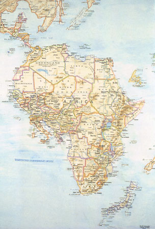
I made this map in college in response to an assignment, and it marks the beginning of my work with maps. Using a blade, I took apart a paper map, moving pieces over to a large piece of paper which I watercolored the same blue as the ocean in the original map. Gradually, the world was reconfigured. I often reconstructed words using presstype in places where the names of countries had gotten truncated. There were switches based on historical or geopological factors (Western Europe inserted into West Africa) ; others were based on formal correspondences or quirks of the map itself. Australia and Alaska had the same green border color, for example, and fit perfectly together due to the distortion of scale that occurs towards the poles.
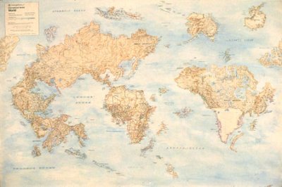
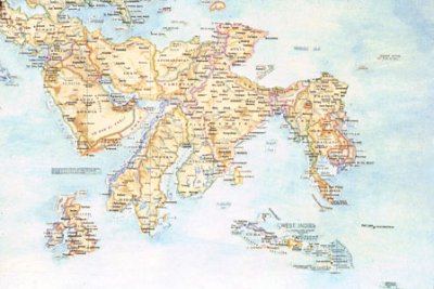
"Worldmapper is a collection of world maps, where territories are re-sized on each map according to the subject of interest."
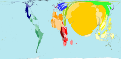 the map of Overcrowded Homes
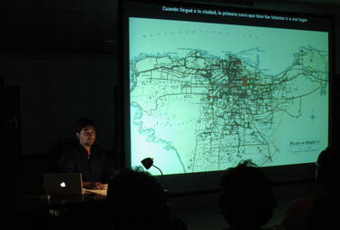
In the framework of The City as Commons in a Divided World, the Kaai Theater presents Yesterday’s Man described as:
" [...] the voyage of a stranger who’s confronted with an ever changing city, Beirut. The project is based on the hypothesis that every city has another city beneath it, and below that another and so on. From time to time, and for unknown reasons, fragments of these hidden cities rise to the surface, confronting the present in the supposedly new city; they appear brusquely or hesitantly and sometimes with harshness and cruelty. "
A collaboration between Rabih Mroué, Tiago Rodrigues, Tony Chakar and Thomas Walgrave. The performance will take place on the 11th of September 2008 at 20.00.
Read more


